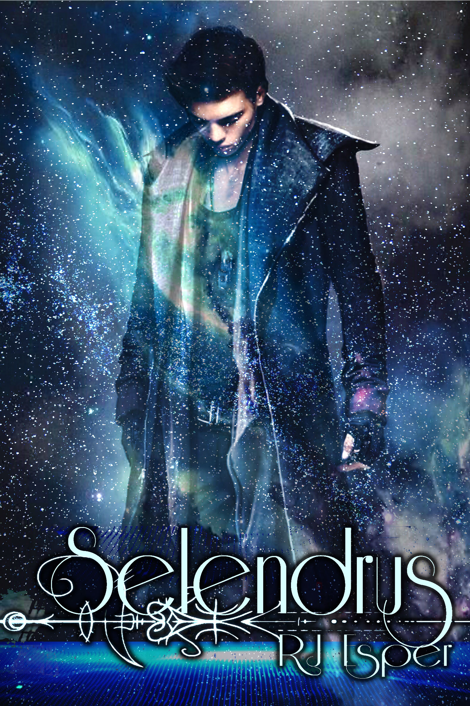

The author says:
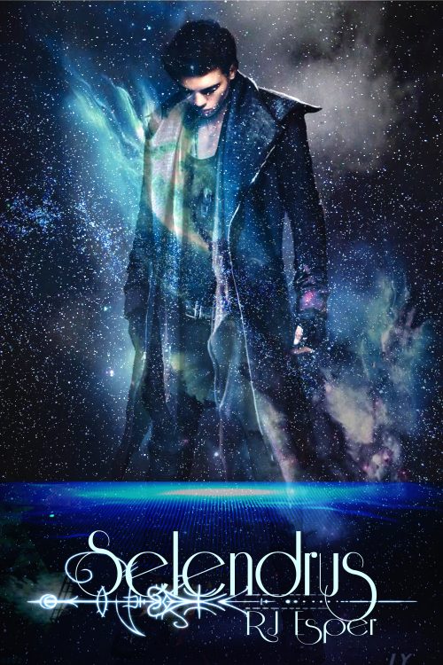
Title: Selendrus
Logline: On a distant planet called Selendrus, a displaced heir named Nyco must come out of hiding to stop an evil council called the Select from destroying life as he knows it.
Tagline: The last of his line, the first of his kind
Genre: AetherPunk, LunarPunk, Science Fantasy
Target Audience Members: The Mythologist (consumers who love lore and learning about the history and details of a world), the Romantic (consumers who enjoy complex characters, their chemistry, and the human tale), and the Maker (consumers who enjoy constructing, cosplaying, or creating pieces regarding the world).
Target Audience Demographic: SciFi and Fantasy audiences from late teens to adult
Cover: This is a quick concept mock up done on my computer.
Nathan says:
I had to look up “aetherpunk,” and the best definition I could find was “steampunk with magic,” which doesn’t really look like what I’m seeing here. Maybe that definition doesn’t mesh with yours.
It’s definitely got the SF vibe, as well as general “punk” — how important the granular sub-subgenre identification is will determine if other visual motifs are needed.
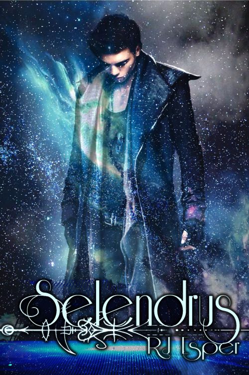
From a simple design standpoint, I think you’re hurting yourself by trying to fit too much of the figure on the cover. (One of my rules of thumb: “How often do you ever really NEED to see someone’s knees?”) I’m also not overly enamored of the typeface you used, if only because the thin letters are hard to read, especially at thumbnail side — if you’re absolutely committed to that typeface, make the type larger. (And given that another of my rules of thumb is “The smaller the type, the clearer the typeface,” I doubly recommend changing the typeface for the byline.)
Here’s a three-minute redo trimming the blank space around the figure and title to show what I mean:
If you want to emphasize the steampunk/aetherpunk vibe, my suggestion would be to remove the semi-mystical characters under the title (which make it even harder to read), and instead add a pseudo-Victorian border to the whole thing, letting the curlicues etc. contrast with the starscape.
Other ideas?