
The author says:
This is the diary of twelve-year-old Sean Campden–Middle School Kid. If you’re a fan of Wimpy kids, Dorky kids, Middle School jokers or laughter, then you’ll love this edition of Any Kid USA, Telling Stories and Naming Names. There’s never a dull moment when you’re Sean Campden. Especially, when you have to deal with killer bunny rabbits, a drone that picks kids up right off the ground, The half-man, half turtle guy, and the wildest school bus ride ever. But when he wants a bicycle for his birthday and gets a different bike, he sets out to find out why. His Mom has a reason for buying him a different bike, and soon he’ll find out what it is. You can find out the reason for yourself when you read this entertaining, and humorous edition of Any Kid USA.
Nathan says:
I think you’ve got it aimed right — it definitely has the vibe for the “Wimpy Kid” demographic.
However, there are several typography tweaks needed:
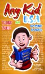
- The separation of “Telling Stories” and “Naming Names” (not just separated by space, but by different colors and typefaces) makes it hard to read as a single phrase. “Telling Stories” is especially a problem, as the thin letters and the similarity between the red of the type and the orange-brown of the background makes it hard to read at anything less than full size.
- Relegating the author and artists bylines to a corner, in a type size scarcely larger than the background type, just makes it that much harder to notice.
Other comments?
Can’t add much to what Nathan said. Most of the problems are typographical. For instance, I read “Any Kid and USA.”
Thanks for the feedback. I’m making the changes that were suggested. You were very helpful. Again thank you.
I think it’s too cluttered. Lose all that background text and maybe the ruled lines too.
I do like the art.
I see what you suggested and I am making the changes. Thanks for the valuable input.
The “Sean’s” on the journal is hard to read and confusing. At first, I thought it said SeaV. I recommend, if the artist can, changing the “n” up a bit so that it’s not so hidden behind the “a” in “Sean.”
The background–I”m with Gwen, dreadfully busy. Too busy. Is there any chance that the killer bunnies or other characters could lurk in a (solid!) background.
And yes–please, less creative coloring on the typography. It’s too too too busy and makes eyes flash in different directions.
I’d make the boy a bit smaller and move him back a bit–gie yourself enough space to do a proper byline at the bottom. Lose the “by,” that’s really not used any longer. Make all the names in the byline far, far larger. You could put your name the largest, centered, and then put the two illustrators, smaller, below yours, aligned along the bottom, in a single row, separated by a bull or star or something.
Good luck–I think you’re heading very strongly in the right direction!
I took the comments under advisement. Thanks again i actually had the book cover redesigned. You can see the new cover on my website. Anykidbook.com Thank you.
Yes–I think that’s much improved. Good job on it!
*Whew!* It’s nice to get a breather after the complexities of our most recent previous project. I agree with the others that your general concept is right, but your execution of the specifics is somewhat overdone. The lines and text in the background are really cluttering the cover, and crowding all the titles together like that makes a prospective reader feel dyslexic.
Fortunately, this being a genre with well-trodden ground (as you mentioned), there’s a perfectly good and simple general template you can follow from yet another book series in this same genre: Dear Dumb Diary. Here’s the book series, and here’s the movie adaptation. In fact, that was the first thing this cover brought to mind: Dear Dumb Diary with the sexes swapped.
If you likewise swap “masculine” (blue and/or green) colors in for the “feminine” (pink and/or lavender) colors in the title bars on the covers of that series and arrange just about everything else on the cover (i.e. the fonts, the illustrations, the tagline, etc.) exactly the same, then you have a template for this book and (if you so desire) a whole series of Any Kid U.S.A. books. (If you’re just going for one book, though, I’d recommend arranging it more like that movie adaptation’s poster.)
Thanks for the detailed comment. I didnt get to look at these until now. It ironic now reading this how similar your suggestion are to what I finally did to change the cover on the cover. I’m not totally happy with it but I believe it’s ok for now. I need to work on book 2 so I’m done with this book for now. You’re welcome to take a look at the new cover here anykidbook.com.
I would be interested in what your comments would be. I see what you mean about the dumb diary book. Great comparisons. Book2 will be that much better. I appreciate your input it was very helpful.
Overall: 65%
Concept: I like the guy graphic which stands out. For me, there is too much handwriting on the cover, it makes the cover a little bit heavyweight. I think less is more in this case. The fact the whole cover is lined, makes it harder to focus on author names.
Colors: USA – use harder blue. Use less colors especially for title parts. It is hard to figure out the title I need to search for Amazon. The main title should be the only thing I have to focus on.
Thanks for the comment. Please check out my site anykidbook.com. i made the changes and would appreciate the new feedback. Its still a little busy but I need to start writing my new book and will make that book better. Thanks again.
Thanks!