The author says:
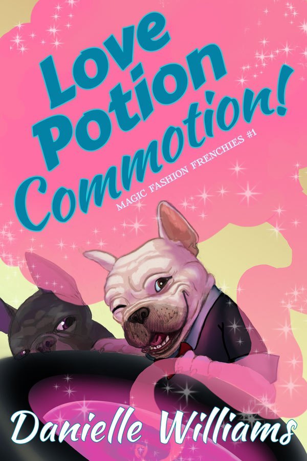
Soon-to-be college student Alanna Lu Feng helps her great-aunt and -uncle with their doggy fashion design business, shooting photos of their French bulldog mascots. It’s good money and fun work—but why can’t Alanna Lu get lucky in love? Vivian and Frank Feng adore their great-niece, but they’re hiding a secret from her: Vivian is a witch! Sick of listening to her great-niece’s dating woes, Vivian concocts a plan to get her great-niece into the arms of a special someone. But can magic solve the problems of love? Turn senior fashionista Iris Apfel into a good witch, give her some talking French bulldog familiars, add a pinch of love story, and you get “Love Potion Commotion”. A fun read for fans of Hallmark movies. A lighthearted comic fantasy that will make the whole family smile.
This book is live, but I’m looking to completely refresh the cover (and blurb) since I’ll be formatting it for print soon. In other words, don’t feel tied to this particular image, composition, or anything because I’m prepared to start from the ground up if needed (I did the illustration and styled the text). Here’s the two main things I’m looking for help with:
– giving it more of a Hallmark Channel vibe. I think this cover, while cute, may skew too young. – ideas on a composition or graphic element that will help me brand the rest of the series (2, possibly 3 more books are planned.) Things to note: – It’s an ensemble comedy. I’m not sure if the cover needs to reflect this, and if so how to go about that.
– This series is based around holidays (Valentine’s Day for this one; the United States’ Fourth of July for #2, Halloween for #3, and Christmas if I do a #4). That might factor into the use of color for branding the series. – I think this book lives roughly in the same space as the classic “Bewitched” TV sit-com, though it has more dogs, fewer wacky hijinks, and a larger cast.
– There’s no mystery/sleuth component, so I’m not sure if it’d be appropriate to visually style it as a “Cozy,” but I think it has a similar vibe to a cozy–light and fun.
It was tricky developing this cover concept the first time around on my own, so I’m looking forward to your help! Thank you, everyone!
Nathan says:
While there is certainly a contingent of readers who are drawn to covers with dogs, there’s a much greater contingent drawn to covers with people. And as the dogs are more background to the human story (at least as given in your synopsis), I think relegating them to a similar background role on the cover is wise.
What you’ve got here is a comedic paranormal romance. I point that out because, once you know how to categorize your book, you can look at how similar books are marketed, which means you know how your target readers recognize books meant for them. Here are the first non-sponsored covers that come up when I type “comedy paranormal romance” into Amazon (and it auto-completed, which means that it’s definitely a thing):


Not a lot of specific commonalities — the images alternate between photos and cartoons — but here are some things that do stand out:
- Protagonist front and center.
- A touch of whimsy to the font.
Your novel also has an Asian protagonist, which seems to be a good hook as it’s fairly unusual to the genre, and yet that doesn’t come through at all on the cover, so I’d play that up.
So here’s what I’d do:
- Female Asian as the focal point.
- Dogs in the background/to the sides.
- Magic indicated by glitter and glows (you’ve already got some of that going on).
- Try to indicate an Asian magic, if you can without turning it into a caricature.
Other comments?
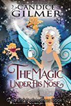
Again, I’m agreeing with Nathan in saying that the cover simply doesn’t convey any real sense of what your book is about. I see only cute puppies and a lot of pink. If I look really closely, I can see that there are some sort of maybe magical swirly things going and what just might be part of a top hat, I guess…but a book cover needs to convey its message a lot faster than that.
I certainly don’t see anything suggesting witches, talking dogs/familiars…or even any hint that humans are involved in the story at all.
If there is indeed a holiday theme to each book, then I think you are going to want to make that very apparent in order to establish a link between the books.
I LOVE this book concept! I love your art!!!
My specific recommendations are:
Find/ draw a cute picture of your MC with a whimsical oh no expression.
Keep the color pink but trade the cloud for hearts (in varied shades and denseness’s of pinks)with a magical smoky vibe instead of one large cloud. (you could play around with this and have the MC be popping one of the heart clouds on her nose or finger or having them chase her, something fun and whimsical but the detail would depend on the model photo you pick.
I adore the dogs so I’d keep them too but much smaller, letting the MC take center stage. I might just keep the white one and add some sparkle to his eye so he’s clearly winking. He might be supper cute in the bottom with his paw on the series tag. A flourish on that would probably be awesome, something he can be ‘leaning’ against that could be used as the series identifier
I like the blue color of your text. (your colors are great and eye catching) I like the yellow of the background but it needs more texture but those details will all depend on the main character.
I don’t hate the fonts but I agree with Nathan that adding a hint of Asian flavor might do wonders here.
Okay, so: cover definitely cute. And probably perfect–for a different book. I agree with Nathan that as you have a Chinese-American protagonist, you should feature her or an avatar thereof. I also think that the storyline is cute and you’re smart to target Hallmark Channel watchers, too. They sound like they are right up your book’s alley.
Maybe something as simple as making the pups (and whatever it is that they are perched on?) smaller and putting your protag front and center. You do need something else to convey “witches” and magical powers, somehow. What about…the protag front and center (is), the pups either down front, like the foot of the stage, or something like that, and Auntie Vivian, wand in hand, spell-casting in the background? (This has the added benefit of letting you go a bit wild with Auntie Viv, too, for comedic effect.)
It’s obvious that your artist and you were influenced by the intro for Bewitched (the original) and that was smart. If you think back, Samantha rides off on her broom, with the text “Bewitched” magically skywriting behind her…but for most of the toon intro, she’s right there, leading the parade.
I think that’s what is missing here, the overwhelming presence of your heroine. I do think that the overall cover has skewed too young.
I’m not sure that the font is helping you, but the cover’s so busy that right now, it’s hard for me to tell. Font-wise, I would consider “Stylish” on Dafont, which is very Bewitched-y (yes, I know, this isn’t Bewitched, but you’re trying to reach out to the same demographic and any unconscious connection thereto is good), or Witched, also on DaFont ($45 for commercial use).
I really do hope that this relaunching works for you. It seems a VERY cute plotline and idea and I applaud how smart you are in assessing your audience and trying to make sure that you reach them.
I’d love to see your next whack at it!
Yeah. I agree with Hitch that the cover is much too busy…it needs to be streamlined a little bit. The bottom third is especially overwhelmed by all of the overlapping shapes.
If you really want some inspiration from the “Bewitched” opening credits, go back and take a good look at how very simple, graphic and to the point it is.
https://d1xfgk3mh635yx.cloudfront.net/sites/default/files/styles/inline_wide/public/image/featured/1044764-9-story-go-n-co-produce-bewitched-series.jpg
Hey, Ron!
To be fair, although the author mentioned Bewitched and said that her book lives in the same space–a concept with which I concur–I’m the one who went on and on about it. But I also agree that the opening credit for BW is absolutely perfect, in terms of saying everything AND being simple, at the same time.
I also do think that ahem, “homaging” that font would work.
Remember the guy…what, two years ago (?) that had the unwitting guy-trapped-in-space comedy? We suggested the Harlow Solid font, which was a direct lift from The Hitchhiker’s Guide to the Galaxy? Don’t care if people thought “oh, that’s from..” because it was perfect.
It immediately told readers of THHGTTG that “this book is for you, too.” Ditto here. A little magic (cough) from Bewitched would serve this book well. That, or something that channels the same look/feel, something that a prospective reader would immediately feel comfy with, thinking “yup, thats for me.”
(Insert little nose crinkle here). 🙂
I love the candyfloss colours, and the fonts are spot on – well, not the subtitle – but yes, the dogs make think this is one where a dog is a protagonist. Second dog is also weirdly obscured. So, go with smiling Asian woman – it would be nice to have one with the two dogs in the image, but might be difficult to find, and to get the same dogs for the rest of the series could be even harder! Photoshopping everyone to look like they are in the same space is also tricky, if you did go with photos – perhaps a little vignette with a frenchie and the subtitle, that could be used on the other covers too?
Yes, I would say the cover skews a little too much toward YA fiction in its appearance, and that the imagery is a little too focused on the protagonist’s occupation rather than on herself. While the pinkish-lavenderish smoke does hint at fairy-tale-style magic and girly-girl feminine themes in general, it’s an awfully broad and vague theme overall. What you really need is to pull back from the generalities on this cover and focus more on specifics: the protagonist, her somewhat magical family, and then her occupation.
While I’m not too well versed in how Asian cultures and North American cultures differ in their depiction of witches (or “magical girls” as a few anime series I’ve seen refer to them, but your characters’ names suggest they’re Chinese rather than Japanese), I would advise you not to worry too much about being a bit stereotypical with your depictions. Stereotypes, after all, are basically cultural cliches; though these can be rather offensive (intentionally or otherwise) when the cliches are based on how the given culture looks from some other culture’s perspective, nobody complains much when anyone depicts a culture as it typically sees itself. Also, what’s a cliche to one culture can seem quite exotic and intriguing to another, so however Asian people typically depict witches on a cover might not be too interesting to those Asians themselves, but would probably be interesting to just about anybody else e.g. English-speaking cultures from Australia to North America and Europe.
Since you’re basically advertising a romantic comedy with some paranormal overtones and inspired by the old Bewitched television series, I’d recommend using some vector graphics like the ones depicted on half those covers our esteemed host showed you. Stick the protagonist at the center, put her wacky surrogate-parent relatives on either side of her, and have her holding one or both of those cute little pugs under her arm while posing for a photo shoot. This being themed on Valentine’s day, don’t forget to sprinkle hearts of pink and red liberally around the scenery wherever convenient the same as you might do with stars and stripes for your next book, and pumpkins and ghosts and black cats and the like for the one after that, and candy canes and Christmas ornaments and stuff for that potential fourth book.
I get that you’re trying to differentiate your book a bit from others of the same genre so it’ll stand out from them, but an Asiatic family on the cover should be quite sufficient for that in most English-speaking locales. When Disney’s overseas executives marketed its 2003 remake of Freaky Friday in China, they did change the title to The Fortune Cookie (that being the MacGuffin responsible for mind-swapping the mother and daughter in the story), but the movie posters there were not otherwise too different from their American counterparts focusing on the leading actresses Lindsey Lohan and Jamie Lee Curtis in full costume. You likewise need only to keep the focus on your main characters, and let secondary ones (like those adorable pugs) serve as props on the periphery.
Once you’ve got your cast assembled and properly decked out in festive Valentine’s Day paraphernalia on the cover this way, all you need is to pick out one of those fanciful fonts for your title and byline like Hitch and our esteemed host are recommending for you, and you’re set.
Just wanted to thank everyone for all the thoughtful comments y’all took the time to leave! I’ve been busy setting up a new computer (my first time on Linux!) and releasing a couple new books, but I’m going to gather all these comments and use them when I start this cover’s revamp! It took MANY MANY thumbnails to get to the current cover, so I’m excited to have all these new ideas to work with.
Thanks again!