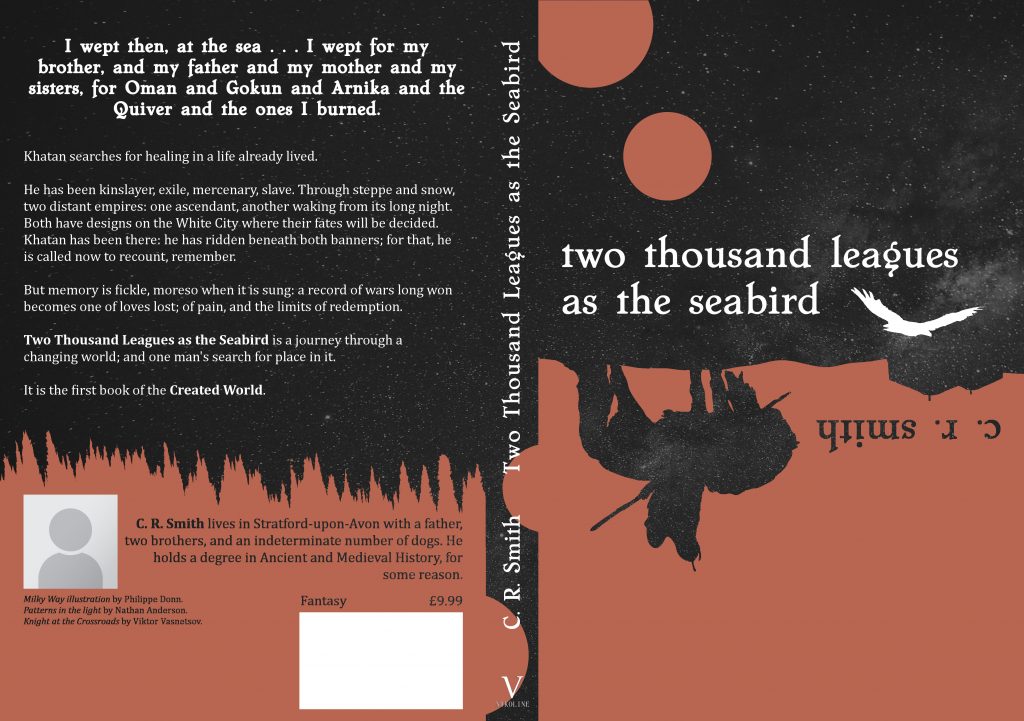
The author says:
TWO THOUSAND LEAGUES AS THE SEABIRD is a literaryish fantasy novel set in an Central-Asian inspired world. It is the memoir of Khatan, an aging mercenary, as he attempts to navigate his own past and revisit the mistakes that have brought him to ruin, along two mirrored military campaigns. It’s very character/relationship focused, with the warfare and politics sort of fading in the background. I’m still a ways out from publishing and I’ve never designed anything like this before, so any feedback is greatly appreciated. Cheers!
Here’s the blurb in case you want to crop to just the front cover:
Khatan searches for healing in a life already lived. He has been kinslayer, exile, mercenary, slave. Through steppe and snow, two distant empires: one ascendant, another waking from its long night. Both have designs on the White City where their fates will be decided. Khatan has been there: he has ridden beneath both banners; for that, he is called now to recount, remember. But memory is fickle, moreso when it is sung: a record of wars long won becomes one of loves lost; of pain, and the limits of redemption.
Nathan says:
My frequent quip is that the covers to “literary” novels try hard not to look like they’re about anything in particular. This cover succeed in that, as it really doesn’t give any indication of content, nor use any specific element to attract attention.
Your bigger problem, though, is with the “literaryish fantasy.” What you’ve described may be well written and character-driven, but it’s a fantasy novel — full stop. By that I mean that you’re going to have a lot better luck marketing it to readers of fantasy novels than readers of “literary” novels. And that means that you have to put image elements on the cover that are going to appeal to the readers who would want to read your book.
As always, my best advice is to find other books that you would expect to appeal to the same readers or be mentioned in the same breath as yours, then see how those books signal their appeal to readers.
(Side note: The usual convention in the English-speaking world is to have text on the spine rotated clockwise, not counter-clockwise.)
Other comments?
(Side note: The usual convention in the English-speaking world is to have text on the spine rotated clockwise, not counter-clockwise.)
Actually, many British publishers will run the text on the spine this way.
Oh, those hipster Brits…
A. I absolutely fail to see “fantasy” in this cover, literary or otherwise. B. I absolutely fail to see what is gained by having half the cover inverted (including the author’s name).
I’m sorry.
I really don’t like the rust color against the black. It’s too dark and the contrast doesn’t compensate for it, not that I think that there’s enough of that, either.
It feels like it’s trying too hard. That makes me feel like it’s bordering on twee, and that’s no bueno. It’s as though you’re relying on the cover to push the book over to LitFic, from fantasy…and that’s all well and good, but in terms of pure sales, if you want to sell units, you’re better off–far–in fantasy than LitFic.
I do appreciate that you gave thought to the font and used something that, for this cover, would have been appropriate. My issue is, I feel like this cover is for a different book.
That silhouette also looks Native American, rather than a rider on the steppes. The headdresses, clothing and weaponry are not the same. Altho the Yurt looks right–upside down.
I feel that you should give it another go.
I can’t make out what the silhouette is supposed to be, and turning the author name upside down is a poor choice. The cover looks like something I’d be forced to read in a sophomore English class. As an avid fantasy reader, including “literaryish,” I never would’ve picked it up.
What are the fantasy elements in your story? Is it a high fantasy? A sword and sorcery? Is it supposed to read like a legend with supernatural elements, like the Odyssey or Siddhartha?
Your cover should help me prepare myself for what kind of fantasy I’m getting into, and it’s not doing it. I have no idea if this is the kind of fantasy I’m currently in the mood for.
I don’t mind the inverted silhouette idea. It gives it a quieter, literary feel. But that’s the only thing you’ve communicated; genre, setting, and character are missing. (Character is the silhouette, sure, but I can’t see who it what this person is, and it didn’t read as a person on a horse until I turned my screen upside down.)
You might be better served with a color scheme that suggests more of an Eastern Asian feel and some sort of fantastical element that shows off the level of fantasy in your book.
*Central Asian color scheme, I misread. Something from those beautiful Mosaics you find in mosques.
Oops, I didn’t realize I was replying directly to your comment. My bad!
It’s cool. We’ve ALL done it here. 🙂
Welcome to CC.com! The more the merrier.
It’s surprisingly cluttered for such a simplistic cover.
It also looks like a book we would have had to read for school (with great reluctance).
The red is off-putting, being bland both in texture and tone.
There is too much selling on the back cover. Maybe have the quote and a shorter blurb, but leave the author stuff for the interior.
The writing is trying far too hard to be “literary”, and can easily result in reader fatigue if that style continues inside.
I agree with the mucky red being off-putting. I would go with blood red, heck, why not? Mercenary would have spilled a lot in his time. With a limited palette, it wouldn’t clash with anything either.
But in general, it is a bit boring. Modern fantasy books do not stick to the old waterfalls, unicorns, pink clouds, fruitsalad and cleavage -mould anymore, they can be quite simple and stylish. This idea could well work, even the upside down silhouette, but it would be more identifiable if it was better – it looks odd even if I turn the image upside down. No wonder it looks a bit like an ink spill now.
So I would second the suggestion to look at some fantasy covers, not YA fantasy, not elf romance, and compare. See what strikes you. With some polish, more dramatic font, brighter colours this could well be the first stage, if you don’t end up starting with a completely new idea.
Frankly, it looks to me like you started with a fairly decent old-fashioned silhouette-of-a-horizon set of covers and then turned it upside down and added a speckled black and dull red color scheme to it. These are all the sort of “clever” artistic and sub-textual and symbolic things people might do when designing covers for literary fiction, but not so much for any other genre. Let’s be honest: as genres go, literary fiction is a marketing nightmare; almost any other genre will sell better, and if your book fits into both literary fiction and any other genre, you should therefore design your cover for the other genre every time.
If it were up to me, in view of the story being in an Asiatic setting, I’d probably try to make the cover look like that of a contemporary re-issue of James Clavell’s 1975 novel Shogun. While the novelty interest in ninjas-and-other-Eastern-martial-arts stories people had during the 1980s has long since faded, it remains that a lot of people still think of anything that reminds them of ninjas and samurais and other Eastern warriors as exotic and therefore interesting. Even if your protagonist is not involved in any of those specific martial arts, therefore, you still ought to put a setting that reminds people of such on your cover.
I mean, even if the guy were actually a Westerner who fought all of his battles using “cowardly” Western guns (as many Asian cultures thought of them when they were first introduced), it remains that he’s in a setting where a lot of those martial arts movies are supposed to have taken place. For that matter, if the focus of the story is more on his relationships than on his battles, this is all the more reason to emphasize the exotic setting on your cover. While drawing prospective readers, it could be subtly telling them “You know, it’s not like the people who actually live in the Far East spend all their time in highly choreographed martial arts battles for your amusement. To prove my point, this is a story about the love life of a guy who happens to have spent most (or all) of his time living in that region of the world.”
Again, though, just about anything would be better than the vagueness of a literary fiction cover. I’d take whatever the Eastern equivalent is for one of those rainbows-and-unicorns-and-waterfalls images from a children’s fantasy novel over a cover deliberately designed not to look like anything too specific. Go for some multicolored illustration, and not just some vaguely recognizable shapes using a two-toned muddy color scheme.
I, in fact, really like it as a lit fic cover–I like the color scheme and the inverted text, and it’s all very clean and well-executed. (Nice Viktor Vasnetsov reference, too.)
But, unfortunately, I have to agree that that’s just not how we sell epic fantasy, literary or otherwise. You could get away with it as a paperback reprint of a well-known fantasy book, but not as a new release. You should look at other Central Asian fantasy and do something similar to that.