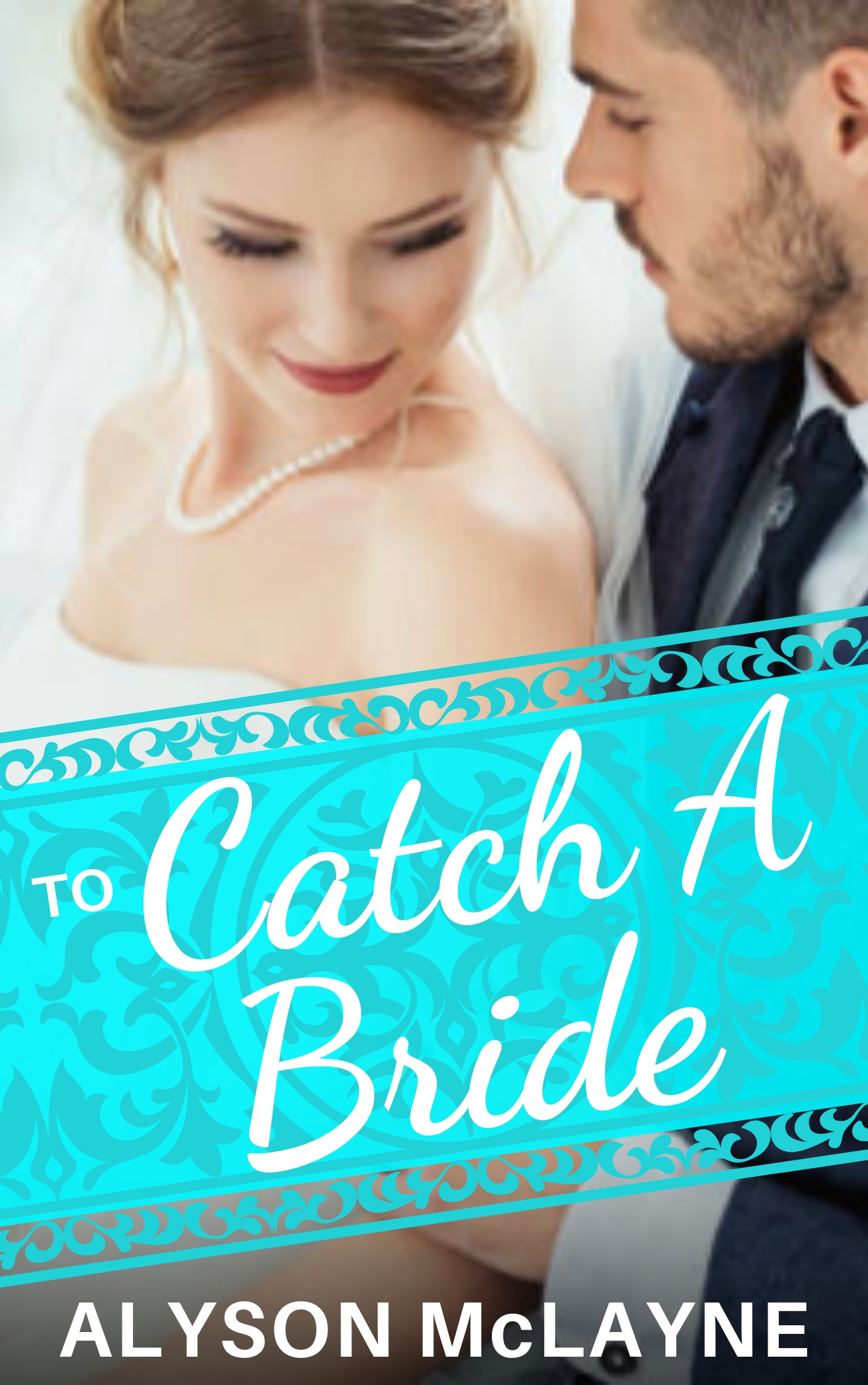
The author says:
TO CATCH A BRIDE is a contemporary romance set in the high-society world of Santa Barbara. The series is called Santa Barbara Billionaire Bachelors, and the target audience is women of all ages who read contemporary romance. It would appeal to the readers of Bella Andre.
Nathan says:
The main photograph certainly bullseyes the genre requirements (I hope this is a mockup, because the photo as presented here is too low-res).
I’m not so sure about the lower half. I can see what you were going for, mixing the “straight” type with a cursive font, but I don’t think they’re the right ones. The handwritten fonts I see most used in the contemporary romance genre are less measured and more free-spirited:
And my cursory examination of the genre divides the non-cursive font into “serif” and “tall sans serif” — the blocky sans serif font you use for the byline and “To” doesn’t fall into either. (It also seems that the more erotic and 50 Shades-ish the book is, the more likely it is to use a sans serif font, while the “clean” romances go more for serifs, but I’ll leave a deep examination of that design trend to others.)
Other thoughts?
Assuming you get a high-res photo for the final version, this is spot-on.
I’d play around with getting rid of the title bar. Bars aren’t in vogue on covers, and the little bit of photo we can see below the bar doesn’t give us any useful information. I’d try making the title blue and putting a little shadow beneath it to see if you can make it stand out on its own.
Well, I suppose it does nail the genre but in doing so the cover is also extremely generic…change the title and it could just as well be any other modern romance.
That being said, I don’t think that the blue graphic device adds anything to the cover. Instead, it is not only overwhelming it covers up virtually all of the photo but for the faces. I would eliminate it.
I don’t know why “To” is in a different typeface.
If the book is part of a series it should say so.
Ah… for once, we get to work with a book with a fairly simple premise from a well-known genre. I only have three recommendations:
1. The picture’s fine, except that as our host says, it’s too low-resolution. Be sure to get the highest resolution version of it you can for your final cover.
2. The font for your title is more appropriate to this kind of book than any of the others. For both legibility’s sake and suitability to the genre, I’d recommend using it for both your title and byline, and coloring it a pleasantly pale shade of pink.
3. While romance books in decades past have occasionally been known to have a title bar across them, that was usually only for when the cover image had a landscape layout and the bottom half of the cover needed some filler. As a rule in any era, however, what people want to see first and foremost (even before the title) is the cover image. These days, one can almost always find a suitable picture with a portrait layout (like the one you’ve chosen) and having a title bar (frilly or not) is out of style; so as my colleagues say, go ahead and ditch that.
If you view the Bella Andre books, you’ll see that she has none with a title bar. All of her books have the ubiquitous male/female image, looking cozy, and the title.
She uses serif fonts, by and large (in more recent years), rather than handwriting fonts, too. Now…lots of romance novels, of course, do use h/w fonts. If you need a free one, and you want something less…less free-spirited, Google’s Qwigley is not terrible. Remember, with handwriting, script and calligraphy fonts, never use all caps. They’re impossible to read that way.
I am very fond of Waterbrush ROB font, for h/w or brush text on covers. It’s a great brush font and it works well in any number of environments. Remember also–many of those finer fonts look beautiful in a sample, but on a cover, where you need immediate readability, they’re too light, like Ruthie, another pretty–but fine–GoogleFont.
Milonga (Google) isn’t my particular taste, but it would probably work. A font that I’m wild for is Brilon; it’s simply beautiful and elegant and works certainly for this genre and many others. ( https://creativemarket.com/TobiasSaul/1963894-Brilon-Font-Extras .
I am not affiliated therewith.) Savoy, here on CC.com, has done a number of covers using it and it’s always lovely. There are many others that are really good, but of course, they’re not free. Speaking of Tobias Saul (the creator of Brilon), Miros, another one of his fonts, is lovely too and particularly suited to romance. If you want something like Waterbrush ROB, but a bit more feminine, TypeSetIt’s (Rob Leuschke) other font, NautiGal is very similar but, as I said, a skoosh more feminine.
Above and beyond romance–is there something else you can tell us about the story? That might inspire me a bit…I do not normally read romance, but I’m up for trying to find something fresh!
Of course..all of this might be utterly unnecessary and a simple serif font, or a serif small-caps font, would do the trick and you needn’t put in the time on finding something “extra,” but I do believe that readers are clearly attracted to beautiful images and fonts and colors. (There’s an image on Unsplash, of a couple under a transparent umbrella, in the rain, with flowers arranged in her hair, that I think is lovely and I hope to see it in a cover someday…).
Anyway–yes. Lose the title bar and up the resolution (as the others said, that’s just because it’s a mockup, yes?) and get the right font and you should be good.
I like the blue color quite a bit but don’t love the style of the box. I think you could probably skip the box and make your text that color instead. (If your set on a box, I’d make the background of the box much less distracting and more wedding themed and add that shadow to pull it from the picture a bit)
But I’d try the title with some bokeh behind it to separate the text from the picture a little bit and make it readable. (because the picture has a slight blur on it, I think bokeh would really work here.) The title could use a new font, and arrangement. Author name could maybe do with being a hair thinner and more elegant, maybe even add some space between the leters. And I might even put a swash their and use that as my series identifier. I’d also maybe throw in a super short tagline to hook the reader. Something Like: He has twelve days… I don’t mean use that, I mean use something that will make the reader wonder why he needs to catch a bride.
I’d also flip the picture so she’s on the outside edge.
Being Santa Barbara…
https://i.imgur.com/x3OofZm.jpg
Santa Barbara is a beautiful area. Why not feature a different image of it for each book that is appropriate to the story?
Well, B.L.: ain’t ANYBODY going to know that’s SB. It’s a generic beach shot. That could be LA, Providence RI, New Jersey, Florida, the Phillipines–there’s nothing there unique to SB.
And I hate to pile on, but Savoy’s correct in that is NOT your best by a long shot.
Savoy’s also right on the romance novel aspect–the truth is, for some generic-ish area like this (beach!), the readers don’t really care. Don’t really care which beach, which country, which state…just the romance between him and her, or..whomever.
I usually like your mock ups but I hate everything about this one… The colors are all wrong for a romance, the text isn’t working, etc. The original submission is really strong. It just needs a few tweaks to be great.
As great as Santa Barbara is, it doesn’t need to be shown at all to sell the book. That’s a fact the reader can learn when reading the story. Romance readers are reading for the romance in the story. The picture on the cover needs to capture the imagination of the romance, not the place the romance happens.
It doesn’t NEED to be shown, but since you’re going to have some kind of setting and the series is based there, what’s the harm in replacing the generic background with Santa Barbara?
No harm, but there really isn’t background in the submission. Removing the couple for a place won’t help sell a romance. If they can find a great shot of a couple and have it ‘say’ Santa Barbra by showing some clearly definable detail, more power to them but the place isn’t necessary to sell the book.
Showing a couple on a beach might be engaging if the couple were getting married but who knows if the couple in the book get married on a beach?
The pic they have of a wedding couple is working for this cover once they fix a few small issues. The type of pic they choose works very well even if this particular picture doesn’t pan out. The colors in their picture are very genre appropriate.
They are just ideas.