The author says:
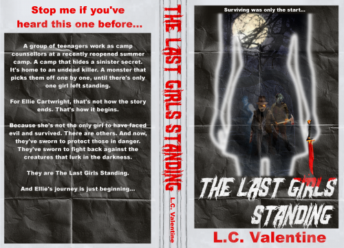
I’ve included the entire cover, including blurb. This isn’t final, and not yet published, but my current design. I am particularly interested in any response in regards to thoughts on copyright, as it intentionally parodies an existing movie poster design. All the elements are entirely originally made by me, but I’d still like to check thoughts. Thank you.
[original submission and comments here]
Nathan says:
Much, MUCH stronger concept, riffing on the visual motifs of one of the best known slasher movies of all time. I don’t know that the italicized title works, and I’d definitely find another font for the byline, but I think you’ve got most of the heavy lifting done.
Re: “Parody”: I don’t think you’ll run into any legal trouble hearkening back to elements from the Friday the 13th poster, but I also want to point out that, if “parody” is what you’re going for (i.e., emphasizing the “tongue-in-cheek” element that you mentioned with your last submission), I would encourage you to play up the humor just a little bit. My first thought is to have something else in her hand instead of a blood knife — a bloody fork, or egg beater, or tennis racket, or…
Other thoughts?


This is certainly a quantum-level improvement!
Taking your question about copyright first: Parodies are permitted by copyright law. A parody, however, by definition, is done for comic effect and usually by means of exaggeration. I see neither of those qualities here. This comes a lot closer to an homage…which might be a nice tip of the hat to Friday the 13th, but there is no copyright protection for homages. In any copyright question I think it is always safest to err on the side of caution.
It’s certainly a strong design but there are still a few things you may want to look at. The main thing being that the figures within the outline of the girl are almost impossible to make out. A book cover shouldn’t require close scrutiny to figure out, so I would suggest making those figures a good deal clearer.
Since the background texture—the folded paper—continues on to the bottom edge I would extend the girl’s legs to the bottom of the cover as well.
The blood on the type doesn’t work too well. Make the drips and drools larger. That will help.
Nathan’s suggestion about putting something else in the figure’s hand other than a knife is a good one: it might be all it would take to push the cover over the line into clear parody.
For the most part, I’d say you’re headed in the right direction, but that “unfolded movie poster” texture in the background is over-complicating your cover and making it less than fully comprehensible in thumbnail. Just as reprints of the original Friday The 13th posters are widely available without crinkles and folds, so too you should skip the texturing and just set the girl’s outline against a completely black background exactly like the one on the poster you’re parodying. As our esteemed host already mentioned, you should also put something other than Jason’s knife in the girl’s hand in order to make this parody… y’know, humorous. (I’m partial to objects with inherently funny words for names, such as a rutabaga or a blunderbuss, but here it’s more important for the object to look inherently funny while still being at least a semi-plausible weapon; so… maybe a rubber chicken with blood-stained spikes?)
Also, that tagline would be good for a drama, but you said this piece was a bit more tongue-in-cheek, so your tagline should likewise be somewhat comedic. In this case, I’d recommend going for something like “Just when you thought it was safe to prey on blondes again…”
Once again, I’m in a position where I can’t thank you all enough for your feedback. It’s so invaluable, especially for a complete amateur designer like me, trying to do the best for their novel, but with a serious lack of design skills!
I have two confessions to make re: this design. The first is that I feel I’ve mis-sold the levels of parody a little. The novel definitely has humorous elements, but it isn’t an out and out comedy. I’d say it veers closer to say, the tone of Cabin in the Woods as a movie, than a full blown horror comedy like, say, Shaun of the Dead. (Or in novel terms, I think of it as more Terry Pratchett’s Night Watch than his Colour of Magic, for example.. In tone, that is. I wish I could match him for writing skill!).
So my goal for the humorous parody element here was that it was a twist on the killer hunting the innocent victims, by inverting it, so it’s the innocent girl hunting the killers. I do agree on the knife being a bit too close to the original poster, but I didn’t really want to swap it for a pure comedy item, and needed something that fitted there.
The second confession is shortly after submitting this, after sharing the design on Facebook, I was contacted by somebody who was experienced with copyright, who suggested that I was taking a risk using it, as I’d be trading on the Friday the 13th association, which was essentially using somebody else’s work to sell my own. For that reason, I did another redesign, entirely different, using stock images and some editing. Rather than resubmit that AGAIN (you’ve all been so helpful I feel guilty doing that), I thought I’d share it below:
https://i.imgur.com/gp9lWdl.jpg
Yeah, I get that your story’s not supposed to be knee-slapping laugh-out-loud funny, but then neither was that KillerKiller movie I recommended for inspiration on your previous submission (advice which, to see your most recent shared image, you seem to be following to some extent). For that matter, the Dirty Harry movie franchise was likewise a bit of a tongue-in-cheek send-up of all those 1980s TV cop shows in which the hero behaves more like a gunfighter than an actual law enforcement officer (leaving a ridiculously long trail of casualties and collateral damage in his wake, including his partners who keep getting blown away), but you know those movies aren’t exactly comedies either if you’ve ever watched any of them. My point was just that you needed a little humor on the cover; not something to make your prospective readers burst into laughter, just a winking reference or two to a familiar horror movie trope to make them smirk.
That “Stop me if you’ve heard this one before…” line on your back cover is pretty good for this purpose, but keep in mind that for the electronic version of your book (which, incidentally, is almost certain to sell better than the physical version since it will cost less and be immediately downloadable), most of your readers won’t be seeing that back cover immediately (if ever). You need a little breezy humor on the front to establish that this story is a bit tongue-in-cheek. Again, I’d recommend slipping a mild joke into that tagline, preferably something about how those Final Girl characters are almost always anything-but-blonde, e.g. “The brunettes strike back!”
In your most recent cover image, I should also mention that while you’ve got the general concept right, that specific shirt (jacket?) the gal’s wearing looks more like standard slasher’s attire than the typical camp counselor’s T-shirt: long-sleeved with thick cloth that appears to be designed for absorbing the blood of one’s victims, and though it says “Camp Counselor” on it, I don’t see any specific camp’s accompanying name and logo like the ones almost all such camp counselors’ shirts typically have. Remember also that these girls are supposed to be summer camp counselors, which is why those counselors typically wear lighter clothing like shorts and T-shirts. For that matter, even a lot of slashers realistically would tend to think twice before wearing such heavy clothing in the sweltering summer heat (which can persist even throughout an occasional rainy night). Bottom line: for any gal you have on your cover, a T-shirt and shorts are the sensible way for her to be dressing.
I think you got some good advice about the Friday the 13th association.
The latest version is pretty nice, though I am not 100% sure what you are really going for. At first glance, it looks like a beat-up vintage paperback. However, if that is not the effect you are after, than the red border and slash(?) fold(?) marks are just overcomplicating things. If Mies van der Rohe’s advice that “less is more” applies to anything it applies to book covers.
If you go with the back view of the girl with the axe, be very sure to make “Camp Counselor” follow the curves and folds of the jacket.
You might want to have more of the figure showing so that it doesn’t look quite so much like a jacket hanging by itself in midair. You want to make it clear at first glance that it’s a girl. Some hair hanging over the back collar might be step in the right direction.
Thank you! Beat up, vintage paperback is the look I was going for. I wanted to create a sense of nostalgia in the reader. A feel that helped people identify this with older horrors.
Nice advice re: the hair, I’ll try that out, even show a hint of the face perhaps. The ‘counselor’ text represents my very best effort to have it follow the curves of the shirt, but I’ll revisit to see if I can improve.
Thanks again!
Try to be careful about the creases: it’s hard to tell whether they are supposed to be creases in the paper or slash marks. What you might want to do in any case is tone them down a little: they tend to dominate the cover.
If you are in fact going for a vintage paperback cover look, you might want to rethink the type as well and choose something a little more reflective of the period that the rest of the cover invokes.
What are you using to create the art? Photoshop has a filter called “Liquify” that might enable you to get the words to fit the folds on the jacket better. Frankly, if you can’t do this you might want to leave them off entirely.
This isn’t working for me; there are way too many elements and they aren’t combined very smoothly. The white border is dull and takes up too much room. The creased paper doesn’t look like an old book, it just looks like too many Photoshop layers. Arial is too dull as a font; the other font is too much, and they don’t go together. The knife is clearly not in her hand.
“Old paperback” can be a nice-looking aesthetic, but it’s really hard to pull off, and when it doesn’t work, it looks very awkward. If I were you I’d go for a more minimalist aesthetic that’s simpler to pull off.
I love the 80’s aesthetic and the homage to Friday the 13th, but I think it won’t work on a book cover. At thumbnail size, the woman’s silhouette and the title are easy to see, but every other element becomes hard to understand.
I agree with Gwen, a minimalist aesthetic will help you since you will want for the readers to get atached to the book when they see the thumbnail.