The author says:
This is a 90 minute fantasy short read of a boy who meets the seven deadly sins. In the story he prays for the seven, but now they want more from him. He just wanted peace on earth, but now he’s summoned the seven into his home. The story is for fans of Frank Peretti and Bill Myers.
Nathan says:
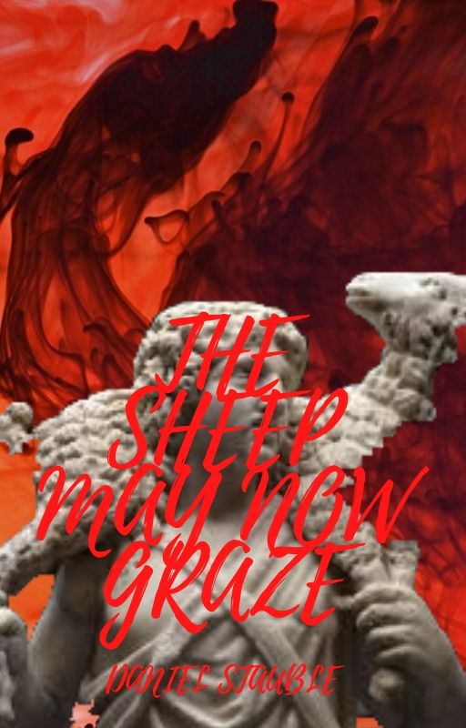
I CAN’T READ ANYTHING.
Seriously. Between the uppercase cursive font, the lack of leading, and the placement of the text over the busiest part of the image, you’ve done everything you can to make it unreadable, even at full size.
Put the title in the top half of the image (that’s what it’s for), in an easy-to-read font, with enough contrast with the background that it stands out, and you’ll be halfway there. (Then you can deal with things like the poor resolution of the statue photograph, or the way that the lamb’s neck is half-absent.)
Not too much I can add.
You did everything you could to make the title impossible to read and then used it to obscure the only important visual element on the cover.
The type needs to be simplified and moved elsewhere. Then you can resolve the problems with the image Nathan mentioned.
Thank you Nathan and Ron, I am working on applying the advice you have given me specifically the contrast, placement and font of the text, and the image issues.
I’m unsure what the intent was here. As Nathan said, as well as Ron, the font is simply incredibly bad and the only thing that would have been worse would have been putting that text, in that color, over the red background.
You’ve obscured the sole focal interest and made the title unreadable, all in one fell swoop. I realize that you don’t want to invest your life in this, as it’s a “quick read,” but that cover will kill your short book’s chances. (Sorry, but sometimes, the fast bandaid removal is kinder than the slow…)
Assuming that you retain the statuary as your primary visual, I don’t understand why you’ve chopped the lamb’s neck in half, either. Were you trying to obscure some other element, in the original image? The Good Shepherd statue, if memory serves, really just has the lamb’s neck, nothing that unusual about it…?
And that font…please, kill it before it strikes again. It has its place in design, yes, but not on any cover that’s this busy already. You have all the swirly red stuff, the gray statue, and then this handwriting/brushy font, that’s really wrong for this set of graphic elements. Even if you made it white or black, on the red background (trust me, don’t try black on that red background), it’s not right. It’s kerned incorrectly and it’s not saying what you want it to say.
With such a busy cover in the first place, stick with a simple sans-serif font. With such a lengthy title, go for a condensed sans-serif, like…Bahnschrift Condensed, Blizzard regular (if you still want something that looks a skoosh different); Draft H; Futura Condensed; oh, Gobold High might be just right for this. And good old League Gothic is fairly condensed, that would work. Trade Gothic LT Std might do it. Verb Compressed.
Any of those would suit.
I’d also like to mention that despite all the red, this cover really lacks contrast, which is, IME, crucial for catching the eye of the prospective reader. You might want to think about how you could tackle that.
Good luck–I think that we’d all like to see what you do, when you revise it. I know I would.
Hi Hitch,
Your detailed critique is appreciated. I think I will try for the League Gothic because that is the only one of your recommended fonts I could find on Canva which is the design website I am currently using because of a tight budget for this short story. Thanks.
I would say “Where to begin?” but there really is nowhere to begin with this except to say “Start over.” With the title a very similar color to the background and scribbled over the statue, your cover basically has no image on it, just a morass of colors and shades that look like the random swirls from the “paint tanks” movie makers in the 1980s used as a practical effect when a scene required them to generate an artificial sky to be layered into the background. That all-too-obviously cut-and-paste statue of the boy carrying a lamb takes too long for the human eye to parse out from everything else even with the cover at full size.
What to use as an inspiration? I can’t glean much from your synopsis, but it sounds quite a bit like the general plot and theme of Mark Rutland’s adult fable Behind The Glittering Mask, which also dealt extensively with the nature of the infamous Seven Deadly Sins. I suggest looking into what kind of covers have been used on that particular book over the years. (Amazon isn’t showing them, but I’m pretty sure it’s had several different covers over the decades it’s been professionally published.)
Hi RK,
Thank you for your critique. I have seen one of the past covers for that book you mentioned and it does look interesting. You have definitely given me some things to think about and apply.
Hi author! I’m not sure where you were going with this cover–you say the story is fantasy, but the cover has the horror vibe going on. Your comp authors most often used a sans serif for the title, and either the same or a serif for their name. (and notice they didn’t put the title over their image, but above it or below it) A heavier weight sans serif in white would work over the red background.
However, when you’re ever in doubt of what font to use, esp. for fantasy, Cinzel and Trajan are good workhorses (don’t use both on the same cover), AND always check out your comp authors’ books–if you want those readers, they’ll be looking for similar covers to authors they already read.
Also, remember that pixabay, pexels, and unsplash have lots of high res photos you can use commercially without a license. I don’t think Canva has any blend modes, but Pixlr does (a free online graphic editor). I’m guessing the chopping of the lamb’s neck was a blend attempt? Let me know the program you’re using if you’d like some quick tips!
Hi Syd,
Even though I was going for a similar cover to the other top fantasy 90 min short reads like ‘Andar’ by Becca Colton and ‘Moon Blaze’ by J.R. Rain, the title placement, font, and color were off by probably a lot. I was thinking about going for the color yellow on the text cause that seems to work best, but the other comp authors are using white. Also, I am using Canva and will try to Pixlr. Thanks!
Well…Andar and Moon Blaze have something else, too–contrast and a LOT of it. (I would strongly recommend you take 30 minutes or so and read Derek Murphy’s well-known article, 8-Cover-Design-Secrets-that-Publishers-Use-To-Manipulate-You-Into-Buying-Their-Books. He addresses contrast–if you look at the Batman cover and Brave, you’ll see what I mean.
Both Andar and Moon Blaze have it, too. You’ll see that those deep reds/oranges are contrasted strongly with deep blues/slates. It’s not the red (alone) that screams to the buyer; it’s the contrast.
I hope that helps. I realize that you’re DIYing and using Canva or Pixlr and that means that you don’t have some experienced cover artist sitting around to do your bidding, but good luck with it.
Both those short reads use clean, easy to read fonts (“Moon Blaze” looks like it uses Cinzel, by the looped double O). With text, white or black is almost best.
You can upload your own images (ie, downloaded from Pixabay/Pexels/Unsplash) to Canva, and also Pixlr. Pixlr is pretty comprehensive for a free, online editor. I did a remake of your original idea with Pixabay images on Pixlr to test it out. The blend modes differ from what I’m used to, but they were there: https://imgur.com/PxCj8b2
I personally would have liked more text control, but eh, for free it ain’t half bad.
Hitch is right abt the contrast and gives good advice to read what Derek Murphy has to say, you can’t go wrong with listening to either of them!