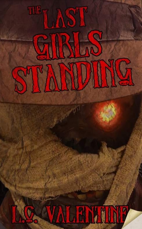
The author says:
A group of teenagers work as camp counselors at a recently reopened summer camp. One that hides a sinister secret. An undead monster returns from the grave, picking them off one by one, until there’s only one girl left standing. For Ellie Cartwright, that’s not how the story ends. That’s how it begins. Because she’s not the only girl to have faced evil and survived. There are others. And now, they’ve sworn to protect those in danger. They’ve sworn to fight back against the creatures that lurk in the darkness. They are The Last Girls Standing. And Ellie’s journey is just beginning… (This cover is not final, hence I’m seeking feedback before I move on with it. Thank you for any help).
Nathan says:
I really think you’re missing a bet by not having the cover showcase Ellie and the rest of the Last Girls Standing. The “hook” to this story are the protagonists, not the monster, so having a bunch of blood-spattered teenage girls in a stance like the Bad Girls movie poster (what, that reference is too old? Fine, how about Birds of Prey?), with a shadowy monster looming them, would more clearly promise what the book’s main attraction is.
That kind of thing is budget-intensive, I understand; if you need to be more scaled-back, how about imagery which juxtaposes “teen girl” with “horror violence”? (The first thing that came to my mind is an iPhone in a pink, bejeweled case, leaning against a bloody Louisville Slugger wrapped in barb wire.) You could find someone to photoshop something like that together competently for a lot less than the custom artwork in my idea above.
Also: That font’s too self-consciously spooooky to be taken seriously. Only use it if you’re going for a solidly tongue-in-cheek, R.L. Stine-loving demographic. And even then, it really doesn’t work well on a slant.
Other comments?
I have to agree with Nathan at least so far as replacing the current art…and that for no other reason than that it is really just about impossible to tell exactly what the image is.
The creature could figure prominently on the cover, but it is—as Nathan suggests—misleading to make it dominate the way you have done. The book is not about the creatures, it is about the girls surviving them.
(I do like Nathan’s idea, which would certainly be worth trying. It could easily be set up without any recourse to pre-existing stock imagery. But, that being said, I think that an image in which one or more of the girls appears might be the best way to go.)
Since the art needs to be replaced entirely, any discussions about the typography at this point are moot.
Since I completely agree with Nathan, I just want to share some posters that (I think) illustrate his ideas:
Here, here, here, here and here.
When you pick a new image, remember you need contrast between text and artwork (and a better typeface, for horror covers big sans typefaces work well).
Bad Girls is exactly the movie I immediately saw in my head, when I read the description here. That’s exactly the cover I’d recommend, too; those survivors, those left standing, in a Kick-Yo-Butt stance and preferably with weapons of some kind, whether those be claws, teeth or traditional weaponry like guns and the like.
Yes, having that drawn would be pricey. But a really solid cover designer could probably photo-manip that into reality. It might not be exactly perfect; say your band has seven girls, but the designer can only get 3 to work, whatever, but I’d love to see those girls posed in front of a menacing…Yeti or Mummy or Frankenstein’s Monster or whatever.
I LOVE the concept, by the way, for the book. 🙂
Thank you very much for the feedback everybody. It’s all very solid and useful.
Having the girls on the cover was my original intention, but it was a case of finding models to portray them, which I struggled with. That said, I tried doing this with resources I had, and I appreciate I need to spend more time and money.
That said, I LOVE Nathan’s suggestion and will definitely see if I can do anything with it.
Tongue-in-cheek B-movie is definitely what I was going for with the typography, so at least I know that’s sort of hitting the mark.
Thank you again everybody, it’s been so useful.
So… basically, this is meta-fiction about the Final Girls from each of several horror stories getting together to form a monster-hunters’ posse? That sounds like a very workable concept, but as my fellow critics point out, that also means the girls should be the cover’s primary focus rather than any of the monsters who tried to kill them. Besides, even if this were a story more about the monster than his victims, having him stand so close to the “camera” doesn’t make the cover very comprehensible in its thumbnail.
While basing the cover on old slasher B-movie posters is generally a good idea, I’d have to ask what the general tone of the story is to determine which kind of B-movie poster is best to emulate. If you’re seriously examining how these girls deal with stuff like their lingering traumas and possible cases of survivors’ guilt from living through horror stories, a grim shot of just one of the survivors showing her looking frazzled and mentally disturbed and on the verge of going psycho herself would really help drive home the “she who fights monsters becomes one herself” moral point of the story. If you’re approaching this story from a more comedic angle (“Hey, since we survivors of our thoroughly useless friends’ and families’ little-mourned demises have so much in common, we really ought to start a club with each other!”), then a cover showing a bunch of peeved girls with their weapons in hand about to attack an abjectly terrified lone monster would probably be more appropriate. (If the monster in question is a mummy, as this cover submission suggests, having those girls all be carrying torches and pitchforks would be especially fitting, since using the pitchforks to pin down the mummy and the torches to incinerate him is one of the most obviously practical ways to eliminate that particular kind of monster.)
Either way, the point is show your prospective readers that while this meta-fiction is drawn from roughly the same genre as all those old B-movie slasher flicks, the predator(s) and prey in this story have switched places. In addition to my colleagues’ suggestions, I would also recommend studying the posters for movies like Hard Candy (2005) and KillerKiller (2006) for inspiration. While such stories go back a lot further than people tend to realize (including in those sleazy B-movies; the Italian giallo L’Immoralita (1978) had a little girl turning the tables on a murderous molester decades ahead of Hard Candy), these more recent examples are most likely the best approximation of what kind of cover imagery will attract your target audience these days.
Thank you RK. This is also very insightful. My biggest problem with not including the girls has been one of practicality; I’m currently doing this all myself and I don’t have access to three models that physically embody the characters (I went for a very diverse cast and live in a very white city, unfortunately).
However, I completely agree with these criticisms. I went for an image where I thought ‘hey, this looks cool close-up!’ instead of thinking as a designer. I’ve gone back to the drawing board, and am floating a new concept, a little different from the suggestions here to fit in with what I’m currently capable of (although I do love all the suggestions so far and if I go the route of hiring a designer will certainly feed them to them).
To answer your question regarding the novel’s theme, it IS more of a satire than a hard study of psychological themes, although I touch a little on both. Tone wise, I’m aiming for Buffy the Vampire Slayer; slightly cheesy, tongue in cheek, quirky but believable characters, so I don’t want an out-and-out comedy cover, but I also don’t want something too ‘serious’.
Well, you can get very affordable (cheap!) girls of diverse appearance at Depositphotos.com and other locations. I mean, your location is not the driver, here, unless you’re going to run around taking piccies of strange women and then asking them to sign releases. Can’t see that going well, either.
Just a suggestion.
I was more thinking of asking models to pose for the cover haha! Didn’t think of looking at stock images, as I didn’t expect to find the poses I needed, but I’ll take a look! Thanks
Take a look at some of the specialty stock sites out there. You might end up paying a bit more, but you can find some very specific images. This post links to the spreadsheet I keep with stock sites, their cost, genres, whether they use PoC models, etc:
https://www.scarlettebooks.com/where-to-find-stock-photos-for-book-covers/
Thank you! I’ll take a look! That’s super useful! Already saved to my favourites haha
If you can find your own models that would be better than using stock images.
If you’re a competent photographer — there’s an “instamatic” tag on LBC for a reason.
True enough…but I think that it would be worth the effort to try before turning to found images.
Apologies if I’m being dumb, but what is ‘LBC’? I’m not familiar with that.
“Lousy Book Covers” https://lousybookcovers.com/
This sounds like a cracking premise which deserves a great cover! I’ve put my guide here on how to get to something more fitting going through my process of designing something punchy using stock imagery:
https://www.kathrynrosamiller.com/post/cover-advice-the-last-girls-standing
Wow, thank you, Kata, for the indepth guide. I really appreciate it! It’s incredibly useful.
I like the concept of your book. I like the others ideas of a girl fighting squad. You may get away with a girl in the middle as a graphic and two cut off halves of girls on the perimeter showing depth and space. I baseball bat image or club would work in her hand. Maybe make the background in silhouette black trees and glowing campfire. You can use stock images for these as well. A little bit of transparancy would work. Good luck. At age 12-13 I’d love that book.