The author says:
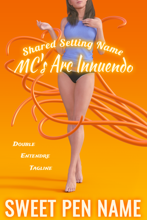
Contemporary erotic short story like you’d find on SmashWords. Non-con/dubcon/tentacle monster motifs. Target audience: Female millennials. Horror elements are tongue-in-cheek. Genre-savvy MC. Text on cover is placeholders, but shape/placement/font/style of text is as-intended, so please do feel free to critique the layout and design of the text. 🙂
Nathan says:
Lord knows I’m totally not the target audience for this, but…
I’m thinking it’s not sexy enough.
Building on the idea apparent (if not articulated) in indie romance/erotica publishing that “parts is parts,” you might get more mileage from your art if you trimmed it down further — say, right at the bottom edge of her undershirt — so that your cover is dominated by her panties and legs and the tentacles.
I also think that orange is not a particularly erotic color; it’d probably have more impact if it went right into red.
But again, not really my arena. Anyone else?


There are a lot of reasons this doesn’t hit the mark (not the least of which is what Nathan pointed out: there is nothing either sexy or erotic about it–in fact, the cover is simply bland). I think it doesn’t work largely because none of the visual elements work together: they all seem to be too obviously from separate sources. The girl seems to be utterly oblivious to the tentacles which in turn don’t even cast a shadow on her or the ground let alone appear to be rendered in the same style.
Discussing the text is really moot at this point since the imagery needs a complete overhaul.
(This is certainly perhaps an extreme in the other direction, but at least all of the elements are, uh, interacting https://en.wikipedia.org/wiki/The_Dream_of_the_Fisherman%27s_Wife#/media/File:Tako_to_ama_retouched.jpg )
That woman, the model–looks like a pseudo-human. I’m sorry, but she does and that was immediately my first thought. I don’t mean that I thought “oh, that model looks like a pseudo”; I mean, I thought she was a pseudo and that’s gotta be a deal-killer right there.
I’m also no fan of tentacle porn. It’s…not my bag at all, but I agree with Nathan–this desperately needs a lot more erotica and a lot less “innocent girl prancing around her living room in boring undies watching TV singing la-di-dee-dah, la-di-di-DAH practicing her acceptance speech at the prom for Prom Queen.” B/c that’s what it looks like now.
And the tentacles? Well…no offense, but the less said about those, the better. (Honestly? I didn’t even realize it was tentacle porn until the boys said it was. I thought they were supposed to be those gymnastics streamers, so…no bueno there.)
There’s just no sexy here and that seems to be the exact opposite of what’s needed for that audience, no?
(Myself, seeing purple and orange together makes me want to scream. That’s me, though, so…uh, Go Suns!)
So, yeah–I think this needs a total rethink.
Lastly, Ron, you’re on my permanent you-know-what list for THAT image. BLEEEEAAACCCKKKKK. I now need a brain-douche. 😉
You are more than welcome! 😀
Oh, come on — that’s classic art there, that is!
Did you read the image description? I laughed, my girlfriend laughed, the toaster laughed. I shot the toaster. It was a good time.
Hitch, you’re lucky he was as restrained as he was.
(Delicate shudder.)
It’s just not something that captures my interest, so…I’ve never gone looking. It certainly seems to have some highly creative artists that are fascinated by it, however. Can’t criticize their skill.
I don’t wanna sound rude, but this looks like an ad by Fanta. I (actually) like the image, but I don’t see the erotica or the octopus or the hentai vibe. (Well, I understand it doesn’t need a hentai vibe, but, come on, an octopus porn story screams hentai).
I think my only contribution would be to suggest taking inspiration from series like “Princess Knight Lilia”, “Sexy Magical Girl Ai” or “The Dark Knight Ingrid” and drop the orange color.
So I’m not the only one who sees the computer rendering; Hitch sees it too. Contrary to what she says, I wouldn’t say that’s necessarily a deal-breaker with your specific target audience, especially considering that rendered “pseudo-humans” are quite common in visual works featuring various sexual and/or violent acts that are extremely illegal (e.g. vorephilia, guro, and toddlercon) and/or downright impossible (e.g. humans getting freaky with giants, faeries, or—yes—naughty tentacles) for live-action photography to capture without a Hollywood-blockbuster-movie-sized budget; not to mention that on Smashwords, well… I wouldn’t say the readers there are all that discerning about much of anything anyway. That said, I do believe she has a point about how poorly rendered those tentacles are and how lacking in eroticism the entire image in general is: like Hitch, the thumbnail had me thinking those plastic-looking orange strands might just be streamers or floating “noodles” of the kind you might see in a swimming pool.
As with my colleagues, naughty tentacles are definitely not my thing, along with a great many other kinks (which makes me especially grateful for the advanced filtering functions on fan-fiction sites’ search engines). As it happens, however, I have seen one potential source of inspiration and guidance for what to put on your cover while watching various animated features. The episode “Unity” from the old animated Superman series is possibly the closest any children’s cartoon has ever come to displaying naughty tentacles; I’ll bet it left even some of Japan’s hentai animators scratching their heads and wondering how the hell the animators at Warner Brothers ever got away with showing stuff like this to American children.
Basically, the villain in that episode turns out to be some kind of multi-tentacled space alien who mind-controls people by spewing sticky strands of off-white goop full of little parasites into their mouths. Then, once the parasites take control of those people’s brains, they go around spewing more of those disgusting-looking strands out of their mouths to infect other victims. When Supergirl does battle with some of these zombie slaves spewing these disgusting-looking sticky off-white tentacles from their mouths, well… suffice to say, her super-strength isn’t quite enough to keep them from trussing her up like the starlet of a really twisted bondage porno; if not for Superman turning up just in time to rescue her, she’d pretty much have been mind-raped into being this tentacle monster’s tentacle-spewing zombie slave too.
Not at all coincidentally, something very much like that image of the tentacle-trussed Supergirl is what I think you ought to have on your cover in place of what you’ve got now. Even if your prospective readers manage to recognize those poorly rendered orange strands (on a yellowish-orange background) as the tentacles they’re supposed to be, the gal in her underwear you’ve got now doesn’t seem so much as if she’s about to get entangled in those tentacles as she seems to have just shaken them off. If you want readers to realize what kind of short story this actually is, the gal on your cover needs to be quite thoroughly entangled already, with some of those tentacles covering her mouth so viewers can see she’s in such dire straits that she can’t even scream for help.
In retrospect, leaving placeholders for the title and other captioning was a wise decision. Until you get a better image for your cover, those other features aren’t even worth discussing. Go find a better image showing a woman already thoroughly entangled in what anyone can see at first glance are tentacles (naughty or otherwise), and then we can consider what to do with the rest of your cover.
What are the rules for display there? Can you show nudity? Make sure the art you pick can actually be displayed on the site. If so, I’d ramp this up a lot. Find a really erotic pose and show a tentacle actually on the woman. Maybe not as graphic as Ron’s version though…lol
(I agree with the colors and text needing a redo too)(And don’t forget to display the humor, although that could be portrayed by font choice.)
Something worth keeping in mind is the license for the art you use. Even lots of free art has strictures on what it can be used for and usually porn or racist mediums is out.
The Smashwords TOS has the relevant rules. (See Section 9 in particular.) Those strictures on free art you mentioned are another reason why cover designers for bizarre erotica (such as stories involving naughty tentacles) often use rendering instead of modifying a stock photo. Of course, a lot of the artists at places like Deviant Art aren’t into placing such restrictions on the commercial use of their art, but Smashwords’ rules still apply regardless of where you get the cover image: basically, no “graphic images of nudity (either photographic or illustrated) or persons involved in sex acts” allowed, with Smashwords deciding what’s too “graphic” and looks too much like “persons involved in sex acts” for its viewers. (From some of what I’ve seen being allowed on there, the staff there are apparently pretty flexible with that rule.)
From an artistic point of view, the main necessity is that the girl in question be clearly entangled in the tentacles and involuntarily so. From a corporate and legal point of view, what’s important is that all of her naughty bits be covered and that the naughty tentacles in question not be doing anything too obviously naughty with her as yet. Pretty much everything else goes.
Everything else aside, the cover is just hard to read, because it’s white text on a light yellow-orange background, and the glow on the text makes it even lighter. For the same reason, the tentacles absolutely disappear in thumbnail. Higher contrast on both, please.