Design 101: The Cliche of Floating Eyes

Design 101 is an occasional series of design tips for non-professionals designing their own book covers.

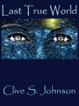
Once upon a time, there was a book published called The Great Gatsby. It looked something like this:

cover[1]

Actually, it looked pretty much exactly like this, because since it was first published in 1925, this has been the cover illustration on just about every edition.  That’s not just unusual; it’s stupendous.  I don’t know if this was the first cover art that used the “floating eyes” visual motif (note: yes, there are also floating lips, but the eyes are what everyone sees), but the fact that this cover has remained the cover for the book might give you an indication of just how powerful a design motif that is.

However.

What was once powerful can easily become a cliche once everyone starts doing it, especially when people new to a particular arena (like, say, indie writers who are doing their own covers with little experience) don’t realize just how common it is.  So while it is indeed possible for an experienced professional illustrator to use a “floating eyes” motif, if you are coming to this site for advice then you do not qualify as an experienced professional illustrator.

How common is it?  I used to update a tumblr called Floating Eyes, featuring nothing but book covers featuring, yes, floating eyes.  I stopped updating it not because I had run out of material — far from it! — but because I was finding it impossible to distinguish covers I had already posted from new ones. And that, really, is the point: It’s become a common cliche, a bit of graphic filler that does nothing to distinguish your book.

In the interests of proving my point, and because you might not click through that link, here is the FIRST 100 covers on that tumblog:

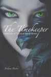
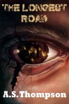
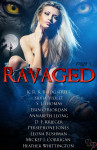
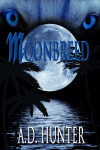
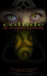
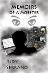
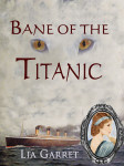
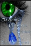
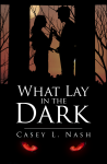
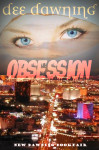
My point, I trust, is made.

Few Are Chosen, K’Barthan Trilogy: Part 1

The author says:

Charming outlaw with own transport and limited social skills seeks lucrative, employment at minimal risk.

When you’re running from a murderous government and work for an equally murderous gangster, accidentally torching his apartment is a bad move.

The Pan of Hamgee just wants a quiet life but destiny has other plans.

GENRE: Humorous Science Fiction Fantasy – and Petrolpunk or whatever you’d call steampunk if it was about cars… if such a thing exists.

AGE BAND: Teenagers – and anyone else who is interested.

FACCover 600dpiFront

FACCover 600dpiFront

Nathan says:

I really like it. The cover tells me almost nothing about the book, but it makes me strongly want to find out.

My only comment is I don’t like the way the thimble is rendered in a different style from the rest of the illustration.  For one thing, it doesn’t have that pop-art vibe that informs everything else, and for another it makes the thimble harder to identify in the thumbnail.

That’s all I got. Anyone else?

In Good Faith, a Johnny Donal P.I. Novel

The author says:

Johnny Donal’s life in the South Carolina Lowcountry should be good but love gone awry, lies, double-dealing, and murder combine to make it miserable.
Donal, a retired cop with a successful investigations agency and he should be enjoying life. He isn’t. That he has a stellar reputation as an investigator; that he has a source of independent wealth; that he can pick and choose cases should, if anything, add to his good life. None of it does.
Instead, Donal is troubled. His lover Victoria left him and, worse, he’s batting zero with his attempts to get her back. He also has a client with a strange attitude about the circumstances surrounding her missing husband and Donal isn’t sure that he can trust the woman. Then a friend is murdered and that case intertwines with Donal’s missing husband case.
Despite a double dealing client, negative involvement with influential locals, and political obstacles all cluttering his investigation, the question becomes can the Donal, who has problems of his own to resolve, uncover the identity of the killer and bring him to justice?
Plot and subplots take the reader on a journey filled with duplicitousness and murder. As the story unfolds Victoria returns, but the fears that drove her away in the first place lurk just beneath the surface. All hell breaks loose when the killer tries to take Donal out. Closing the case and bringing the killer to the bar of justice will no longer suffice. Vengeance becomes the only option.


cover[1]

cover[1]

Nathan says:

I’ve seen several of these covers recently, which repeat segments of a single image around the layout.  I hate ’em.  Or rather, I don’t see the point.  If an image is strong enough as a focal point (as a chain is), then the repetitions are distracting; if it isn’t, then more isn’t better.

From your description, your book is target at roughly the same demographic that reads Harlen Corben or Lee Child or Michael Connelly.  So why doesn’t it look like them, so that those readers will recognize it as one of their own?  Here’s what I get from surveying books in that genre:

  • strong, narrow type, usuall sans serif
  • a strong but nonspecific central image
  • bold colors in a limited palette

Going from that, here’s a five-minute redo of your cover:

ingoodfaith

Now, this is definitely not the final I’d go with; I’m not sure I like the font I picked, the colors could use some tweaking, and the pure black background behind the chain is bland; I’d probably find some grungy texture to be the background, possibly sheet metal or the like. But you can see where I’m going.

(By the way, I know we’re not here to critique blurbs, but yours could use some streamlining.  Read it aloud in Gravelly Movie Announcer Guy Voice and see what could be tightened.)

Other suggestions?


True Colours of the Chameleon

The author says:

True Colours of the Chameleon is a modern crime/romance novel. An unemployable research scientist ‘Doc’ becomes a drug producer and forensic advisor in a criminal gang and befriends master of forgeries and disguises ‘Chameleon (Cam)’. When the Birmingham Seven’s heist of the Blue Moon Casino goes wrong, Doc and Cam end up on the run together with the spoils. They’re pursued not only by the police, but by two of their old comrades who want Doc and Cam out of the picture on account of them being witnesses to a murder. Doc is pushed to her limits when she is called upon to kill to defend herself and Cam, and it becomes apparent Cam is keeping a dreadful secret about his past from her that threatens to shatter her trust in him. As the law and their other enemies close in on them, they must overcome these barriers if there is to be any hope for their survival.

CamCover-electronic2.indd

CamCover-electronic2.indd

 Nathan says:

I’m okay with all the elements. I don’t like where they are.

The way things are arranged now, you’ve got a top half with plenty of detail/texture, and a bottom half in flat silhouettes.  As you can see in the thumbnail, the bottom two thirds ends up looking dull by comparison.

The first thing I’d try is moving the silhouettes up to the middle so they overlap into the top image, and move all of the text to the bottom. You’d have a visually intricate top and bottom, and the silhouettes in the middle, by virtue of them now being a focal point, won’t seem like an afterthought. (Without actually doing it, I’m not sure how well that would work — I’m a tinkerer when I design — but it certainly seems like it would be worth doing.)

Other thoughts?