Design 101 is an occasional series of design tips for non-professionals designing their own book covers.
Once upon a time, there was a book published called The Great Gatsby. It looked something like this:
Actually, it looked pretty much exactly like this, because since it was first published in 1925, this has been the cover illustration on just about every edition. That’s not just unusual; it’s stupendous. I don’t know if this was the first cover art that used the “floating eyes” visual motif (note: yes, there are also floating lips, but the eyes are what everyone sees), but the fact that this cover has remained the cover for the book might give you an indication of just how powerful a design motif that is.
However.
What was once powerful can easily become a cliche once everyone starts doing it, especially when people new to a particular arena (like, say, indie writers who are doing their own covers with little experience) don’t realize just how common it is. So while it is indeed possible for an experienced professional illustrator to use a “floating eyes” motif, if you are coming to this site for advice then you do not qualify as an experienced professional illustrator.
How common is it? I used to update a tumblr called Floating Eyes, featuring nothing but book covers featuring, yes, floating eyes. I stopped updating it not because I had run out of material — far from it! — but because I was finding it impossible to distinguish covers I had already posted from new ones. And that, really, is the point: It’s become a common cliche, a bit of graphic filler that does nothing to distinguish your book.
In the interests of proving my point, and because you might not click through that link, here is the FIRST 100 covers on that tumblog:
My point, I trust, is made.
![cover[1]](https://covercritics.com/wp-content/uploads/2014/03/cover11-500x762.jpg)

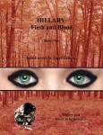


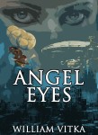
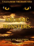
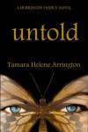


































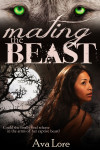
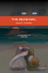
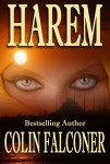


And the great thing about Fitzgerald’s cover is that it honestly represented an important element of the story–a billboard on the island–so the eyes, always watching over those who passed below, were symbolic observers of actions, attitudes, and behaviors. The floating-eye choice was intentional, powerful, and meaningful. I’d wager that few of the imitators could say the same.
Yes, you did duplicate. Well, one at least: “These Trespasses”.
Not surprised. There are probably more duplicates in the 200+ more from the tumblog.
Well, you certainly made your point!
…and, by the way, how many people notice the nude figures in the reflections in the eyes in the Gatsby cover?
I noticed the figures.
First, before I made any comments, I had to check my web site to see if I had committed the floating eye sin, and Eeeek, sure enough, I had! A couple of times. Egads! So, no smug response from me.
But I do have to say, I’ve never cared for this cover. Just sayin’
The “Gatsby” cover art by Francis Cugat (brother of the bandleader who was also an artist) is perhaps unique in that, rather than read the finished book first, as most artists do, Cugat was working on the cover in Scribners’ offices when Fitzgerald stopped by for a meeting with Maxwell Perkins.
Fitzgerald was transfixed by the treatment (and obviously, Cugat had read an early galley); so much so that Fitzgerald himself was influenced by the cover ~ a first as far as I know ~ and changed parts of the ending to reflect that influence.
My aunt and uncle, the screenwriting Hacketts, were close to Fitzgerald, as was the subject of my submission (OAK POINT), Countess Mona von Bismarck. Indeed, before writing Gatsby, Fitzgerald attended many parties at the estate, Oak Point, and modeled aspects of Daisy and Jay after Mona and her husband, Harrison Williams, capitalism’s richest man.
Mom’s first job after Vassar was as a secretary for the personal banker of Maxwell Perkins, whom she met many times. NY, at least, is a small world. And Oak Point was a world of its own.
There are a few really good covers in that big mess of eyes.
Which is sad.
If they were not within a sea of peepers, they could be really stunning. They never ever will be now though.