A Hospital Bed at Home

The author says:

A Hospital Bed at Home is a linked collection of true stories about the experience of being a carer during the weeks, months and years that can stretch between the day someone you love is diagnosed with an incurable, fatal disease and the day of his or her death. Couples facing separation after forty years together; a workaholic with three small children and a dying, angry wife; an Irish immigrant called home to nurse an ailing father who cannot, or will not, eat; a Buddhist couple striving for serene acceptance of a brain tumour… The patients and carers profiled in these stories bring to their challenging situations the gamut of typically human strengths and weaknesses, plus all the baggage of their pre-existing relationships. The narratives are intensely personal and biographical, but the insights and information they contain about illness, caregiving and dying at home have profound and general relevance. The author’s reflections on these topics are woven throughout, linking the individual stories and concluding with a gritty memoir about caring for her own mother, an anxious optimist who was ravaged by cancer.

A_Hospital_Bed_at_Home_ebook_Cover

A_Hospital_Bed_at_Home_ebook_Cover

Nathan says:

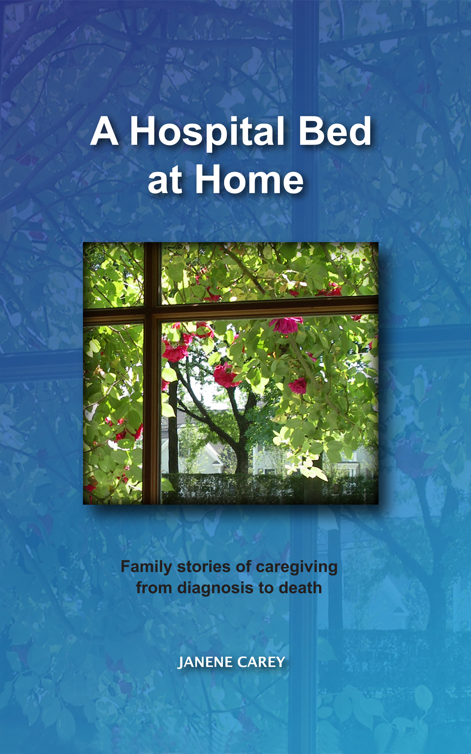
I like the idea of a view through the window from the implied bed.  If I were going to go with that, I’d use one image that shows the full window frame (or most of it).  I think the image-upon-image here is distracting, especially when both of them are essentially the same idea.

Don’t be afraid to go larger on the fonts; there are no specific details in the cover photo that you risk obscuring.  You can see from the thumbnail that the title is awful tiny, and both the subtitle and byline are almost not there.

I’d also find a font or two with more character.  The first thing I’d try is something with a handdrawn vibe to it (but still clearly readable), to support the idea that this is home-based, almost do-it-yourself medical care, as opposed to an institutional setting.

Other thoughts?


Sweet Remedie

The author says:

My book is about a guy named Oscar who developed depression and cuts and his parents find out and put him on medicine that makes him hallucinate and he hallucinates a girl who he falls in love with.

sweet

sweet

Nathan says:

The text on a nothing-but-text cover needs to be two things:

  1. Easily readable.
  2. Interesting.

Let’s look at the first.  Intersecting type always “hiccups” in the reader’s mind, because while trying to read the vertical word, the eye is more easily drawn to the horizontal word (which is itself not easily recognizable with another word interrupting it, because “remedie” isn’t the spelling our brains expect).  It’s worse in this case because the “e” in sweet isn’t pronounced the same as the “e” in remedie.

As for the second, a plain uppercase typewriter font is about as far from “interesting” as possible. It’s got no mood, no nothing.

And then comparing your cover to your book description, we might suspect some sort of medical thriller (red cross and “remedie”), but the description you give is only tangentially related to the field of medicine.  Do we get depression, or hallucination, or delusional true love from the cover? Nope.

Plain covers can be very effective; see this one for Michael Collings’ horror novelThe Slab. You could do something similar, but you must make sure that both your font and your background texture are exactly evocative of the mood of your novel, since there’s no other artwork to carry the weight. And a subtitle is invaluable in these cases, to add information that artwork would otherwise convey. If your story whimsical? Bittersweet? Stream-of-consciousness surreal?  Use a subtitle to add info.

Anyone else?


Blood Diva

The author says:

What if Paris’ infamous party girl didn’t die of consumption at 23 in 1847? Blood Diva is a sometimes humorous, erotic look at love, sex, romance, celebrity, destiny and the art of seduction, that asks a simply question – Can a one hundred ninety year old French courtesan find happiness in 21st century Brooklyn without regular infusions of fresh blood?

latestblooddiva
latestblooddiva

Nathan says:

I like both the concept and the artwork chosen, but the resolution is too low; you can see the fuzzy pixelation that’s a dead giveaway for an image found on the web and blown up.  The contrast is especially obvious when comparing any straight lines in the artwork with the lines of the font.

And speaking of the font… Too, too dull. You don’t need something ornate — the artwork takes care of that — but explore try to find either something period or, for contrast, something very current and edgy to indicate that the story takes place in the present.  (I’m not sure how well my second suggestion would work; it would depend a lot on the specific font.  You’d have to try and see.)

Also: The modifications to the art to make the fountain flow red are really, really primitive. Take the time to do it right.

Here are other things I’d do:

  • Reduce the unused space at the top and bottom of the poster, either completely or to a symmetical border.
  • Play with the color balance, upping either the green or blue, to give the image a slightly unsettling/otherwordly aspect — you don’t want the cover on a vampire story to be too warm and sunny.  (But make sure that the blood still looks like blood.)

Anyone else?


The Burning of Cherry Hill

The author says:

THE BURNING OF CHERRY HILL is a dystopian novel set in North America 150 years in the future. Though it features teenage protagonists, it was written for the older teen/adult crowd. The siblings (Zay, 14, and Lina, 12) grew up on an island in hiding from a government they never knew existed. They are remanded to foster care when said government brutally kidnaps their fugitive parents and burns down their home. The kids have to learn to cope with a totalitarian (but prosperous and outwardly generous) government while trying to figure out a way to find and rescue their parents. The tulip is a recurring literary theme in the story.

web

web

Nathan says:

This is a beautiful cover, and it is absolutely wrong for a YA dystopian.  There is nothing here to indicate that readers of The Hunger Games or Divergent or The Maze Runner or Partials would be interested in it.  It is all well and good for the tulips to be a recurring motif, but a watercolor of tulips doesn’t draw the kind of crowd you’re trying to draw.

If you’re absolutely committed to using this artwork, then I would suggest you add a thick contrasting border of some kind which gives more of the feel of the setting and which contrasts with the tulips.  Is this a technologically advanced future?  Is there a way that could be represented in ths border?  How about a thick steel doorframe, complete with locks on one side and thick hinges on the other?  Combined with a different type treatment — one that boldly emphasizes the title rather than putting it to the background, you might have something.  But personally, I’d start over; hang the tulip original over the sofa, and then do something completely different for the cover.

(This is how I don’t make friends.)

Anyone else have input?

Out Bound

The author says:

Taiga Chavez is an imperfect person in an OCD world. A loyal soldier, she longs to leave Earth behind. But on her 1st Outbound mission, she soon learns that being the good soldier can have an ugly meaning. On a planet filled with aliens that give new meaning to the term “wild life” she must choose sides. At stake? Simply the fate of two worlds, including her own. No pressure. The year – 2415, The places – Earth and space. Science Fiction for adult or YA.

outboundforamazon

outboundforamazon

Nathan says:

Um…

I think I see what you were going for here, sort of a Predator-esque heat-signature portrait of the alien creature. Yes?

However. I really don’t think it works. The color scheme, combined with the blurriness of the graphic, doesn’t say “space” or “SF” or “military action” or anything like that to me. At best, it says “My Little Pony.”

In a similar vein, I can see what you were trying to do with the title spacing, but this really isn’t a font that is forgiving to that kind of deliberate spacing.

And the biohazard symbol seems like a completely random addition.

It might be easier just to start over with a different cover concept, but if you want to work with this one, here’s what I’d do:

  • Posterize, filterize and texturize the hell out of that image so that it looks like the computer-enhanced image of something barely seen.  Add some other readouts and telltales around it to emphasize that.
  • The parts of the cover that aren’t the actual alien, change them from pink/purple into something darker for contrast.  If you fade to black at the top, you can add stars to give some kind of outer-space feel.
  • I’d pick a different font, and then texture-fill it with burnished metal or something else that gives it a hard-edged, military feel.

Anyone else?