The author says:
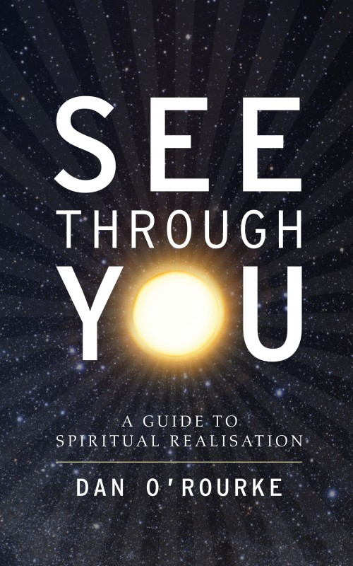
See Through You is a book for people on a spiritual path, searching for who they truly are. It’s a book that provides a practical guide to spiritual awakening, or in other words, discovering who you truly are.
Nathan says:
This is another cover where I’m not really the target audience, so all I can say is that something clashes for me between the two typefaces used; perhaps a cursive or italic font for the subtitle would work better.
Anyone else got anything?


I like it. I think it’s simple yet will say a lot to the target audience, which Nathan is not. It’s very clean and professional looking to me at both scales. I have nothing else to say, but good job.
I’m not the target audience either, but it looks like a good cover for the reasons that Adrian mentioned. While the byline and subtitle fonts are good, the title font could use something. It seems a little plain. It’s not a deal breaker, but I would play around with other fonts to see if any of them really pop.
I have no really compelling problem with this cover. The typefaces might be better chosen, but that’s about it.
I actually like it quite a lot.
There was a cover on Lousy Book Covers not long ago that tried to do something like this, with a light being an “O” on the cover–but it was just terrible. This is how you do it properly.
I’m not the target audience either. In fact, I doubt there’s all that large of a target audience for this kind of book in general. The cover’s not too bad; just don’t expect it to sell a lot of books by itself. You’ll probably need some kind of promotional campaign as well.
The big bright sun in the middle could be centered a little bit better from top to bottom, and a closer inspection reveals harder edges than it ought to have, which betrays it being a cut-and-paste job. For best results, you might want to airbrush those edges or blur them heavily. As for the fonts, having two is overkill; go either with the one or the other.
Apart from that, there’s not much else I can tell you, other than that about the only “spiritual awakening” a big round light on the cover brings to mind is that big light at the end of a tunnel that some who’ve had near-death experiences report seeing. If that suits the kind of enlightenment you have in mind for your readers, so be it. Otherwise, you may want to consider some other kind of imagery to represent what kind of enlightenment you’re offering.
Remember: We are here to talk about the cover, what we like about it, and how to improve it.
We are not here to talk about what genres we think have big markets, how we think a book will sell, or jokes ripping on authors.
We want to be positive here and provide a good environment so people keep coming and get better results, not so people get discouraged and give up.
I like it. It calld to mind existentialism, dimensions and such for me. I don’t mind the fonts, either. The very simple font makes it feel clean and modern to me.