The author says:
On a stormy night, Amelia Stirling meets Darren Duncan. While stuck at an old station, he could take her on the ride of a lifetime. In a tangle of confusion, could ghosts be afoot? Is danger looming in every corner or is it all an illusion?
Nathan says:
There’s only a little bit of information here, but I’m going to guess that it’s a paranormal romance. Yes?
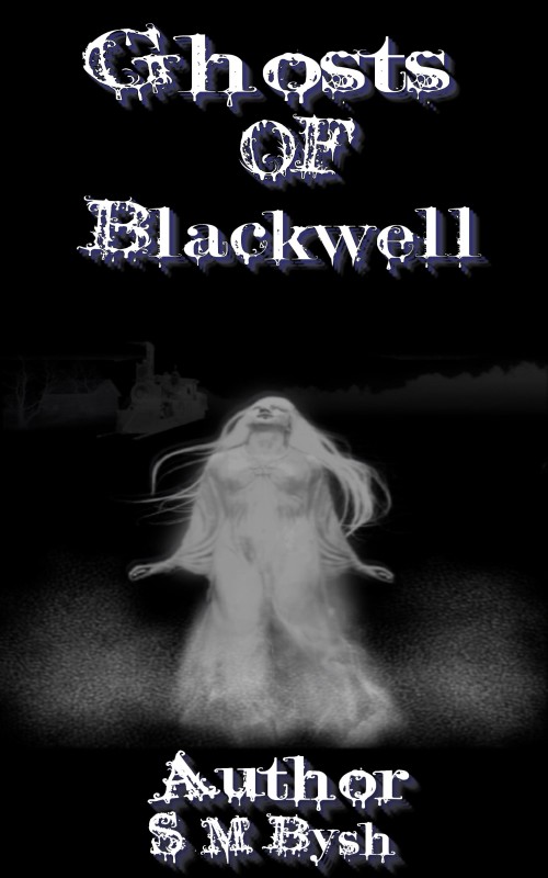
First: There’s no need to put “Author” before your name, any more than you need to put “Title” before the title.
Second: You may think that the font contributes to the cover, but it actually detracts by competing with the illustration. And the fact that the lines of type are all different sizes, and have been stretched different directions, doesn’t help. (Thanks to its size and the fact that it’s in uppercase, the word “OF” looks like it’s the most important word in the title.) The best option is to go for a plainer or more readable font — either use one that comes “pre-distressed,” or add some texture (don’t overdo it!) by overlaying a texture.
Third: The illustration looks like it’s been stretched a bit. It’s also not of a terribly high resolution, and that’s readily apparent in contrast to the type.
Fourth: It’s okay to have the text overlap the illustration. Really. As it is, it feels like all of the elements are separate instead of connected.
Fifth: A little bit of color? I know there’s a little bit in the shadow to the type, but it really gets lost against the monochrome illustration. It doesn’t have to be garish, but even a tint to the shadows could go a long way.
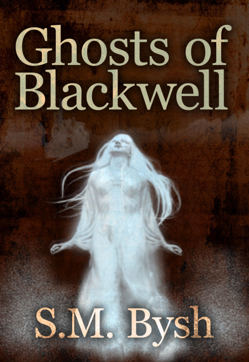
Since the image sent was large enough to work with, I did a five-minute revamp to show some of the things I’m talking about. Again, the description is a little shy on detail, so I’m not at all sure that this version fits the genre or tone of your book, but…
I think that’s a good starting list from me. Anyone else?


Hire Nathan! His take on your cover is sweet. 😉
Nathan’s points are right on the money, and his mock-up really shows the difference.
Nathan’s comments are spot on. I have to add that your font choice is a difficult one to take seriously. It’s the sort of font one would use to sent out invitations to a Halloween party.
And if that’s your book blurb, it needs work, too. Might I suggest:
It’s a stormy night and Amelia Stirling is stuck in an old train station eager to get on with her vacation. While waiting for the delayed train to arrive, she meets a handsome stranger who charms her and warms her soul. Amelia feels that he could take her on the ride of a lifetime. But in a tangle of confusion brought on the by night’s storm, it seems as if something lurks in the shadows. Is the station haunted, or is it all an illusion brought on by an overtired mind? Either way, Amelia is determined to find out.
Obviously I took some liberties which may or may not reflect the content of your book–I went with the paranormal romance angle. Feel free to modify or discard it in any way you wish.
Nathan’s version is much better. And was all that texture and stuff really in that black nothingness before you changed the colour? Very cool.
No, only the things visible in the original cover were there. I threw a texture over it all to add interest the blank black. It’s not what I’d go with for a final version; I just googled “grunge texture” and grabbed one from the top line.
Great job Nathan! You’ve improved this from ” repel” to “SELL”