 The author says:
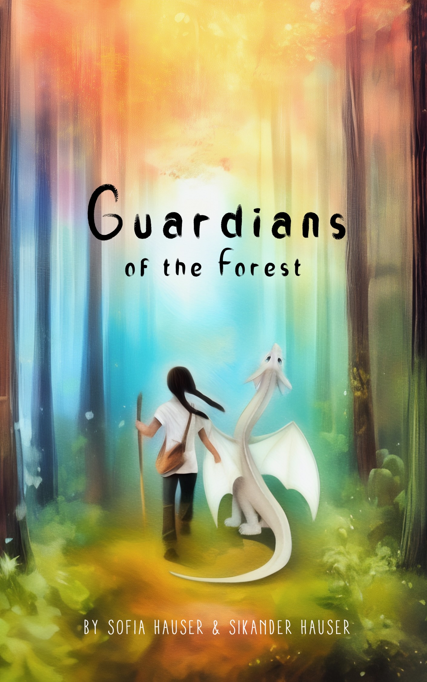
Midgrade adventure story with a female hero, intentionally left timeless. The blurb references a girl meeting a dragon. They then end up on their adventure in the forest trying to topple a bullying wizard. Written for dragon nerds age 8-12 who value the adventure with dragons and are captivated by their personalities and companionship rather than the more popular awe of ‘might beast’ association. The main format is audio book and paperback in libraries.
Nathan says:
It’s good that you’re thinking ahead to whether audiences are going to see the cover first in ebook vs. paperback. I think there are some modifications that can make the cover much more impressive in print.
First: There’s a lot of unused space which doesn’t contribute at all, especially at the top — worse, it makes the title harder to read and the main focus of the graphic harder to discern. (Imagine that someone is seeing a library book display from a dozen feet away.)
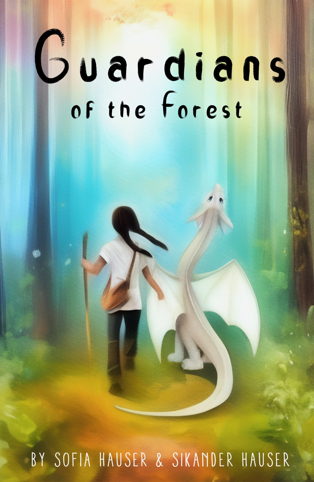
You could make the title larger to fill that space, but that still leaves the central figures too small. I’d say crop and enlarge the whole thing:
 Beyond that, three more suggestions:
- Use a more impressive, “fantastic” title typeface.
- Make the byline bigger.
- Refine the artwork. The human and dragon are too smooth, almost blurry; add detail and texture so that the eye is rewarded for lingering on them.
Other suggestions?
The cover is adorable, and I second all of our good host’s suggestions.
Your “elevator pitch” is a rather bare-bones description, but it’ll suffice for our purposes. Three points of advice:
1. This cover’s tall-and-thin ~5:8 aspect ratio is more suited to an electronic edition (for viewing on people’s tall-and-thin cell phone screens) than a paperback edition for grade-school children. I recommend trimming it vertically to make it a slightly shorter 2:3 ratio.
2. As mentioned, your pitch is sufficient for us, but I do hope you’ll flesh out more of the specifics for a summary on the back cover (which you should definitely provide for your book, since you’re going old-school with this—while the front cover was typically what lured prospective readers to the book in the first place, those back-cover summaries are what convinced young readers such as myself to check those books out from the libraries back when I was your target audience’s age).
3. While your cover image is a cute picture, all that digital airbrushing and the pale whiteness of the girl’s shirt and the dragon’s skin set against a bright-mostly-sky-blue-and-white background makes the details a bit murky and difficult to see in the thumbnail, which means it will also make them difficult for even children with relatively sharp vision to see and comprehend at any significant distance in a library. I recommend either changing the color of the girl’s shirt and dragon’s skin or else darkening the background a bit to provide for greater contrast, and sharpening the image in general to harden all its edges so that the figures in the foreground will be easier for today’s children (who’ve mostly ruined their vision somewhat already from spending too much time on their cell phones) to spot.
Now that it’s been scaled up, I love it. I actually really like the font and the softness of it all – *provided* the tone is intentionally “I love my dragon” rather than “high adventure”.