The author says:
Genre: meta-horror
Setting: from the 1980s to the near-present in a world not too different from our own except where otherwise noted (i.e. the black magic involved in the protagonist’s origins)
Target Audience: experienced horror fans who’d like a novel that does for them more or less what John Scalzi’s Redshirts did for Trekkies
Premise: What if (minor spoilers) the cat in the “cat scare” scenes in horror movies (and sometimes horror novels) actually *is* the monster, and this is his way of warning people nicely that they’re not welcome in his domain and really ought to be leaving if they don’t want to suffer some horrible fate? What if the reason he does this is that most ordinary people are actually a lot more reasonable and capable of taking the hint than the cliched characters in poorly written horror stories? What if we saw some of these horror stories from said monster’s point of view for a change? That’s what this story does: explains his origins, and how and why he does what he does.
Nathan says:
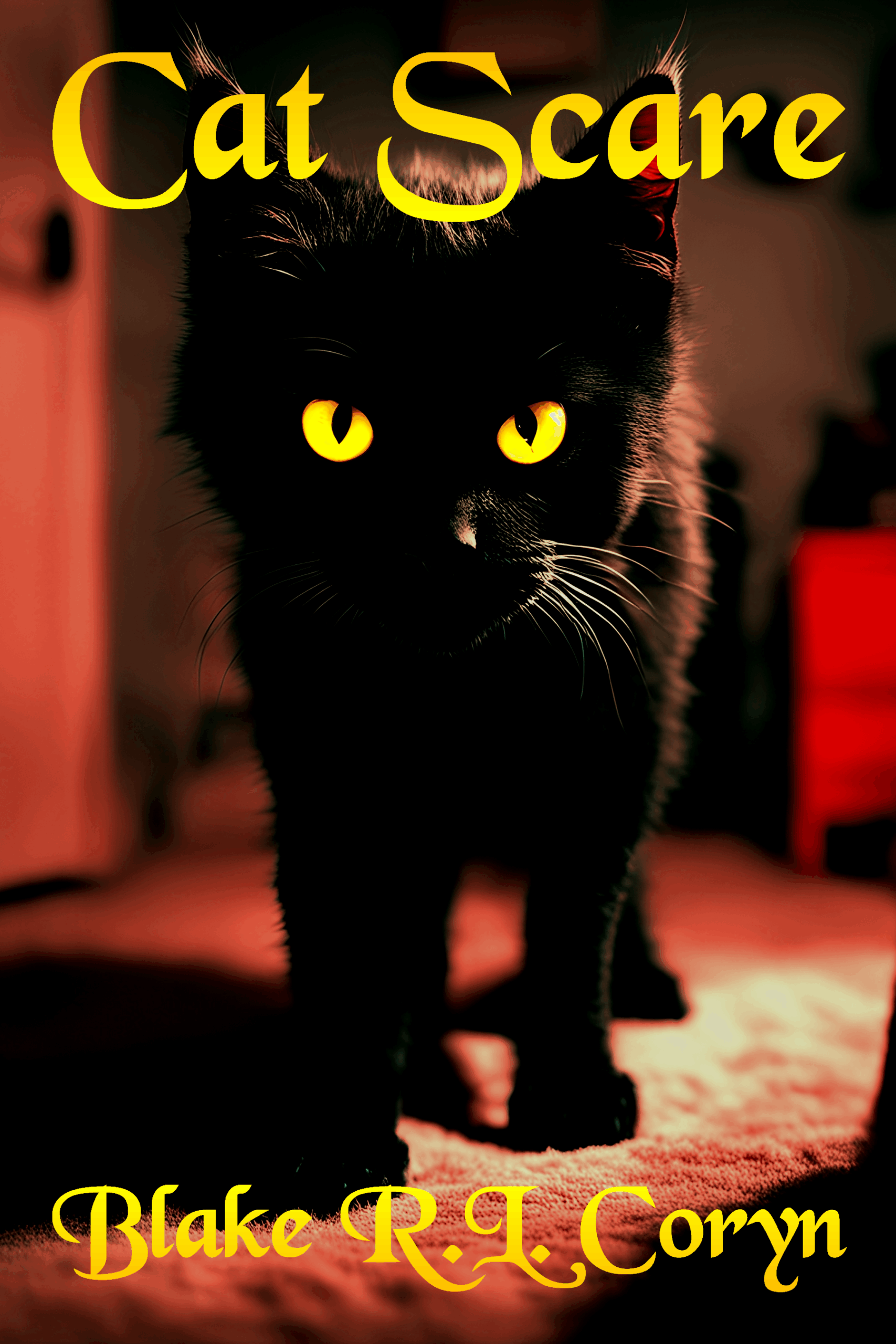
Aw, what a cutesy-wutesy kittie!
…Which shows the problem right there. Looking at this cover, between the kitten photo and the typeface, I might think that it’s some sort of cozy paranormal fantasy.
If you want this to appeal to horror fans, lean into it. Use typefaces familiar from horror movie posters. Use a full-grown cat — NOT a kitten — hissing or arching its back or doing something ominous. Don’t make the mistake of thinking the cover’s fine because you know the story and it fits; think, “Will this tell the target audience who knows nothing about the book that this book is for them?”
Other comments?
You could even have a split image of your kitten on one side and an evil cat on the other to suggest what is lurking.
And definitely find a menacing font.
I’d like to disagree. That is a pretty frightening image by itself. A hissing cat, with an arched back and a shock tail, is a *scared* cat. Scared monsters aren’t scary (eg – Monsters, Inc.) I would say two things about the cover —
1) Maybe back up a bit, let the cat exist without being covered. If possible, maybe get a picture of a cat sitting and glaring menacingly? But the picture itself is red enough to make me think it was in the final scenes of Carrie.
2) If that picture is what you have, perhaps a black border around the pic? Only a half-inch, maybe a gold line to differentiate the dark border with the black of the picture. Or not, depending how it looks.
I do agree the font could be scarier. But also, the gradient makes it look a little … cheap? Instead, go for a border around the letters to make them pop. Gold border for red letters? Or perhaps two-tone letters, orange at the top, and a diagonal slice across the title so the letters below are yellow?
All right, those glowing eyes and noirish shadows do kinda make the kitty look like he’s glowering at us, but that doesn’t make him look any scarier than—I’d say—Tardar Sauce a.k.a. “Grumpy Cat” from the I Can Has Cheezburger-style memes sites. The typeface for your title and byline wouldn’t be bad for a fantasy novel, but it doesn’t quite fit with horror, even if your story is also a fantasy. (If the source of the horror in a horror story is some currently unknown technology or extraterrestrial species, as in the Frankenstein and Alien movies, it’s also science fiction; if it’s something supernatural as in the Dracula or Halloween movies, it’s also fantasy. The “black magic involved in the protagonist’s origins” you mentioned is supernatural, so—fantasy.)
That said, I notice you say this is not just horror, but “meta-horror” which “does for [experienced horror fans]… what John Scalzi’s Redshirts did for Trekkies” in your summary. So, if you’re doing for horror fans what Redshirts does for the Star Trek franchise’s particular kind of science fiction, does that mean the protagonist (and/or maybe some important secondary character) is going to find some way to break through one of the “fourth walls” to go confront the hack writer(s) who put everybody in a cliched horror story? Alternatively, might this be a kind of “story from the point of view of someone who has to live in a horror story’s universe” as a previous submission The Fiasco in “News” was for superhero stories and Redshirts (to some degree) was for Star Trek stories? What kind of “meta” are we talking about here?
Depending on what kind of “meta” you have in mind, what might be important is not so much making the cat scary as making him meta, to wit: while glowering through the fourth wall’s not a bad start, it might be more “meta” to have the cat actively attacking the fourth wall. As our esteemed host knows (from having spent many years reviewing horror movies alongside some of his friends who were also experienced horror fans), something one commonly sees in horror movies where the “cat scare” involves a literal cat is the “spring-loaded cat” i.e. a feline who flies or drops into the frame from some unlikely angle as if it had been launched from a catapult off-screen. Maybe some such “spring-loaded cat” is what your prospective readers need to see as well: the cat in midair, all claws and teeth extended, flying right toward the viewer.
Thanks for the feedback, everybody. I guess I’ve spent enough weeks waiting to see if there will be any more responses. So… Q&A time.
Nathan
In fact, there is some paranormal fantasy in there, and much of the story takes place in a “cozy” domestic setting, but point taken.
I’ll definitely try to make him look a little more mature and ominous in my next draft, but I should probably mention the point of the cover is not exactly trying to scare the target audience, as that would be nigh impossible to do to experienced horror fans anyway. For that matter, I can’t think of any book covers or movie posters for horror stories ever intended to deliver a scare to potential members of the target audience before they bought the books/movie tickets. The point here is to make the cover look something like a conventional horror novel cover/movie poster with a twist: something that says “horror” while designating the monster to be… a seemingly harmless housecat.
As to typefaces, I agree the right one could go a long way all by itself to clarify the genre and get the target audience’s attention, but all the free “horror” fonts I’m seeing offered online so far seem to be trying too hard to the point of absurdity (e.g. Bloody Terror). As for old horror novel covers and movie posters, a remarkable number of them use conventional typefaces that are horribly overused and therefore no longer suitable these days, e.g. the original poster for the Jodie Foster movie The Little Girl Who Lives Down The Lane uses Impact; which might have worked back in 1976, but certainly isn’t going to now. So, got any suggestions?
Tracy Miller
Leaving aside how difficult such a “split screen” effect is to pull off on a book cover, I said the cat is the story’s monster; which is not necessarily the same thing as a villain. (Jodie Foster’s character is actually the monster of The Little Girl Who Lives Down The Lane, but she’s not that story’s villain either.) As is typical in many works in the horror genre, this particular monster preys exclusively on people the audience is likely to feel deserve any and all foul fates they may receive. While he certainly has reason to be trying to look menacing, therefore, at no time would this monster ever be trying to look evil.
As for using a menacing font, I am wide open to suggestions. Again, most of the free horror-themed fonts I’m seeing available online seem intended to come off more as campy and goofy than properly menacing. So, any ideas what would be a good “menacing” font for this cover?
Damien
Also—as previously stated—I’m going for a menacing look, not trying to scare an audience that can’t be easily scared anyway. A scared cat isn’t menacing, but one that’s springing into action (or about to) is. Maybe if I stood the cat’s tail up straight? When cats and dogs raise their tails up straight and twitch them from side to side, that’s the “saber rattle” which indicates the animal is about to attack; which is pretty menacing, yes?
So a red background is good. Got it.
What I have is a free AI text-to-image generator that produces very high-definition graphics; and if there’s one thing AI image generators trained on the internet know how to generate, it’s a picture of a cat. The only problem with it (and with all AI image generators, for that matter) is its apparent inability to understand descriptions of what any living creature in the image should be doing. Nevertheless, this being a free generator, I’m free to keep trying until it gives me something that yields the intended effects.
As with the typeface, I’m wide open to suggestions on the styling. I’m not quite understanding your suggestion here, though. Can you show me an example of what you’ve got in mind?
RK
So, to reiterate the point one more time: I’m not trying to make the cat scary, but menacing. For that matter, the vast majority of professional book covers and movie posters for horror stories aren’t intended to scare the viewer so much as indicate what the main threat (i.e. menace) to the story’s main characters is going to be. That this story’s main threat is the principal main character doesn’t change that intent, right?
Also, yes, this horror story is fantasy by the definition you gave: the principal “supernatural” part is that the protagonist used to be a human until a witch’s spell turned him into a cat; not something even most self-proclaimed witches (“Wiccans”) here in reality would claim their “magick” can do. A subtle point woven into the story is that if fantastic things like that happened all the time, they would no longer be particularly fantastic or horrible to us, just familiar hazards of everyday life everyone has to learn how to avoid or mitigate; hence the “world not too different from our own except where otherwise noted” disclaimer in my pitch.
It’s “meta” of the latter kind: unlike the deliberately schlocky science fiction in Redshirts, there’s no magic in this story that would allow any of the characters to meet the story’s writer(s). If you’ve read Redshirts, something you might recall from it is that at one point the other redshirts showed the protagonist a secret device so secret that nobody outside the show—even the show’s writers—knew about it: a one-of-a-kind alien “black box” in their lab that always provided them with whatever would resolve the crisis of the week just in time for the episode’s climax. Likewise, what makes Cat Scare here meta-horror is that it casually reveals a lot of what goes on in horror stories at times and places the “cameras” aren’t watching.
The purpose this serves is to show some in-universe reasons why conventional horror stories proceed the way they do. For just one example: experienced horror fans typically know the out-of-universe reasons for why the victims in a horror movie are almost always despicable and unlikable characters: so that the audience won’t get too attached to them, and won’t feel too guilty for being entertained when they inevitably suffer some horrible fate. In-universe, however, there’s also a pretty good reason why the monster chow are such wretches: because the morally superior kind of people who are friendly and likable (e.g. the “final girl”) also tend to be the kind who are sufficiently intelligent—or at least have enough common sense—to make good decisions that will either prevent them from being in a horror story in the first place or have them immediately looking for an exit the moment they realize they’ve wandered into one.
Well, yes: above all, the point of making my cat protagonist look menacing is to make this cover look the way experienced horror fans expect a typical horror novel’s cover to look. They’ll only discover the “meta” aspects of it as they gradually come to realize they’ve actually been following the story from the monster’s point of view. That “spring-loaded cat” idea sounds good; I’ll see if the image generator can be persuaded to whip me up one of those for the cover’s next draft.