The author says:
This is a book I wrote for people who are going to have open heart surgery. It’s advice seen through the patient’s perspective. I did this with no understanding of covers and I know it’s poor.
Nathan says:
Just so I could understand the content a bit better, I pulled in the Amazon description:
The author found himself facing open-heart surgery. Researching the Internet, he found lots of scary stuff that led to terrible fear. The books he found didn’t give a good idea of what it was going to be like from the patient’s point of view, and so he resolved to keep a day by day diary of the whole process, from diagnosis to recovery, detailed here in “The Road Map”.
The Road Map doesn’t replace existing books, nor does it attempt to advise you on surgical matters. It relates the details of diagnosis, preparing for surgery, and recovery: the things that can only be experienced by those who have undergone a heart bypass procedure.
I think that, because the book emphasizes the personal and experiential side, you ought to begin with the image of a person. Maybe someone being advised by a doctor, or someone in a hospital bed receiving a shoulder-hug from a visitor. Emphasize that this book isn’t about the organ, it’s about the person.
I just searched “patient” in iStockPhoto, and there are scads of images showing a patient in comforting consultation with a healthcare professional (most of them run between $12 and $33 for a license to use them on a book cover). Happy hunting.
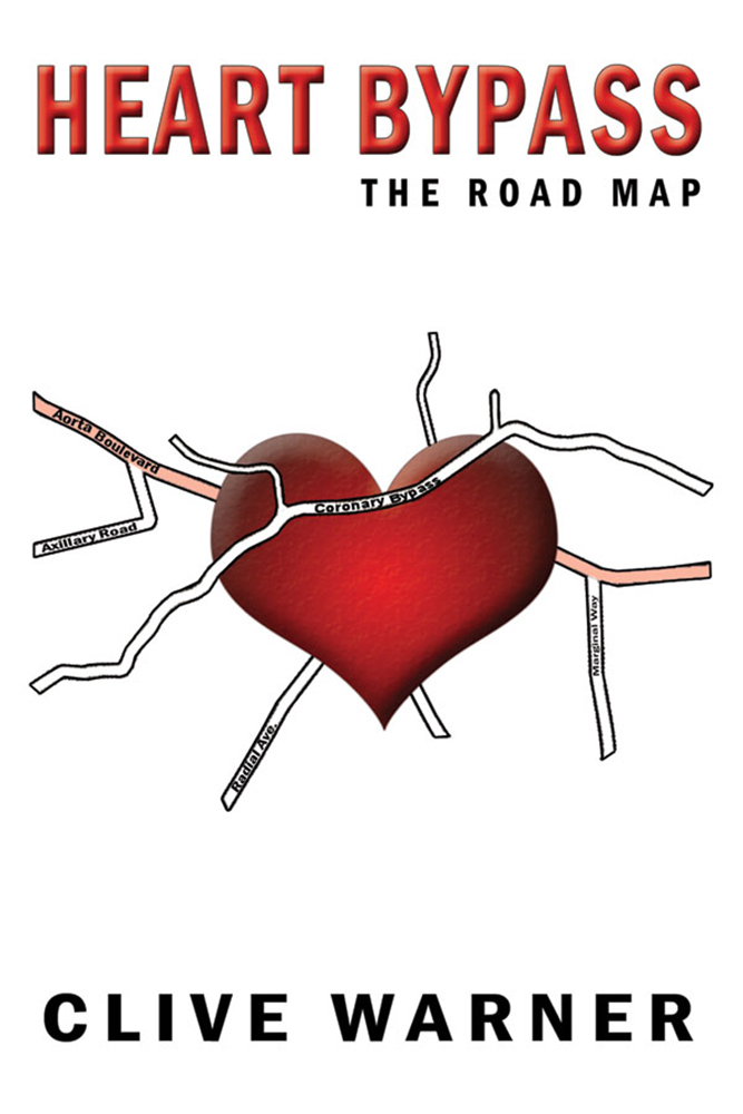
The germ of a workable idea perhaps, but lost with everything on the cover far too small, overwhelmed by the sea of white in which everything is floating. But as interesting as a road map/heart combination might be visually, it’s perhaps too much a literal depiction of the title: “Heart Bypass, the Road Map” and, well, there it is. You might want to take Nathan’s suggestion and make the cover more personal and more directly suggestive of the nature of the book.
I agree with the others–the graphic doesn’t have to be so literal. If you still want to go with the map/heart theme, there are a lot of options on Shutterstock, like this one:
https://www.shutterstock.com/image-vector/abstract-city-folded-map-location-markers-203322391
Also, the cover desperately needs a subtitle to explain what the book covers.
Hmmm… If I saw this cover in an old brick-and-mortar bookstore, I’d expect it to be some weird kind of children’s book symbolically describing the various parts of the human circulatory system by comparing them to various parts of our nation’s grid of interstate highways and freeways. If I saw it in thumbnail on an internet sales site, I wouldn’t understand it at all and therefore wouldn’t click on it for a closer look. Either way, it doesn’t achieve its intended purpose of getting its target audience to take a closer look.
As our esteemed host says, this book is about your personal experiences with receiving treatment for your heart condition, so what it needs on its cover is at least one person on it; a human touch, basically. A roadmap, symbolic or literal, is decidedly impersonal and therefore not what your cover needs. Even if you actually spend most of the book complaining that the system made everyone cold and uncaring and impersonal toward you, the point of the cover is to emphasize that this is your personal story you’re sharing of your experiences (good or bad) with needing and obtaining heart surgery, and not just a cut-and-dried technical description of the process by which this happened.
So yes, I also recommend getting a stock image of someone meeting with a doctor. In addition, since a “road map” is a rather clinical and impersonal metaphor, I’d suggest you use something more direct and personal like “What to expect when you need heart surgery” or “What my doctors told me about heart surgery and what they actually meant” as your tagline. The point is to get the prospective readers in your target audience (which is a niche, but one that has a substantial turnover rate) to realize this book is by one of their kind for the benefit of all their kind; to say “I’ve been where you are now, and this is probably how things are going to go for you too.”
maybe something like this?
https://imgur.com/a/lp1JESN
the designs are a lot different; one is a bit humorous while the other a bit scary so neither might be right. It depends on the tone of the book. if this supposed to be an uplifting sort of thing, choose art that reflects that. Changing the color tones on the second version would lighten the tone of it a lot.
If I was ‘fixing’ your version, I’d make the roads larger and name them things like 6 weeks bedrest lane, confusing instructions way, Nursing Boulevard, things like that which relate to the contents of the book. you might even change out those roads for a signpost set in the heart.
then balance the text with the image.
(Maybe I’ll go make a 3rd version like that for fun…lol)
PS. You could use any of the covers I link. they were all made with free art.
Thanks, everyone for the great comments, very helpful indeed.
I like the initial concept of a valentine heart and map-like intersections. The minimalist nature of the illustration, however, isn’t very striking. From your story description, I gather you were scared, confused, etc. Many would be. Consider an illustrated design that convey that feeling. Use colors, shapes, and patterns jumbled in chaos to scream for attention. Juxtapose map-like images with human figures. Look at the art of Jim Dine for inspiration.
Hey…you guys here at CC.com ever go check, to see if any of the feedback that we give is ever taken into account? I was curious, so I checked on this very book and nope, it sure wasn’t.
sigh.