[previous submissions and comments here and here]
Nathan says:
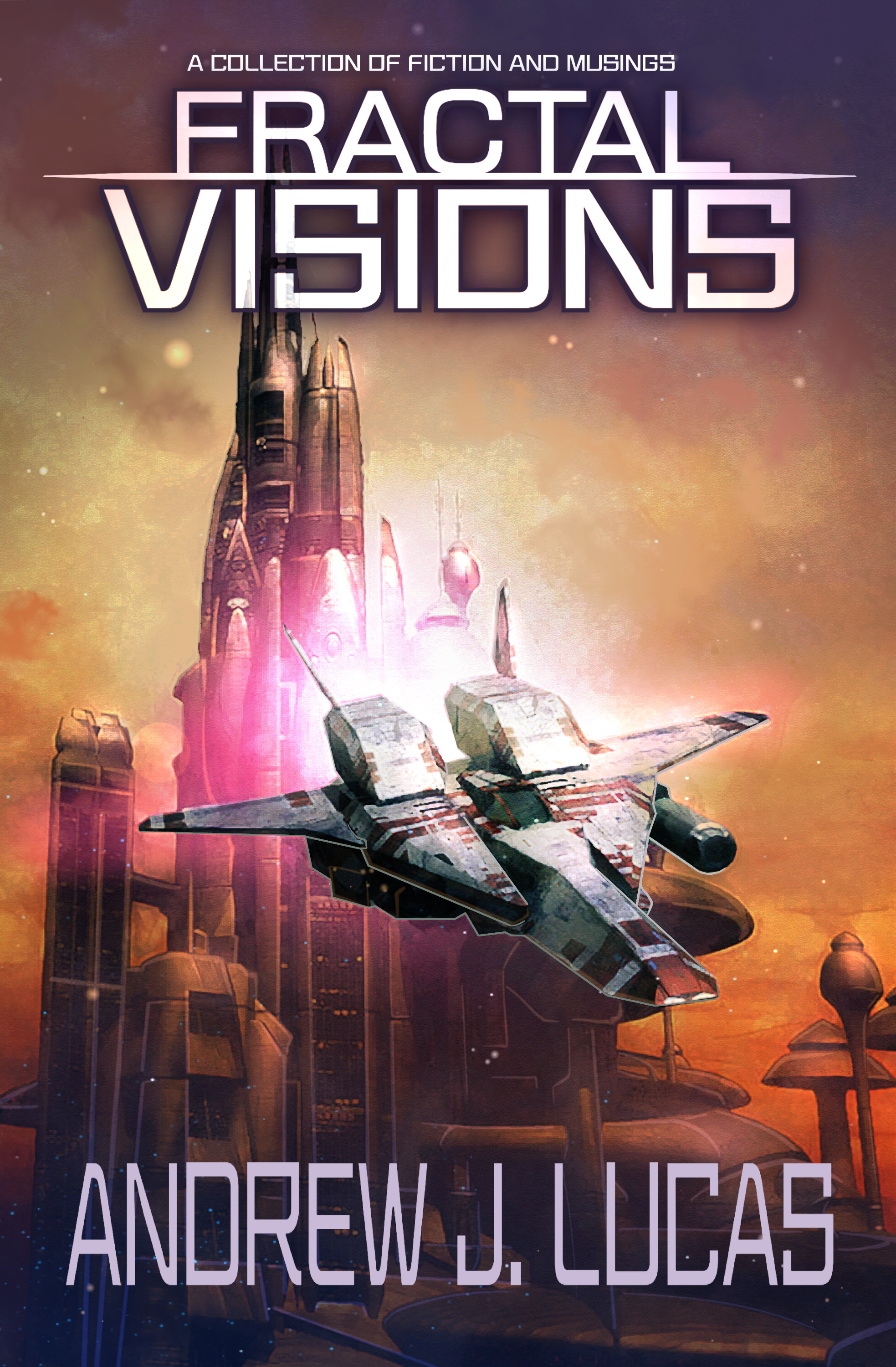
Much better. I’d only suggest a couple of tweaks:
- Enlarge the title until the horizontal line touches both edges to make it really pop in thumbnail.
- The byline is a little hard to read; if the font has both upper and lowercase, I’d suggest using that; if not, use small caps, or just manually make the initial letters a bit larger.
Other comments?
I agree with Nathan: about the only things I would suggest would be enlarging the title and tagline.
I kind of wish there wasn’t a light outline around the spacecraft, but it’s not too obnoxious.
SO much better!!!
Ditto what everybody else here has said–leap years’ better. Well done.
Now that’s more like it! The lettering could maybe be even a little bigger and bolder (especially on the tagline), but I suppose you do have to leave a little margin around the edges for the printer. On the whole, this I could see as the cover for a professionally published sci-fi paperback.