The author says:
Lucifer’s love curse is set in 21st century im America. The story is about Lucifer the fallen Angel, who is also a vampire. He falls in love with a woman and learns he had a curse placed on him that would change him entirely when he finally accepts her love.
Nathan says:
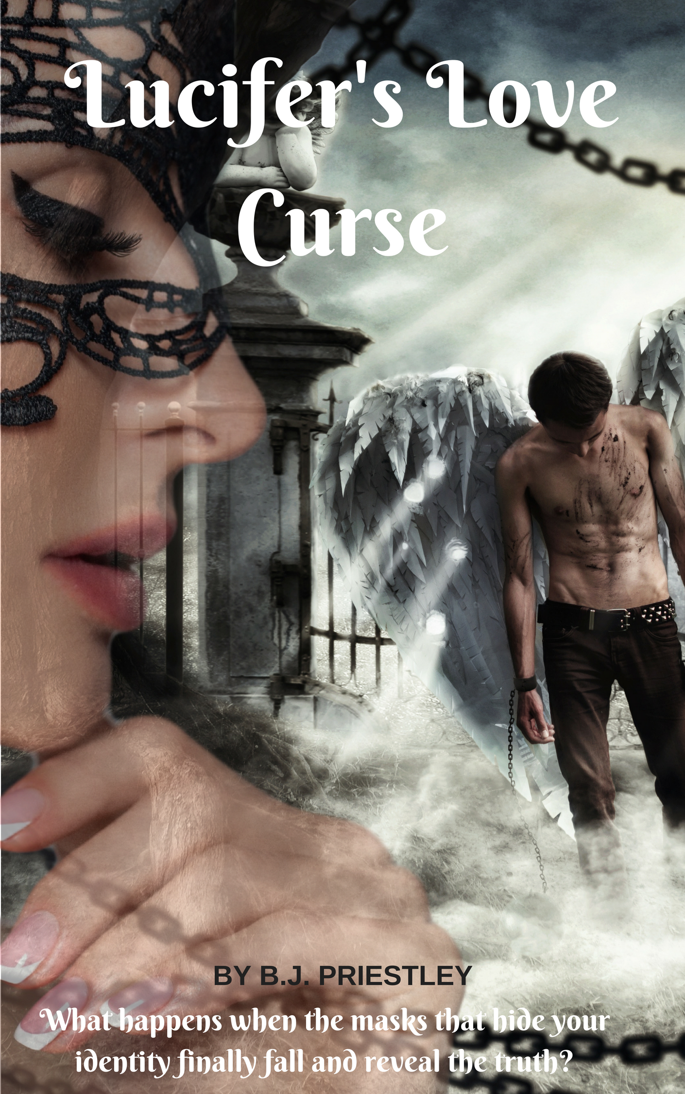
This is a nice amateur try, but it doesn’t reach the level needed to show it to the world.
- The semi-transparency of the various images adds nothing, and just makes it hard to comprehend each one. (The chain is especially irritating.)
- There’s simply not enough clear contrast in the image. Desaturate it and take a look, and you’ll see what I mean. Make the darks dark and the brights bright so that figures stand out from the background.
- The cover image was made without considering how much space the title should take up; that’s why, even with a too-small title font, the type overlaps awkwardly with image elements.
- The byline shouldn’t look like a footnote. You could easily take out the tagline that adds nothing and fill that space with your name (tip: you don’t need “by”).
Other comments?
I love the idea. The use of layer masks would improve this considerably. Like Nathan said, take out the transparencies and make her the focal point without all the distraction would be an enormous improvement. Removing the weird angel thing on the pillar and all the chain except on him would be good. The font isn’t working on any level but the picture needs to be fixed first. Then I’d choose a really strong color to give this some much needed contrast, speaking of which, up the contrast a hair to make the black and white pop more.
Ditto on the need for a strong color and the solidifying of the lady’s face.
But can we talk about how well done those holes through the wings (and the light coming through them) are? The concept, I think, is very strong and has an eye-catching composition even in thumbnail.
Eliminating some of the noise/distraction in the pic is the first step, then adding color (but don’t change the values!), and finally changing up fonts will get you something pretty decent, I think!
I wish to amend by saying “don’t change the values *too much*”.
I’m having a hard time resisting playing with this cover its so intriguing a concept, but I promised myself I’d limit the time I spend messing around in photoshop.
I noticed and loved the holes although I want to make them a bit more ragged and maybe have a loose feather or two drifting away… I’d also try flipping the gate to be behind him and making her face take up more space and if she is supposed to be holding the chains I’d make that much clearer. I really love the idea of this cover and can’t wait to see it with improvements!
PS. I’m picturing a really bold distressed font. Something really gritty to match the tone with an elegant serif font for byline and tag with maybe a hint of swish for the romance, although I suppose you could do it opposite…lol
I have some real beauts for that. I agree, a distressed sans would rock it. (Abandon might work for this very interestingly, due to the sharp-edged serifs. I don’t recall if all the letters have alternate versions with the edges.) Dime Zero’s kinda naughty…Good old Scorched Earth. Crackvetica is grunge, but cracked grunge, which might be fun for this, if Lucifer’s Fallen Angel-Vampy love is not all it’s cracked up to be…(forgive me).
There’s Inked God, if you want to keep a romantic-y feeling. This will invoke memories of Bleeding Cowboys, but…it could work here, if the cover gets cleaned up a lot, less busy. You can’t use a font as busy as Inked God, on a busy cover. There are some simpler sans, like Buckwheat, but…you’ll need a better design, first.
My take would be, to be honest, lose the woman entirely. The Fallen Angel image is compelling enough as it is. She adds almost nothing except image confusion. If she must be used, then put her behind the much-stronger angel image. MUCH stronger.
As I said, lose the woman’s image entirely, use the man and either center him more, or title it on the left. Something along those lines.
I can only second what Savoy said.
The cover suffers from two problems that plague too many DIY covers. One is the “kitchen sink school” of cover design where the urge to include absolutely everything that seems important. The other is the inclination to include elements that are only meaningful to those who have already read the book. I might as well throw in the fact that everything is of pretty much equal interest…there is nothing that is of central interest.
You are trying to tell too much.
The cover desperately needs to be streamlined. The thing needs to be stripped down to one main, dominant element. Everything else has to be secondary. I would suggest the angel with the pierced wings, which should be enlarged and made the central element of the cover. Frankly, I’d delete the woman’s face, but if you feel adamant about including it, make it a subtle, secondary element.
because I couldn’t resist…
https://imgur.com/a/jMdwfA5
Much, much improved. I do not love the second one with the foofy romance-y font, but the layout is dramatically better. Well done, you!
I agree with Hitch! Both are a quantum leap above the original and the first is the best. (My objection to the typeface in the second is not so much its foofiness but that it’s unreadable. It’s also goofy.)