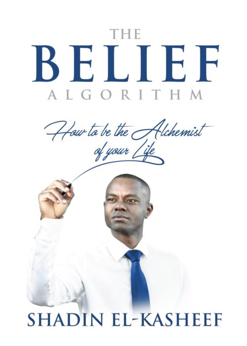
The author says:
The Belief Algorithm – How to be the Alchemist of Your Life
Belief _ how what you believe can determine you success and if you believe in yourself you can win and succeed
Environment – how your environment and the people you hang out with can determine your level of success
Law of attraction – how what you focus on can determine how successful you are.
Ikigai – your why and motivation. How to use this to be successful in your life.
Emotional Intelligence – how emotional Intelligence can lead to success. It is a better predictor of success than iq as per the research
Focus and failure – how to use focus and failure to achieve duccsss in your life
All the letters of belief stand for a way to achieve success in an area of your life
Next chapter is bridging the gap
Bridge the gap between beliefs and achievement through hard work, dedication, persistent, passion, etc. This chapter discusses other areas to work in such as discipline, etc to achieve succsss
The book is a self help, personal development/self improvement book intended to show people how to be the alchemist of their own life and create the life they always desired. I hope that makes sense. I can answer any questions you have related to others parts of the book. I discuss gratitude and perspective as a way to achieve success and how my beliefs around not wasting time, implementing with a sense of urgency and taking action with uncertainly can ultimately lead to success. Thank you for your feedback Looking forward to reading it
Nathan says:
While acknowledging that I’m not the target audience, I think this has winning elements. My only two recommendations:
- Add either a border or an off-white background so that the edges of the cover are visible against a white webpage background (as most ebook vendor sites have).
- Strengthen the word “Algorithm” (either make it darker, or add a dark border) so that it’s readable in thumbnail.
Good job!
Other comments?


The white and blue give the cover a clean, optimistic vibe that’s in keeping with the book’s subject. I may have to seek it out and read it!
It’s nice, not much to add. At full size the guy’s face is a little bit blurry though, not a big deal but not sure if it’s intentional or no. I’m wondering if we should see more easily where the shirt ends and where the background begins. But yeah overall I think it’s pretty much spot on. And I like how the tie is the same color as the text.
Mostly, it just needs a few tweaks to optimize it:
1. Make all titles and the byline as big and bold as possible, and darken them to increase the contrast with the background; they all need to be readable at thumbnail size, as only some of them are at present.
2. As mentioned, add a border or do something to keep the white background from being indistinguishable from the cover’s surroundings.
3. The black businessman’s contrast has been boosted a little too much, causing his shirt to fade into the white background; he’ll look better if you go easier on the contrast and make him more distinguishable from his surroundings.
It’s a pretty great cover for the genre and intent. I agree with RK that you need to make the words ‘The’ and ‘Algorithm’ larger and darker so they are visible at thumnail because they’re essential to understanding what kind of book this is.
I’d shift the businessman and the text he’s ‘writing’ up away from the byline a bit.
There is something that’s niggling at me slightly about whether this cover is quite clear enough, and working quite as hard as it could be.
I think it’s all about the subtitle/tagline (‘How to be the Alchemist of your life’)
1. It needs to be clearer, readable at thumbnail. The main title is a bit ambiguous is genre (it’s a title that could also belong to a religious book) so it needs to be supported by this tagline.
2. There’s also something I question about having the words ‘algorithm’ and ‘alchemist’ both mentioned on the cover – it feels like a mixed metaphor. It’s not strictly a graphic design point, but as the point applies to imagery it applies to cover wording: too many ideas undermine and confuse each other.
3. I think I would flip the photo and have the flourish of the tagline lettering going the other way. To my eye there’s just something slightly visually odd in how the guy is kind of writing backwards twice over.
4. Though it’s a more nebulous point I feel like the tagline could be used to much greater effect to bring this cover up to be really effective. Everything on the cover is well-handled but perhaps a bit dull. The tagline is the most communicative part of the cover and could be used to tie everything else into a more engaging whole, but at present it is going the other way and getting a bit lost. I would make the tagline more of a focal point by doing this:
i. changing the colour – bringing in a secondary colour like a bright green or pink.
ii. making it bigger
iii. pulling away from the neat font look and giving it more of a handwritten look – like the man is writing this on a transparent whiteboard (ala a Beautiful Mind)
I think this treatment subtly transforms the cover into something more engaging and communicative of purpose by implying we are going to be taught something by an inspirational authority. It makes sense of the gag of the man writing the tagline, and draws customers eyes to the part of the cover that is going to give them the most information.
Thanks for the feedback. My book is ready for purchase. Follow the link below.
https://www.beliefcoaching.ca/
Oh that looks great! It started out really good and you did well to listen to the advice to really perfect it.