The author says:
This is a non fiction how to business book geared to entrepreneurs who want to create online businesses.
Nathan says:
The biggest problems are those you can see in the thumbnail — or rather, that you can’t see: The entire cover is unreadable and unintelligible. The fonts are too neutral and unassuming, the orange-vs-teal color scheme doesn’t contrast in value enough for the subtitle to be distinct from the background, and the stock graphic doesn’t seem to have any relation to the topic — it certainly doesn’t draw in potential readers who would want to learn about online businesses. The entire effect is definitely not a passionate one.
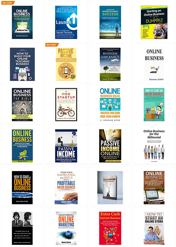
There are a lot of online business how-to books out there. Your cover needs to be aesthetically appealing and easily understood, or else the eyeballs of your target audience won’t even pause on your cover before being drawn to the covers to either side of it in their Amazon search:
These are the covers that come up when I search for “online business” books on Amazon. This is your competition.
My advice would be to start again from the concept up.
(And as an aside, I have no idea what a “PMP” is, or why that designation improves your credibility.)
Other comments?


Orange on cyan is a vibrating color combination. The clashing colors look jittery and hard to read.
I totally agree about the colors. Consider making 1 word really big (such as “Entrepreneur’s”) and focus on your target audience. I also think the eyeball graphic could be more unique or more “in motion” — not sure how to describe it. Just a thought: use one of the balls with the title type “playbook”, then move the subtitle to the bottom.
@Nathan: I do know what PMP means, and honestly, have no idea what that adds to a book on entrepreneurship. (FYI: It’s “Project Management Professional,” which is a type of accreditation, more or less, from the PMI–yes, Project Management Institute. I say this next part with no malice, as I spent the vast bulk of my career in PM: It’s worth noting that pretty much 99.99% of all PMS work for other people. That last bit offered FWIW.)
This cover needs a redo. The HoJos colors aren’t working for me, not as they are done here. The fonts are all too light for a book cover, and the serif tagline font in the orange is simply unreadable, hard on the eyes, and just bad. Don’t do that.
What’s the ONE thing that all would-be entrepreneurs want? MONEY. The second thing? Their deluded idea that t entrepreneurship = FREEDOM. If you want to sell this book cover, play to those emotions.
Good luck–I’d love to see the new revamp.
The cover is simply weak. It certainly in no way conveys anything of the word “passionate.” The type, the graphic and everything else is simply drowning in a sea of blue. It would all work at least adequately if you did nothing more than just enlarge it all: make the title larger (and reduce the space between the lines) and make the graphic fill much more of the available space. But while you are at it, I would advise taking Nathan’s advice and find a graphic that is more relevant to your topic than what appears to be a rather generic image. Worry about the colors once you have fixed these larger issues.