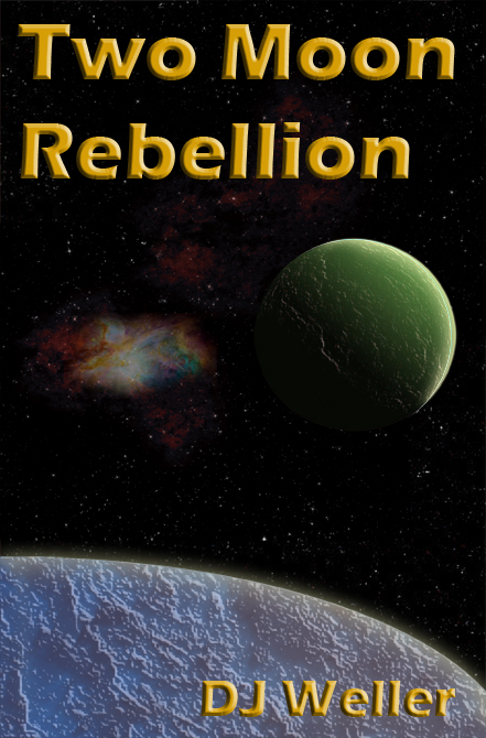
[The original submission and comments are here]
Nathan says:
Much better, but there’s still so much more you can do.
The typeface is still too “gentle” for an interstellar adventure involving space police. Center it! Make it bold and in-your-face!
The addition of the nebula is a good start, but as it is the two moon and the nebula seem like separate elements thrown onto your cover. Make the nebula bigger, and put it in the black space behind the two moon, visually connecting everything into a composition.
The texture on the smaller moon looks fine, but it’s a lot more artificial-looking on the big one, and the curve of the moon, doesn’t seem spherical.
Remember: The point of a cover in this genre is to get the reader EXCITED to read your book. Promise excitement on your cover!
Other comments?


I sense a problem with perspective which is common with beginning artists. It is such a fundamental aspect of image creation I fear that your current artistic capabilities are likely not going to serve your book well.
As Nathan has already said, this genre demands a compelling cover. I would go further and say all books demand a compelling cover. Whoever said you cannot tell a book by its cover was only half right. The reality is you cannot sell a book without a good cover.
To this end I suggest you apply your creative energy to writing and that you seek a well-rounded artist to create a cover worthy of your tale.
I mean no offense and I am only suggesting this course because I think it’s in your best interest.
Best of luck to you.
Better, but still a long way to go yet. The textures and colors are a nice touch, but the addition of the nebula is a little odd, especially in the symmetrical placement with the green moon. It really adds nothing at best and at worst looks like a splotch. A nebula would make a great background, but find one that would fill the entire space. There are hundreds of such images available from the Hubble Space Telescope Gallery (the link to which I gave in my last post). It would not only add a lot more color and interest to the cover, but some action as well. Here is one chosen literally at random http://hubblesite.org/newscenter/archive/releases/2013/17/image/a/format/large_web/
And the site provides even higher resolutions than this.
But even that would probably not be enough to avoid the inherent static quality of the design, which at the moment is deadly.
One test for the effectiveness of a cover is to imagine the title in a foreign language. Would you still be able to tell anything about the book, its theme or subject? I think in this case the answer would be “no.” Other than that it might have something to do with space, that’s about all one might guess. There’s no sense at all of the action and intrigue you suggest in your description, and certainly no sense of “rebellion.”
The font is better but still dull.
I agree with Nathan about the texture applied to the moons: green looks good, blue looks fake.
Making the nebula a larger feature in the background would also be a plus.
Still, there’s no action on the cover. At the very least, there needs to be some tension. Otherwise, you have a tranquil cover that hardly lives up to the “rebellion” in your title.
Re: image
You may want to look at Sorayama’s work for ideas on how to handle the cold dark of outer space: http://www.nvkz.kuzbass.net/Butin/sorayama/soratech/HAJIME57.JPG
Notice the image is high key, nearer white than black, even though it depicts space.
Maybe your cover image would benefit from some hints of the conflict that will happen there?
It is still too static. As Nathan said: EXCITED! No, I am not.
Now, I came across another cover with two moons, sort of: http://i.kinja-img.com/gawker-media/image/upload/18lqaprz1rmgvjpg.jpg / See? The addition of a moving object already makes it look dynamic and thus more interesting.
Yes, it is an improvement. Yes, it could use even more improvement.
The picture establishes that the setting for this is out in space, but only the title establishes that this is meant to be some kind of violent space opera in the style of Star Wars. The very brief synopsis didn’t provide any details, but I presume there’s some kind of violence in there, so let’s see it on the cover. Somebody or something shooting at somebody or something else? An explosion? A pair of crossed blades? Even layering in two hands clasping together to symbolize an alliance would be more interesting than just staring at these two orbs and a nebula in cold lifeless outer space. (There’s a precedent for that too: a handshake worked pretty well on the cover of the authorized extended-universe Star Wars novel The Truce At Bakura.)
Also, apart from whether the font is “exciting” or not, the title doesn’t really give me much reason to be excited. All it tells me is that the story involves two moons and a “rebellion” of some sort. Is it the people on one moon rebelling against the other, or both teaming up to rebel against the people on the planet they’re orbiting, or a rebellion against the distant rule of an evil empire that controls both moons (maybe Earth-sized moons orbiting an uninhabitable gas giant)?
Whatever the case, a more precise and violent-sounding title might be more appealing. A few examples:
Two Moons Against [evil empire’s title here]
Death To [the enemy moon’s title here]!
Raining Lunar Death
The Terra-Lunar Emperor Must Die
Lunargeddon
Lunapocalypse
Moonsfall
Double Moonset Over [evil empire’s name here]