The author says:
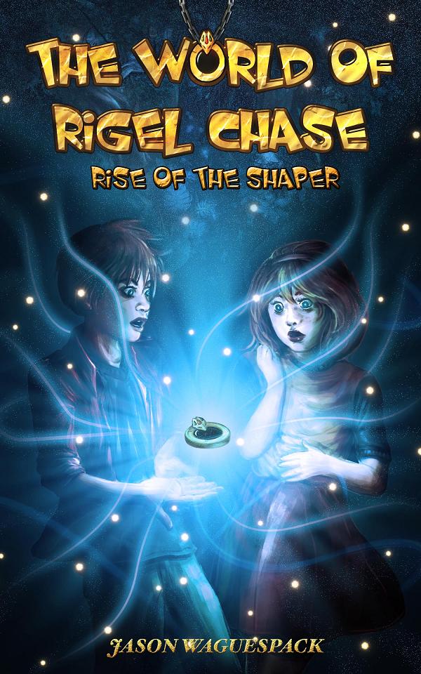
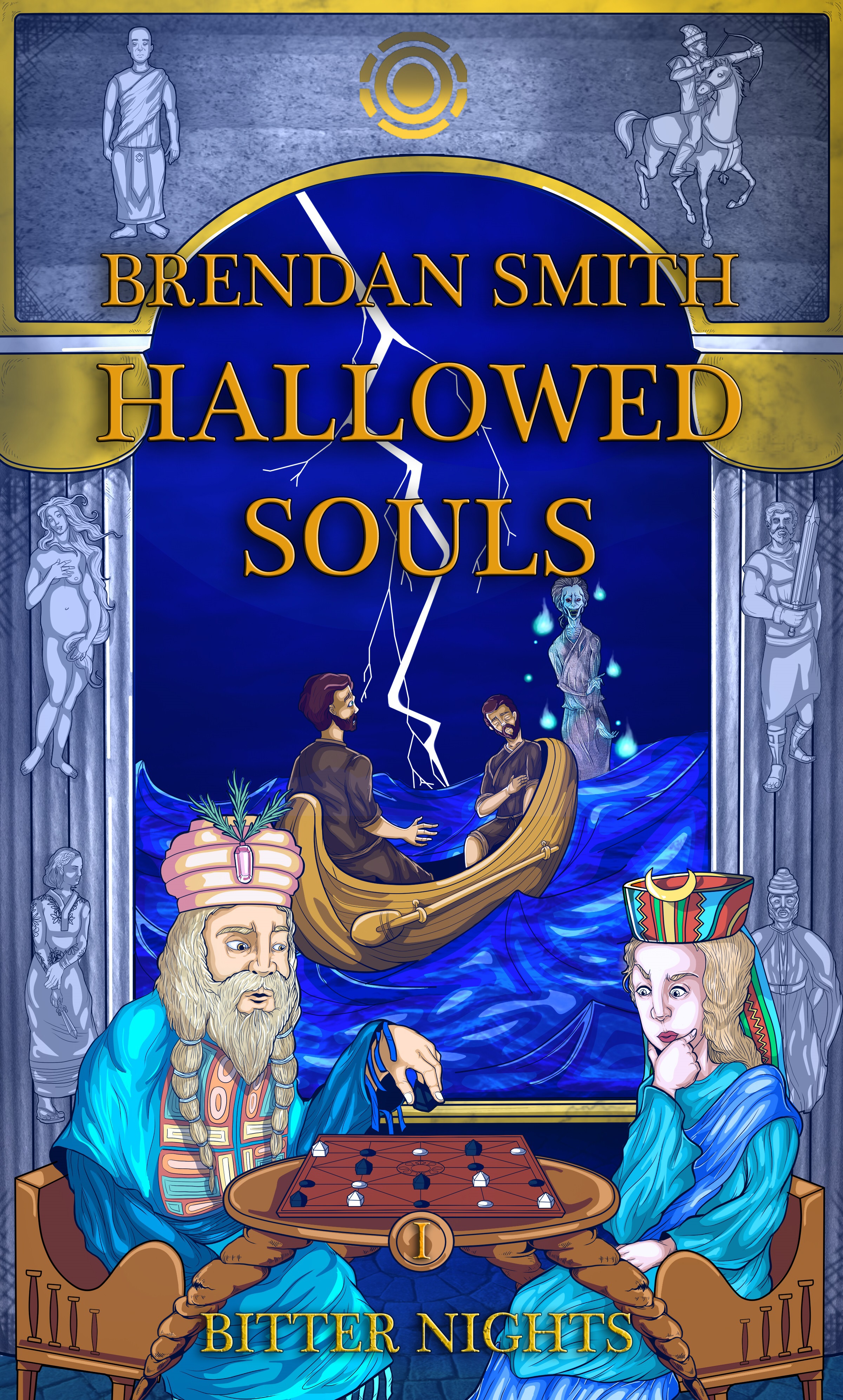
I had forgotten to mention this in my prior submission, but the title is a reference to a major schism ongoing in the first book, as the book series is primarily focused on religion and its flaws. I had taken most of the suggestions into account, such as a more fantasy-esque art style and bigger characters. I did make a font for this that was somewhat Asiatic, but I decided to abandon it as it did not fit the art style.
War rages on as various kingdoms struggle to gain power and maintain their freedom. From the shores of the Grey Sea to the mountains of Cosca, chaos reigns. It is a tale of murder, rape and war. Here a peasant girl masquerades as a princess; a deposed king schemes to regain his throne; and fierce pagans strive to regain their freedom. As opposing forces scheme and plot to gain power, a strange sickness blows in from the mysterious east and ravages the land. Not even Spenta can save them as everyone, from fools to sages, realize that even the most hallowed of souls can do nothing in the end.
[original submission and comments here]
Nathan says:
You’re not going to like this: I think the first submission was better.
Why? Because this kind of semi-cartoonish illustration looks like a chapter book or middle-grade book, which is absolutely not your target audience. The readership for an epic political-historical fantasy is not going to pick up something that looks like a volume of The Magic Tree House, and vice versa. The original cover told us nothing about genre etc., but at least it seemed aimed at adults.
There are other issues with the focal event of the illustration and the placement and readability of text, but those would be rearranging deck chairs on the Titanic.
The advice I’ll give you is advice that I give often: Look at the covers of the books that you expect your target readers to have read and liked. See how that audience is used to being told, “These are books for you.”
Other comments? Am I wrong?