The author says:
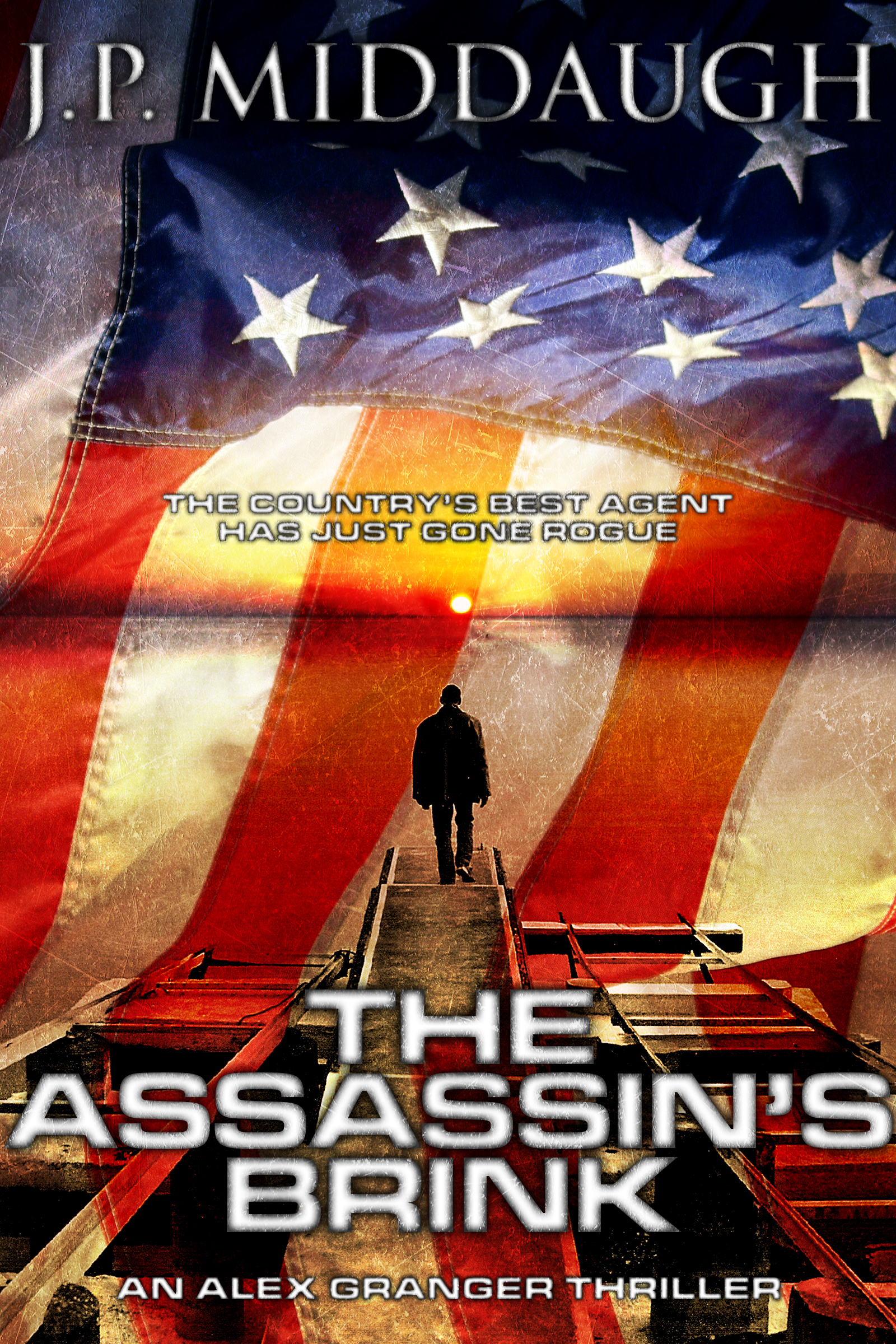
Reworked cover for my in-progress story. I’ve used better images that I think better convey the story’s title “The Assassin’s Brink.” I’ve changed a few things after a bit of time away from the project (gotta love writer’s block and hectic schedules). The two biggest differences to the story are the two main characters; Alexandra Granger is now Alexander Granger and Marcus Kane is now Amanda Kane. Other than that the story will remain roughly the same.
The Assassin’s Brink: An Alex Granger Thriller
Drummed out of the US Army after a dispute with his superiors, former Delta Force operator Alexander “Alex” Granger is recruited by the Central Intelligence Agency for an off-the-books mission in the Middle East to assassinate terrorist leader Abdul bin al Kamal—formerly Lt. Cdr. Kenneth Monroe, a Naval Intelligence officer. But nothing is what it seems when Alex is ambushed and nearly killed by a CIA strike team. Wounded and on the run from his own country, Alex calls upon the one person he can actually trust: Marine Force Recon sniper Gunnery Sergeant Amanda Kane. Off the reservation and hunted by the country they’ve faithfully served, the duo faces off against a shadowy cabal—who will stop at nothing to keep their existence secret—plotting a devastating attack against the United States.
[original submission and comments here]
Nathan says:
I like this very much more. (That sounds wonky, but the grammar’s correct. Honest.) The fonts are strong, the color scheme adds a bit of tension to the red/white/blue, and there’s more detail for readers to discover at full size.
My only suggestion would be for the figure himself; rather than a man with a mission, he looks like a man abandoning his mission and walking away. If you squared up his shoulders and put a gun in his hands, he’d appear much more resolute and driven.
Other than that, I’m happy. Anybody else?