The author says:
HUMANITY IS NO LONGER ALONE IN THE UNIVERSE. AN UNKNOWABLE THREAT APPROACHES EARTH . . . AND WE ARE COMPLETELY UNPREPARED TO FACE WHAT’S COMING.
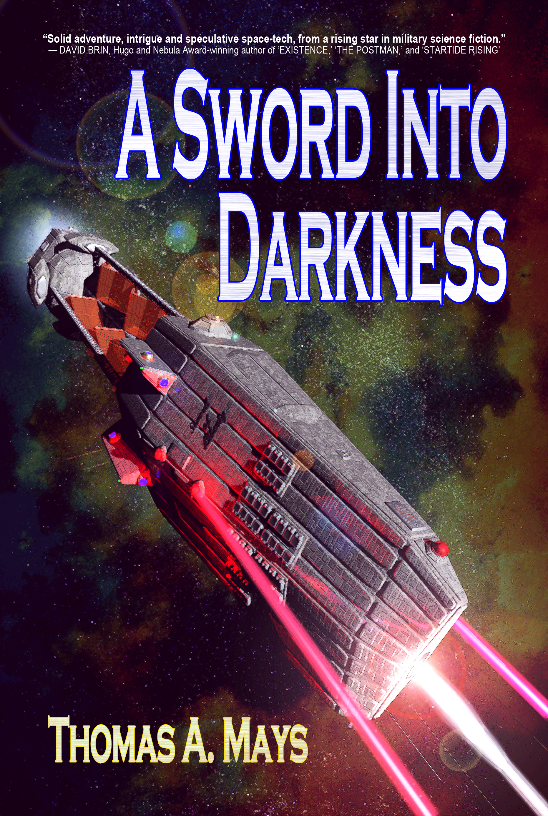
Aerospace tycoon Gordon Elliot Lee cannot stand idly by while a mysterious alien presence from Delta Pavonis bears down upon mankind’s only home. Shut out from NASA and military support, Gordon is forced to go it alone, to sow the seeds for an entirely new sort of planetary defense: a space-based naval force.
Joined by Nathan Kelley — a bloodied naval warrior, scarred by his own actions in the waters off North Korea — and Kris Munoz — an avant garde scientific genius with more ideas than sense — these three will scour the very edges of fringe science and engineering to attempt development of Earth’s first space navy in time to oppose the Deltan invasion.
Beset by ridicule, government obstruction, industrial espionage, and their own personal demons, it will take a miracle just to get off the ground. But the challenges on Earth are nothing compared to what awaits them in space. Against an unknown alien enemy with vastly superior technology, a handful of human scientists and warriors must become the sword that holds the darkness at bay.
MISSILES WILL FLASH, RAILGUNS WILL RUMBLE, LASERS WILL BURN, AND DEFENDERS WILL DIE.
IF THEY FAIL, OUR END IS AT HAND.
Nathan says:
The only improvement that leaps out at me is the title font. I’m wondering if, instead of a contemporary font with a texture to science-fictionize it up, things would work better with a slightly technological font (or even just a squarish sans-serif one) without the texture.
Other than that, it looks like it’s exactly what it’s supposed to be.
Other thoughts?
I agree with Nathan. Even if you choose to keep the current font, I’d remove the texture, which really doesn’t add anything.
I would also make the blurb at the top of the cover much larger. It’s difficult to read even in the large size of the sample.
I agree about the blurb as well. It’s always a nice thing to get a quote like that, so show it off! But don’t go crazy. 😉
Sorry, don’t have anything to add other than my agreement with both guys.
Nice coup landing a blurb from Brin.
I’d have to agree with Nathan on the font. Copperplate isn’t really a “sci-fi” font. But I kinda disagree about the blurb. Unless you made the content shorter (less characters) or more condensed (= less readable) you’d have to make it three, possibly four lines to make it larger. And then it would take up too much vertical space. Just MHO
The thing is, everyone who’d be impressed by a blurb from David Brin would know who he is. You could knock out the whole one-line resume, make the typeface bigger, and Bob’s yer uncle.
You could even just shorten it to “Hugo & Nebula Winner” or something similar.
Thanks for the look and suggestions! I did the art for this as an exercise about a year ago, using Cinema 4D, then when it came time to look for cover art and an artist, I couldn’t find anyone who could match my vision of the ship design as well as what I’d already made. So I committed the sin of doing my own cover. Where I have no experience is in the area of titles, fonts, etc, and that’s obviously where I’m lacking. I liked the Copperplate because of the the two-tiered effect, using smaller all-caps for the lower case. My title is long, and the letters tend to run together with everything a uniform height. Is there a good SF font that can achieve that, or would I just composite a font into two heights for a similar effect? Or is there another way to get good definition for a title of this length?
I’m with you on the Brin quote. I can probably just go with “David Brin”, then make it two lines with a larger font. As for how I got it, a friend helped out with one of his signing appearances, they got chatty, and he passed over an ARC of my book. Mr. Brin made no promises (and said he didn’t really do that sort of thing) but he read it on a flight apparently and liked it enough to shoot my buddy an email with his blurb and some helpful suggestions. I am very honored and VERY lucky.
Just about any font could fit the bill if you set them to “small caps.” Or you could do it manually by increasing the font size of the initial letter. Always be double-careful of kerning issues in those cases.
I think it might benefit from fewer lens flares, and agree that the font and the effect on it don’t quite work. The image is OK though, and congrats on the quote from Brin.