Category: Covers

Tyr

The author says:

TYR is a space fantasy (part one in a series) that follows Kai Brecken. It’s set in an undefined ‘future’ and takes place partly on a planet (Egeria) and partly on a spaceship. The target audience is lovers of sci-fi/fantasy/Vin Diesel. Thank you in advance!

COVERPLAY2

COVERPLAY2

Nathan says:

No glaring problems that I can see.  Let’s go to fine-tuning!

  1. While the star-scape is visible at full size, in the thumbnail it just blends into a gray texture.  I’d suggest adding some extra stars the look like stars even from a thumbnail.
  2. I don’t think your byline needs to be so small.  I also don’t think that a typewriter font is the the right font for this cover.
  3. Back cover: The planet that takes up half the cover really doesn’t need all the focus; it would be better as background. Don’t you have a bio note, or a blurb, or a publisher logo that you could use to fill in that shadow-side?

Other comments?

Rock the Boat [resubmit]

The author says:

ROCK THE BOAT is an erotic romance or maybe a (romantic thriller I’m really not sure) set in current day America. A simple love affair becomes complicated when a soldier shares his new wife with his best friend. Parental disapproval escalates to lies and manipulation. A man with an obsession, a kidnapped spouse, and a murder, change a happy home into a nightmare. One that might be fixed by choosing the right man. this is my third attempt at a cover. I’m going for a hint of sex in a thriller vibe. The covers for erotica books are not at all the ‘feel’ for my story. Mine has very little actual erotica in it.Sorry I’m not clearer, I’m confused myself on my genre.

rtb4.JPG

rtb4.JPG

[original submission and comments here]

Nathan says:

If this isn’t erotic, then you are going to have a lot of readers angry at you for the bait-and-switch, because that definitely ain’t a “hint of sex in a thriller” vibe.  That’s a bikini babe.

The most important role of a cover is to attract the kind of readers who would enjoy the book.  That means you need to know who your target audience is.  Then you need to figure out which other books those same readers would like, and use the covers of those books to learn how those readers are accustomed to being marketed to.

Until then, you’re just throwing random things into PhotoShop.

Black Book

The author says:

A lightning fast action packed sci-fi thriller for fans of Stephen King’s Dark Tower and Lee Child’s Jack Reacher. Sheriff Jack is an elite soldier from the future, trapped in the Wild West. He must find and protect the sacred Black Book before someone or something else does. The clock is already ticking for humankind, but for Jack the countdown has only just begun.

x

x

Nathan says:

Hmm.

Obviously, the most important component of the covers of the books that you cite are the huge letters proclaiming “Stephen King” or “Lee Child.”  You can’t really go that way.

And I’m going to assume that this is a quick sketch version of the design concept, so I shouldn’t worry about things like how the title doesn’t line up with the byline, or how the cowboy silhouette is artifacted against the moon.

A common observation around here is that red text against a black background is surprisingly unreadable. Your byline is in orange so it’s not as bad, but in the thumbnail it still becomes a smear.

For the rest… I’m of two minds, so I’m going to have to defer to the hivemind instead.  Does the minimalist approach work? Could it work, even if this one might not?

Dead Line [resubmit]

The author says:

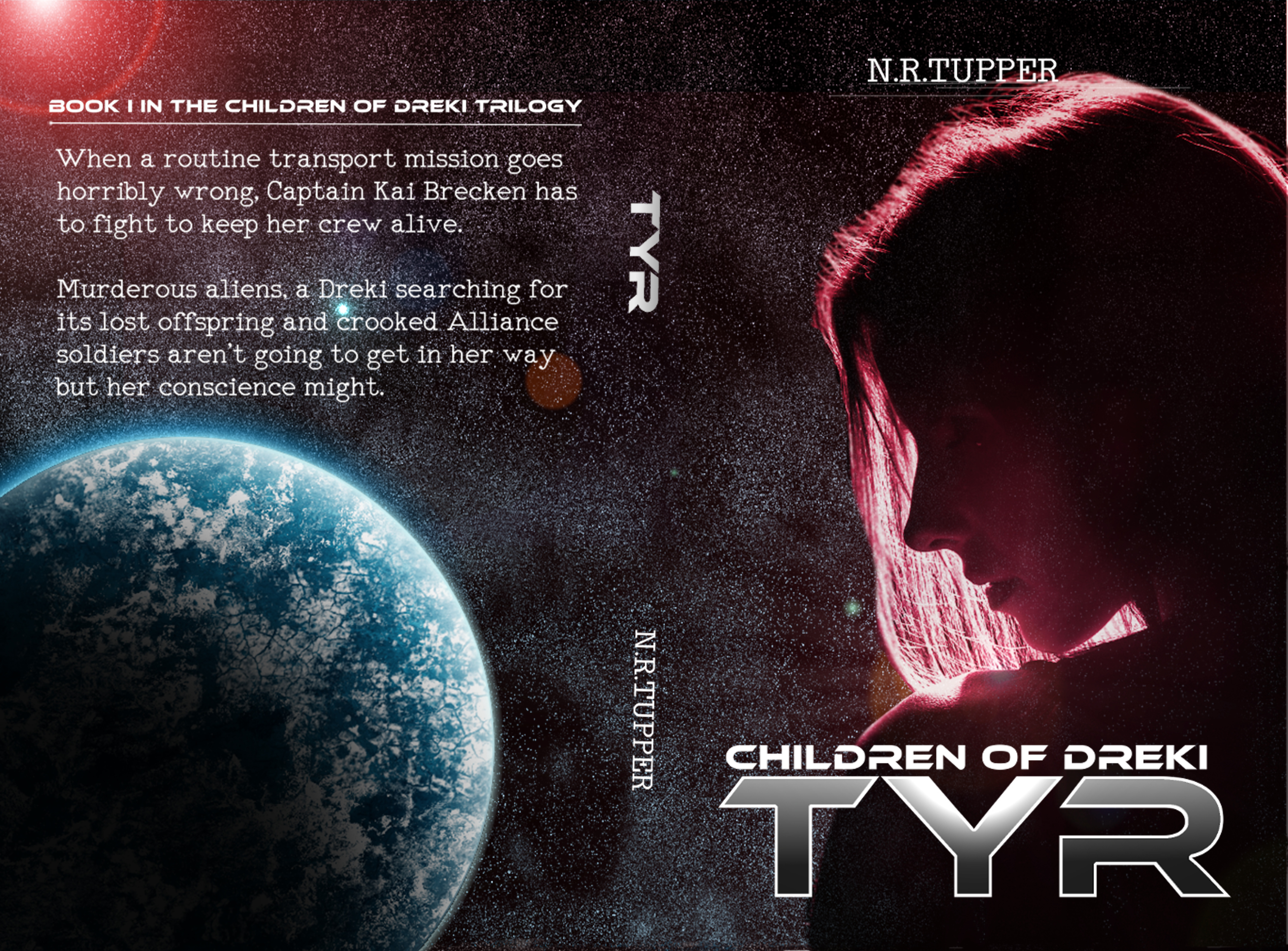
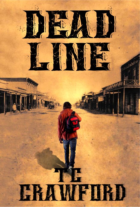
Dead Line is a time travel adventure, set in the current day and in the 1860s/1870s. The locale is Arizona, Tucson and its surrounds. It is intended for adult readers. Jon Hansen, a modern grad student of history, finds an old tintype photograph of an outlaw, Tom Dorin, who could have been his own brother, or even his twin. The only facts known about the man in the photo is his name, that he was a Confederate veteran of the Civil War, and the date he was hanged: March 13th, 1874. Intrigued, Jon decides to make Tom the focus of his thesis paper. His research slides into obsession, until he’s in danger of losing his relationships, his scholarship, and perhaps even his mind. Until the morning when Jon wakes up in a strange room, with a 19th century world outside the window. Everyone he encounters calls him Tom. Now, his scholastic deadline has become a very real dead line… For despite all his diligent searching, one fact about Tom Dorin’s life remains a mystery. On March 1th, 1874, WHY will Tom Dorin hang?

Cover6jpg

Cover6jpg

[original submission and comments here]

Nathan says:

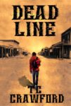
I like the idea behind this cover a lot better. (I should, because it pretty much follows my suggestions from the first submission. :))

I think this also illustrates the utility, if not the absolute necessity, of having a second designer for ideas and tweaks.

If I were handed this cover in PhotoShop and told to play with it, I’d experiment with the typeface (is there too much detail in it?).  I’d play with washing out the sepia further, to isolate the main character more.  And because he’s isolated by color, I’d experiment with making the figure larger or smaller.

I don’t know which of these options I’d choose; I’m very much a design putterer, especially when I get to final details.  So all I can tell you concretely is that this cover is better, but it could be better yet.

Anyone else have suggestions?

Control

The author says:

Synopsis: When one door closes another opens. An adage painfully true for Alexandria Shaw, who is invited to an exclusive club for a night of fun, but after meeting Landon Miller, she is left with a heart-pounding night that leads to a world of danger and a web of deceit. The novel is a mystery/suspense setting in current day.

Control

Control

Nathan says:

If an author sent this to me as a concept, here’s what I’d do:

  • Make the title bolder. “CONTROL” demands a more commanding font treatment.
  • Make the byline bigger across the bottom. (I’d probably also switch out that Trajanesque font.)
  • Add a grungy color shadow to the black.

Other suggestions?