Category: Covers

Wolf’s Cross

The author says:

Wolf’s Cross is an urban fantasy novel rooted in Norse Mythology. The series unfolds as the doom of the gods onsets. It will appeal to fans of Ilona Andrews and Patricia Briggs.
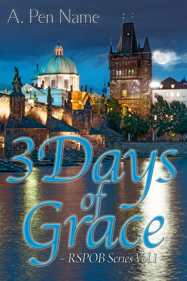
Pageflex Persona [document: PRS0000035_00033]

Pageflex Persona [document: PRS0000035_00033]

Nathan says:

It’s a very eye-pleasing cover. I don’t know, however, if it’s going to strike your target audience as something aimed at them.

My first thought when I look at this cover is that it’s a straight historical novel, a la Bernard Cornwell — not a mythologically-influenced fantasy, and certainly not something that belongs on the same shelf with Ilona Andrews…

andrews

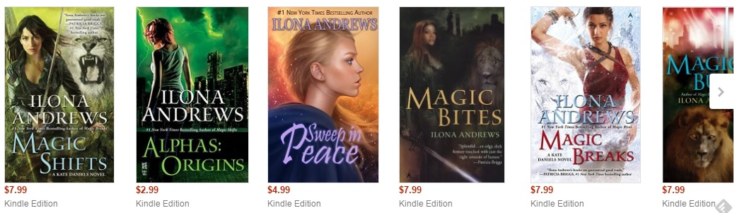
…or Patricia Briggs:

patricia

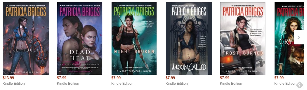
Does your book look like it would be brought to the Barnes & Noble counter in the same armload as these books?  If not, how will your target reader be able to determine — in the split second that he or she will see your cover before flicking his or her eyes to the cover next to it — that it’s meant to appeal to them?

You may think that getting more targeted cover art is gonna cost you an arm and a leg, but really, all you need (judging from these examples) is a colorful valkyrie. In fact, we recently had a cover here on CoverCritics.com featuring just such a character; the author had paid a small amount to use an artist’s pre-existing artwork. A quick search for “valkyrie” on DeviantArt gives me over 98,000 results. A lot of them are manga-influenced, and I’m sure a goodly proportion are artwork that was produced as work-for-hire and is just reproduced on DeviantArt as a portfolio piece, but there will also be plenty which the artist produced for the heck of it, and most of those artists would be happy to get fifty bucks for the right to use artwork that they had made in the first place for free.

Remember: Your book cover is a marketing piece. You gotta go after your market.

Free Apps and Hacks

The author says:

It is a printed workbook for web authors and writers who want to know where to go and try the best productivity apps – includes 150 sites, or video’s, infographics (social media image sizes for example) with space to write their own comments, or add their own apps they use – always carry it with you.

apps book cover final 3jpg

apps book cover final 3jpg

Nathan says:

I think you can guess everything I’m going to say by looking at the thumbnail. The title is hard to read, the subtitle is impossible to read, and the byline might as well be invisible.

This is the second nonfiction title with abstract imagery on the cover that we’ve look at in the last little while (here’s the first), and while there’s nothing wrong with abstract imagery per se, especially for a book for which there really isn’t an image or class of images that gets the point across, that also means that the text has to do the heavy lifting here — it’s got to inform the reader of genre and appeal, as well as give specific information on the contents of the book.  That means it MUST BE READABLE.

I mean, yes, it’s a neat image, but you really don’t have to be careful about covering up “important” details with text, do you?  Make the title large enough that it takes up two lines: “Free Apps / and Hacks.” Enlarge the subtitle so that it extends practically from edge to edge. And for heaven’s sake, don’t hide your byline in itty-bitty type. You wrote the book — let people know it!

We could squabble about specific font choices — I’m not sure the kindergarten-penmanship font works for the subtitle — but even that is secondary to simple readability.

Other opinions?

Ossie & The Babe

The author says:

My book is the true story of a quest spread over many years. I was given a vintage baseball photograph, and found it arresting in its stark simplicity and the intensity of its action. Two players occupy the foreground: a runner identified as Babe Ruth is sliding hard into third base, while an unidentified infielder crouches to apply a tag. Questions sprang to mind at once. Who was the infielder? Where was the game played and when? Why were the distant left-field bleachers nearly empty, if that’s Babe Ruth? Was Babe going to be safe or out? A longtime fan but a novice to baseball research, I set out to crack the photo’s mysteries. A few answers came easily, but others were more elusive. Out of thousands of old baseball photos, this one turned out to be one of a handful that have defied full identification even by dedicated experts. As so often happens, there were unforeseen complications and surprising revelations; there were side trails to follow and broader contexts to explore. Embracing all these has enriched the experience and has helped to elucidate why baseball occupies a special place in the fabric of North American society.

Ossie & The Babe front cover

Ossie & The Babe front cover

Nathan says:

Kinda nice when the subject of your book is an image, isn’t it?  You go into the design process knowing what you have to work with, at least.

Not having seen what the rest of the photo looks like, my first recommendation depends a lot on factors I can’t know, but I’m wondering if shifting the image right so that the player on the left is a little more visible (and a little more instantly recognized as a baseball player) might be a good strategy.

I also understand that blowing up an original photo is going to give you a fuzzy image — the problem is that we’ve seen so many fuzzy images without that rationale (i.e., people just not knowing how to process an image) that I fear some readers will just assume that it’s a poor image choice.  Are there any texture or flaws to the original image — scratches, dust motes, etc. — that would show more clearly that what we’re looking at is an enlargement of a historical photo, and further show that this is a faithful reproduction of a blurry-at-that-size photograph?  Does the original photo have any tinting, or any yellowing from age?  I think that should be included, rather than bleached out.  Shucks, even if the original image doesn’t have any tinting, I think it would be okay to “cheat” a bit and add a light sepia tone.

I like the font for the title, but I don’t know that the color scheme works.  On a black-and-white Kindle or Nook, the title is going to wash out into the gray background.  I’d play around with making “OSSIE &” darker and “THE BABE” lighter so they stand out better against their respective backgrounds.

And finally, I really don’t like the font for your subtitle.  You should keep with the theme of period typefaces; look back on some advertising of the period — especially sports advertising — and use that as inspiration to pick another font.  Or go for a good handwritten font; it would add the connotation that this is a personal quest.

Other ideas?


Functional & Funded

The author says:

This nonfiction book was put together and published through Bookbaby within the last year. It deals with the imperative to pursue operating resources that persists among most nonprofit organizations in the public and private sectors. Featured is a strategic combination of “business as unusual” along with often equally unusual common sense, derived from the author’s years as an acclaimed trainer among nonprofits. It is a workbook, if you will, for anyone in or around nonprofit fundraising, and that’s a passel of people.

12698609_10201657032543268_2887076427773804556_o (1)

12698609_10201657032543268_2887076427773804556_o (1)

Nathan says:

It looks great to me — professional, on-topic, business-like.

If I were forced to come up with suggestions, I’d have these two:

  1. Is there a possibility that potential readers will see the DNA and assume it’s a science book?  I don’t know that it’s a great danger, but as a possibility…
  2. “How to create the only proposal your organization will ever need!”  I’m not a non-profit guy, so maybe your potential readers will know exactly what kind of “proposal” you mean, but it seems a little vague to me.

Other comments?

3 Days of Grace

The author says:

Shortly after moving to Prague, Grace is attacked by a werewolf and has now 3 days to decide if she wants to go through with the transformation or not. The intended audience is more or less young adult with a sense of humor. I would especially appreciate feedback about the typography.

Big-Cover

Big-Cover

Nathan says:

[looks at description]

[looks at cover]

[looks at description]

Are you sure this is the cover to that book?

I mean, I know I’m not the target audience for a YA werewolf novel, but I’m pretty sure that a werewolf novel should give some indication of it being a werewolf novel… or at least not look like it’s something completely other than a werewolf novel.

All we’ve got is an Old World cityscape. That’s not indicative of genre, readership, or anything else that would allow a potential reader to identify him/herself as the target audience.

And the typography, as especially requested, is awfully gentle. Even if this isn’t a slam-bang werewolf action novel, it still seems gentler than is warranted.  Between the flowing script and the words “3 Days” and “Grace” in the title, I would assume that it’s a Christian drama at first glance.

(And “RSPOB Series?” That’s an entirely uninformative series name — once again, it’s not telling the reader anything about the novel. And given that this is the first entry in the series, it’s not like you can count on name recognition to bring in the returning readers.)

I think this is definitely a case of a bad initial concept… or maybe even no initial concept.  You need to sit down and think, “What would catch the eye and the mind of my target reader?  How would I use that half-second of attention before they move on to the book sitting next to mine to tell them that, yes, this IS a book that will interest them?”

Good luck.

Any other comments?