Category: Covers

Not a Hero

The author says:

YA Fantasy trying to turn the fantasy tropes on their heads. The main character doesn’t win the trial to become the hero and has to live with all that entails.
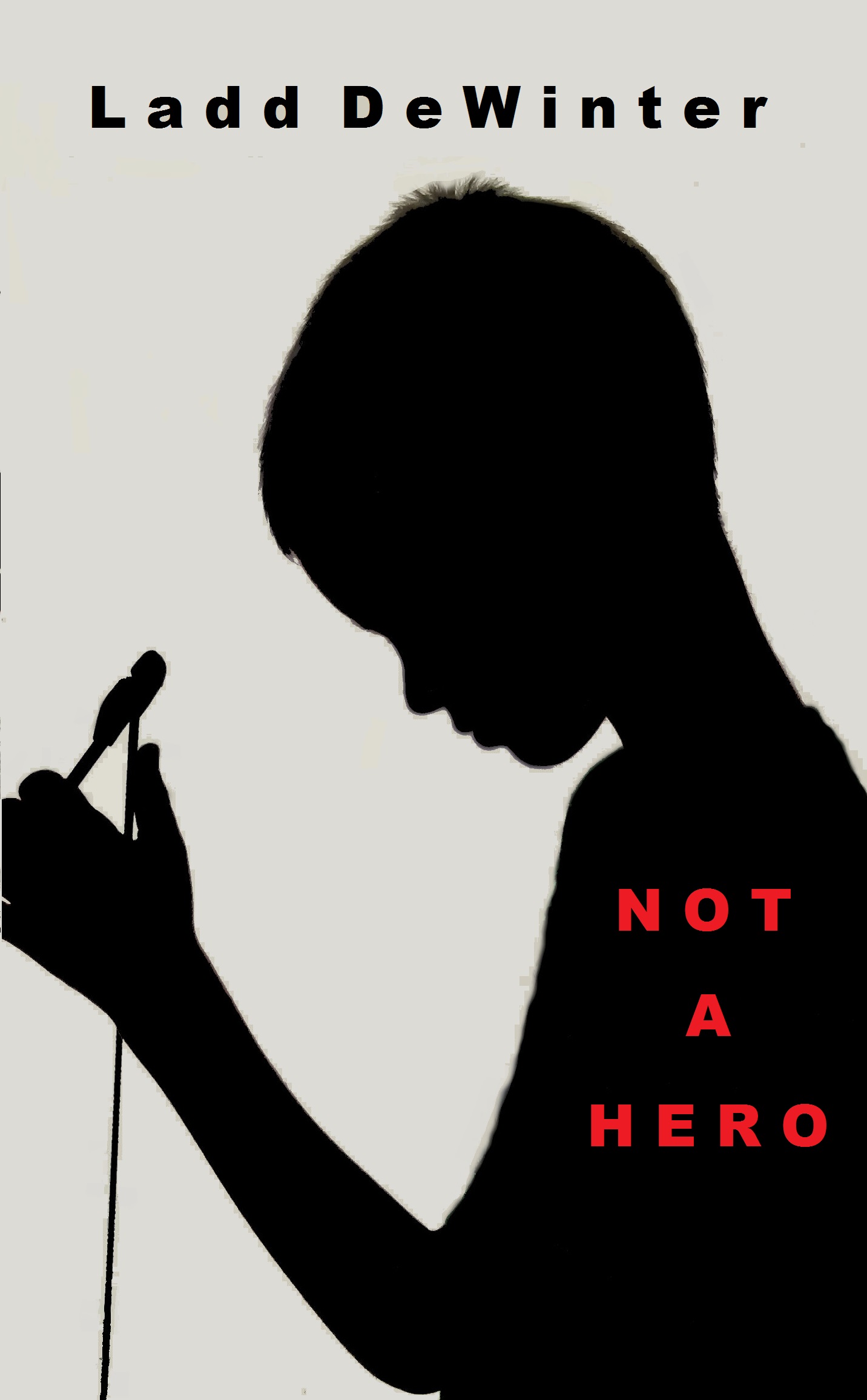
Not a Hero cover

Not a Hero cover

Nathan says:

More than anything else, we’re seeing a particular flaw with the book covers submitted here: They don’t look like the kind of book they are.

Take a look at this cover: Does ANYTHING about it say “YA fantasy?” No. I would guess that it was some lit-fic coming-of-age story, or maybe a memoir of child abuse. In other words, if I were a reader who would enjoy a subversive YA fantasy, nothing about this cover would tell me that it’s for me.

You need to rethink the concept, and you need to do it like a marketer: “How do I attract the readers who would enjoy this book?” Because otherwise, having this cover on this book would lose you more readers than having no cover at all.

The Dipole Dilemma

The author says:

A comedy sci-fi set in the far future when humans have spread across the galaxy. The book revolves around a hunt for an elusive ring, which turns out to be a portal. The book has absurd humour in it and the target audience is probably young adult, I’m going for the audience that enjoyed hitch-hiker’s guide to the galaxy.

Book Cover copy1

Book Cover copy1

Nathan says:

So where’s the funny?

Here’s a rule of thumb (I have many more of them than I have thumbs): If your book’s a comedy, something on the cover needs to tell us that.  If the title isn’t absurd at first glance and your name isn’t Douglas Adams, then the art or type need to clue us in.  Your title, while not non-humorous, isn’t funny in and of itself — and the font you chose makes it hard to read anyway.  And while the subtitle edges more toward comedy, it isn’t visible from thumbnail size.  You’re left with something vaguely science-y.

My own inclination would be to start over with a new image, but even if you didn’t do that, there are tons — oodles — craploads of humorous fonts you could try. Like this one. Or this one. Or this one. Those are from a two-minute browse through the top 100 fonts at only one font site. (And I’m sure that Hitch will show up in the comments with other recommendations.)

If your readers can’t tell that it’s a funny book, your cover is doing nothing for you. So funny it up!

Other comments?

Paradox: The Alien Genome

The author says:

The stunning love child born of a human and an alien holds the cure to a pandemic on Earth in her genome. While the humans await a rescue ship 25 light years from home, they must also keep the xenophobic aliens from exterminating the ‘abomination’.

This is classic science fiction genre of adventures in space centered on the characters. I designed this cover entirely myself using Word, Live Photo Gallery, and Paint layering three images which I credit in the front matter. I’m not sure about the pod, lower right. It seemed boring without it. Thanks for your opinions!

cover724-1

cover724-1

Nathan says:

The problem here is that while the main image says “SF,” it doesn’t say “SF adventure.” If I were to look at the cover and guess about the story, I’d probably think that it’s a tale of exploration and isolation like The Martian.  Take a look at how classic SF adventure novels marketed themselves; there was action, usually involving characters, not just spaceships.

That’s aside from the technical problems here: The spacing on the subtitle just looks weird, the font for the byline looks like it was chosen at random, the main landscape image is artifacted, and the pod is pretty clearly added to the image.

My advice to you is a common bit of advice around here:  Pick the books that you expect your readers to compare your book to, and look at how those books are marketed.  (Also look at how they were marketed originally, if they’re classics.) Covers like that are how your target readers are used to being marketed to.

Other thoughts?


The Unseen

The author says:

Lilly and her friends, Hannah and Erin encounter the Spirit realm. Consequently, worlds collide. Spiritual warfare becomes a reality when an unseen enemy stalks and attacks determined to steal their destinies and ultimately destroy them. Young Adult to Adult audience. Set in in the middle of two diametrically opposed worlds, the natural world and the unseen supernatural world.

The unseen front cover

The unseen front cover

Nathan says:

I like it.  I’m not sure how well it works for this book — I’m far more attracted to the cover than to the description, which leads me to suspect that this cover may not match this book perfectly — but I like it.  I think the byline could stand to be larger, and the obvious superimposition of the chain and cross on the forearm gives the impression that the entire forearm came from another source, but other than that, I have no comments.

Anyone else?

The Lost Soldiers of Thera

The author says:

Set 200 years in the future on a massive spaceship named the Aldrin. Obviously it’s Sci-Fi. The target audience is sci-fi fans that enjoy Battlestar Galactica and Star Trek. Do I need a picture of the Aldrin on the cover?

Lost Soldiers of Thera 2

Lost Soldiers of Thera 2

Nathan says:

Short answer: Yes.

Or people inside the ship. Or outside the ship.  Does it all take place aboard the Aldrin?  Are there space battles?  (The title has at least the implication of military SF.) Do they explore alien planets? Is there something you could show that’s more than just space?