The author says:
A comedy sci-fi set in the far future when humans have spread across the galaxy. The book revolves around a hunt for an elusive ring, which turns out to be a portal. The book has absurd humour in it and the target audience is probably young adult, I’m going for the audience that enjoyed hitch-hiker’s guide to the galaxy.
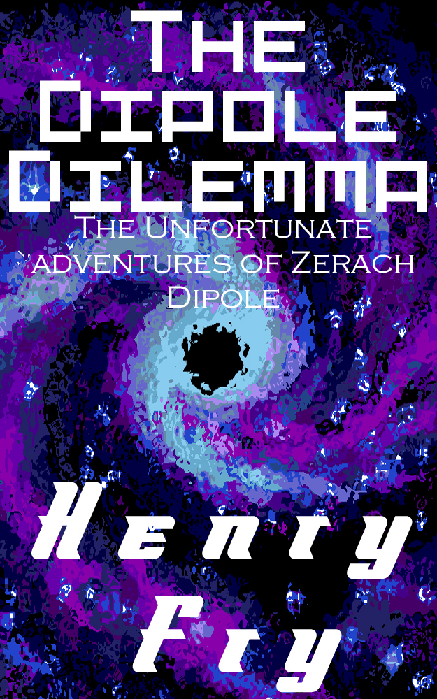
Nathan says:
So where’s the funny?
Here’s a rule of thumb (I have many more of them than I have thumbs): If your book’s a comedy, something on the cover needs to tell us that. If the title isn’t absurd at first glance and your name isn’t Douglas Adams, then the art or type need to clue us in. Your title, while not non-humorous, isn’t funny in and of itself — and the font you chose makes it hard to read anyway. And while the subtitle edges more toward comedy, it isn’t visible from thumbnail size. You’re left with something vaguely science-y.
My own inclination would be to start over with a new image, but even if you didn’t do that, there are tons — oodles — craploads of humorous fonts you could try. Like this one. Or this one. Or this one. Those are from a two-minute browse through the top 100 fonts at only one font site. (And I’m sure that Hitch will show up in the comments with other recommendations.)
If your readers can’t tell that it’s a funny book, your cover is doing nothing for you. So funny it up!
Other comments?
Humor is probably the hardest genre of all to do, since people don’t typically agree on what’s funny. As with Supreme Court justices defining obscenity, I know what humor is when I see it; and while I’m not sure from the synopsis what about this story would be humorous being shown on this cover, I do know this isn’t it. A big swirly vortex thing just isn’t funny, regardless of the style in which it’s presented.
A funny-looking font or three certainly may help, but you can’t grind without grist; you need something inherently funny-looking (like those eyeless raspberry-blowing smiley-faced things on Douglas Adams’ covers) to overlay with your font(s). Those smileys being (presumably) copyrighted and trademarked up the wazoo, you’ll have to come up with something else. What that something else should be depends a bit on what kind of humor you have in mind.
If this book is to be part of a series, you’re really going to have to bust your backside looking for a funny symbol you can make your own, and you don’t want it to be anything too similar to those Douglas Adams smileys or you’ll just come off looking like a cheap imitation. If this is a one-shot, you won’t need anything so repeatable to trademark, but you will need some kind of instantly recognizable visual gag. Think of your book cover as a kind of silent-running one-panel comic, and you’ll not be far from the truth.
In fact, some kind of one-panel comic line-drawing might be just what this cover needs. Despite the rise of “serious” Western comics and animation along with cross-pollination with mature-themed Eastern manga and manhua and anime and the like, seeing a simple line-drawing comic or cartoon automatically signals humor to a lot of Americans. Gary Larson’s The Far Side, of course, is one of the most famous successes in doing one-panel humor, but you might also look at some of the black comedy in Gahan Wilson’s macabre comics, or the runner-up John McPherson’s Close To Home comics (in which he really tries to bring back The Far Side‘s kind of humor and sometimes even succeeds).
Then too, this being the age of internet memes, you definitely ought to look into some of the funny pictures people are throwing around online for hints about what to put on your cover. In addition to getting such a visual gag, you might also want to alter your title to sound funny, or set off the humor of the picture. Just about any picture of someone with a facial expression that brings to mind the old “Where will you be when diarrhea strikes?” joke, for instance, is already pretty funny by itself; but it’s so much funnier if the caption says something like “Constipation, Baby!” or “Hemorrhoids Central Welcomes You” or “Zerach Dipole’s Toilet Paper Cut!”
See how this goes? Try giving us a face-palm or a pants-drop or a pratfall, or just about any kind of visual gag, and then come up with an appropriately inappropriate title to match. I’m already imagining things like Dipole Hates Himself, But Wants You To Love Him or Dipole’s Bipolar Adventure or It Sucks To Be You, Zerach Dipole.
Basically, clown around a bit with your cover’s whole concept, and see if anything that comes to mind sticks. With humor, even more than other genres, people need to see that genre splashed across the cover as boldly and brazenly as possible. Get busy taking your book’s cover as un-seriously as possible.
I had to ask the same question: “Where’s the funny?”
There is nothing about the cover that suggests the nature of the book you are describing. Throwing a Photoshop filter over an existing image is not enough.
You say that your book will appeal to readers of Hitchhiker’s Guide…perhaps you may want to browse through the covers of Douglas Adams’ books or perhaps those of other authors who write humorous science fiction and fantasy, such as Christopher Moore or Jasper Fforde, and see what has been done with their books.
There are serious problems with the typography, but until you resolve the issue of the cover image, they are moot at this point.
This is a very painful cover to look at. From the nearly illegible font to the graphic that makes me think of Microsoft Paint, it all just hits my senses like a Yoko Ono song. Nathan is right about needing to advertise funny.
That old saying that says, “You can’t or shouldn’t judge a book by its cover became false the day people started putting art on the cover of books.
I would go back to the drawing board and think about dynamic scenes or events in the book and try to reflect one of those on the cover. As of now it looks like a low budget self-published hardcore sci-fi novel, and I’m pretty sure your book is not that.
Shoot us another attempt. I’m betting you can do better. Good luck.
Funny or not, I really dislike the fonts used here. All of them.
Dang. It pains me to think that I’m so one-note.
This poor guy is going to think that I’m stalking him, because it just so happens that I chimed in, about his book, on the Kindle forums. I defended it, if memory serves, from some dope who castigated it simply because he didn’t know what a dipole was, and I liked the opening bits.
Now: there are only about a bajillionty comic/comical fonts that can be used for this. I agree, before we even go to that discussion, that the image is oh-so-not-helping. If you are stuck using stock art, and can’t go the Gary Larsen route (which I second, by the way), this might give you some ideas as to how you can skew existing art, to work for a humorous cover: https://pixabay.com/en/ufo-alien-alie-abduction-moon-544201/ (granted, everybody, I’m sure that the cow doesn’t think it’s funny.) Or this goofy looking bastard: https://pixabay.com/en/alien-vacancy-human-star-planet-1261682/ I mean, neither are really what I quite envision, but the green dude would get you headed in the right direction if you can’t go with a cartoon or line-art that’s custom. It’s feel, more than “this is what Dipole looks like.”
Back to my actual bailiwick: fonts. As I said, there are dozens if not bajillions. At Dafont, if you go to “comic,” you can find a host of them. The first two up, if you don’t use a filter, Badaboom and Adventure (particularly the latter) would work. DaFont also has a font called ‘Homer Simpson’ (guess why) that you could use for a Subtitle–not hefty enough for the title, and that would carry some of the feel you want.
I’ll post with some recs on fonts shortly. Oh, also: if you go with a blue/bluey image, thing YELLOW for the color for the text. Doesn’t have to be screaming Yellow Submarine yellow, but you’d be amazed at how much more bang for the buck you’ll get if you tint your lettering toward that hue.
(Laptop’s outta juice. Back soon…)
One note? Hardly. I simply defer to your expertise.
I was looking at some humorous book covers for inspiration on what to say – so far, I can only say: this is not it, I think others have articulated the problems well enough. Anyway, I came across this http://faceoutbooks.com/30th-Anniversary-Hitchhiker-s-Series which seemed interesting. Other humorous sci-fi classics include Bill the Galactic Hero and author Robert Rankin can be said to be too though often veers to fantasy. Douglas Adams, as pointed out, is famous enough to have any cover, but for the rest the cover has to do some work – on that note, neither the cover, fonts or the indeed name of RR:s ‘Nostradamus ate my hamster’ generally leave any doubt that this book is meant to be funny, in any of the editions. Look up some of those and maybe it will help to rethink the cover from the beginning?
Thanks for all of the feedback, sorry I was so late, I was on holiday. I’m definitely going to have another go at the cover with funner fonts that hopefully convey its humour, and try them out with a yellow tint. I’ll also try and have something humorous on the actual cover image itself.