Category: Covers

Self Reliance

The publisher says:

The audio (CD) version of the classic American essay, Self Reliance by Ralph Waldo Emerson.

selfreliancecover

selfreliancecover

Nathan says:

I think you can see for yourself the problem with the outlined type in the thumbnail: It makes it much harder to read.

Beyond that, I can only suggest that you include your own line from your submission, “the classic American essay,” under the title. And maybe a credit for the reader under Emerson’s name.

Beyond that, I’ve got nothing. Anyone?

Ash to Ash

The author says:

Natalie just wants to be normal, but after an almost deadly attack by a man named Ash, her life becomes anything but. Now she must save her sister from a literal monster whose made Natalie his number 1 obsession. Young Adult/Fantasy Novel

an-incredibly-poignant-piece-1

an-incredibly-poignant-piece-1

Nathan says:

This is a pretty good cover… but not for your book.

What I’m getting from your description is a suspense thriller, possibly with a paranormal angle.  The cover you’ve got is perfect for a young adult drama, but it’s got no suspense or excitement to it.  There’s nothing here to tell the target audience for your book that this book is aimed at them.  Look at the covers of the books that you’d expect the readers of your book to love as well, and see how your readers expect books to be targeted at them.

And a couple of technical notes:

  1. Having your byline in a white section tacked on to the bottom makes it look like an afterthought.  There’s no reason that your name can’t be in white across the model’s lower back — it’s not like you’re going to be obscuring any important details of the image.
  2. “Written by” is unnecessary. If you see a phrase and a name on a book cover, you know that the phrase is the title and the name is the author.

Other opinions?

Jon

The author says:

Genre SciFi

Audience 15 to 70

Jon

Escaping from his home world he crosses through the multiverse to hide on an obscure planet. Jon is arrogant and believes he can do anything that he wants including influencing the events on that planet. His android is the most advanced of its kind as well as being illegal on his planet tries to control Jon with mixed results. The bounty hunters are on his trail and if he doesn’t listen to the advice from his android he is likely to get caught. Jon rarely listens to anyone.

joncover-500

joncover-500

Nathan says:

So, is that Jon on the cover? The android?  A random alien who looks cool?  Why are we looking at what we’re looking at?

I very rarely find “portrait of a person” covers engaging, because they don’t show the character doing anything.  I get no insight into the character, and thus into the book, by his presence.

Also, everything is so dark, including the title and byline blending into the illustration. Even just reversing the colors in the type — orange characters with a deep blue border — would make it more readable and eye-catching.

Anyone else?

The World of Rigel Chase: Rise of the Shaper

The author says:

The World of Rigel Chase: Rise of the Shaper is the first of a series of fantasy adventure books for middle school kids and up. Rigel is a kid with a gift for talking animals, lush alien forests and powerful young warriors, but he never imagined he could make them all appear in his backyard one night. Thanks to a magic golden medallion, he can make the inhabitants of his imagination come to life and even transform himself into a flying superhero. But things take an ominous turn when Rigel and his new friends are hunted by sinister creatures who want his special powers, and the librarian who gave him the medallion has suddenly disappeared.

riseoftheshaper_final-full-reviewversion-jpg

riseoftheshaper_final-full-reviewversion-jpg

Nathan says:

Many of my comments center on the boy figure on the left:

  1. I understand that the shadow under his eye is supposed to be the result of the glow below his plane of vision, but he looks like a zombie.
  2. I don’t know what he’s looking at, but it’s not the floating medallion in front of him.
  3. Is he supposed to have a left hand on his right arm? Because that’s what it looks like.

My other comments:

I’m not in love with the border around the letters in the title, and I definitely think it should be removed in the subtitle.

Make your byline bigger! And the font it’s in clashes the the one used for the title and subtitle.

Other comments?

Steve’s Web

The author says:

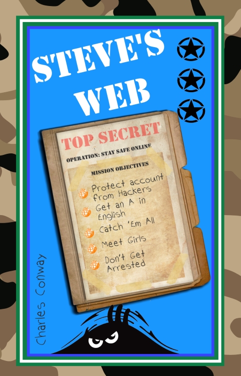
Steve’s Web is a book of short stories with a strong Internet Safety theme. The protagonist, Steve, tells his stories in his own words and relates how his online gaming account was hacked, how he convinced his English class (and himself) that Martians have already landed and how a virtual monster put him in hospital! The book is designed to appeal to primarily boys aged between about 9 and 14.

stevefrontsmall

stevefrontsmall

Nathan says:

Cute, but… YOU HAVE MARTIANS* IN THE STORY AND THEY’RE NOT MENTIONED OR DEPICTED ON THE COVER???

*or the possibility of Martians

Look at how middle-grade books are marketed.  They are not sold with text-heavy covers than don’t really tell you about the story or stories.  They are sold with clear, grab-your-attention titles, and clear, grab-your-attention artwork.

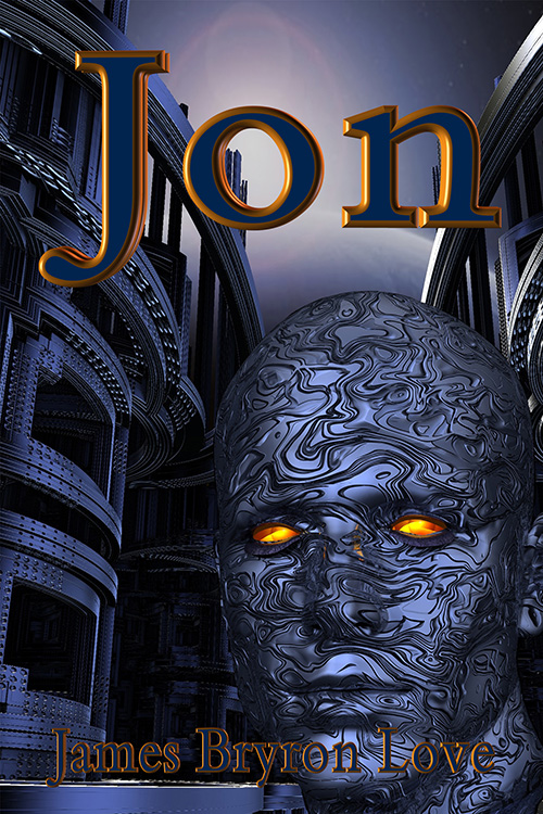
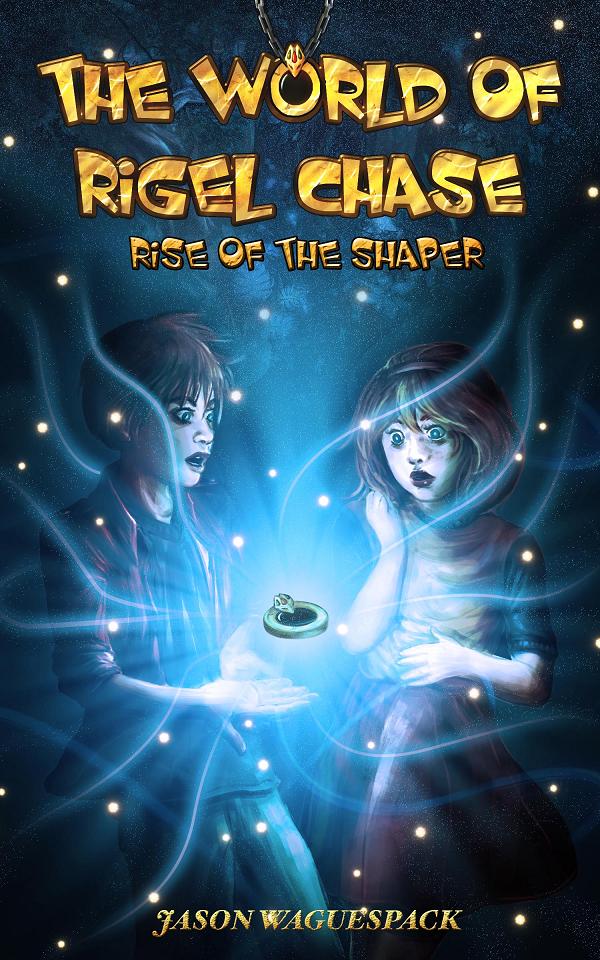
Here’s the top row of books Amazon is featuring for that age range:

shot0001

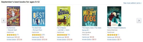
Clear, interesting text, and an interesting central image. This is how the target audience for your book expects books aimed at them to look.  Will they know that your book is also aimed at them?  Learn from your competition.

Other comments?