The author says:
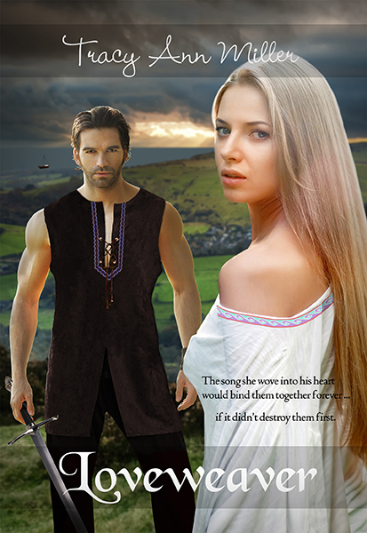
Historical Romance. The year 895. Slayde’s job as an top military leader of Kent is to rid England of the last of the Viking raiders. But Llyrica is no ordinary Viking. She’s a beauty with a mysterious past … and a talent for weaving song spells. Even as Slayde saves her from drowning, he knows Llyrica will be a dangerous distraction. Llyrica is now a stranger in a strange land on a mission to fulfill a deathbed promise. But she must also find her missing brother. This man, Slayde, known as The StoneHeart in his country, seems determined to block her at every turn. And yet she can’t help but be drawn to the affectionate, loving side of him that awakens when he sleeps – The sleepwalker. Unknown to both Llyrica and Slayde, each will use the other to accomplish their quests. Both will also fall under the song spell that she wove into the braid of his tunic. Will her Lovespell ensure a happily ever after for them? Or condemn them to a love that was never meant to be?
Nathan says:
It’s a fair-to-middling example of its kind: A historical romance cover which, while not terrible, screams “self-published.” Why?
- First thing I noticed: That male model. He’s almost as overexposed in indie covers as Jimmy Thomas.
- The edges of every element composited into the cover are distractingly crisp: It’s obvious at first glance that the man, the woman, and the landscape are separate images, that the sword isn’t really in the man’s hand, that there’s something funky about the man’s right arm and his tunic… My suggestion would be to try out a very subtle colored texture layer and see if it helps tie all the elements together.
- The type placement seems to be determined by desperation more than design. I appreciate the gray bars you used, especially beneath the title where it overlaps both dark and light backgrounds, but it still seems shoved toward the bottom. And is there a reason that it’s not larger? I think adjusting the size upward might take care of that “wedged out of the way” look.
- The font for the byline is not only hard to read at anything less than full size, it’s awfully twee for a historical romance.
Other comments?