The author says:
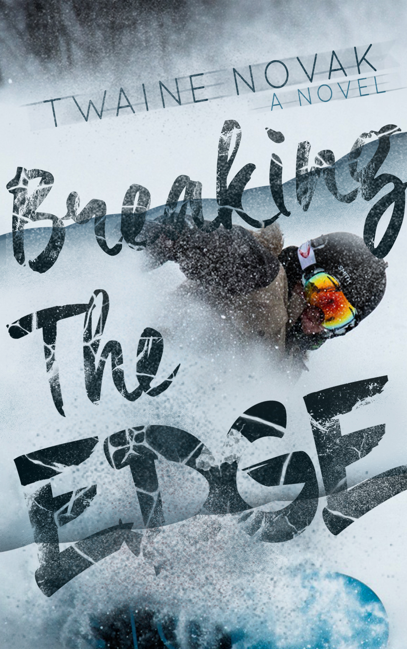
“Breaking The Edge” is a YA-NA, chick-lit novel revolving around sport and romance. I’m trying to pull readers who like Mariana Zapata’s “The Wall of Winnipeg and Me”, and “Kulti”, having the same genre as this story is. A story about the protagonist working in a ski-lodge dealing with her exhilarating father/employer and (hilariously aloof) snowboarder. Note : I don’t know, I’m new in this, and honestly I feel like the cover isn’t really telling about the story?
Nathan says:
Your fortune-cookie wisdom of the day: “Knowing that you don’t know what you’re doing is the first step to knowledge.” So there you go.
And remember, the primary purpose of a cover ISN’T to tell the story; there’s nothing wrong with it doing so, as long as it doesn’t interfere with the ACTUAL primary purpose, which is to attract the interest of readers who would want to read the book by signalling to them that this is the kind of book they like to read.
Actually, looking at the covers for the novels you cite, I think you hit the essentials for your genre –i.e., that it’s energetic, and that it’s sports-related. I think that the second edge you’ve put over the artwork (the one under the word “Edge”) breaks up the cover image too much; the dark lump at the bottom is unrecognizable as a foot unless one purposely studies the photo, because it’s dissociated from the rest of the person. I’d also like to see that right hand extending into the light space above “Breaking” — having both the hand and the helmeted head visible would help instant recognition of the figure as a figure.
One other thing: “Twaine Novak” isn’t the title of the novel, so “A Novel” shouldn’t be associated with it, it should go with “Breaking the Edge.”
Other comments?