The author says:
Enter a world where fiction becomes reality… When struggling writer Lucas inherited a mysterious book from his grandfather, he never imagined his own literary creations would spring to life from the pages. But after his fictional protagonist Easton escapes the book and begins exploring our world, Lucas finds himself trapped within his own magical story. Now, he must navigate a perilous fantasy realm, facing dragons, trolls, and warring kingdoms as he searches for a way home. But the line between creator and creation blurs as Lucas discovers the consequences of his writing extend far beyond the page. With each twist and turn, this gripping portal fantasy explores the power of imagination, and the bond between an author and his fictional characters. Can Lucas escape the book, and reclaim control of his life? Or will he be forever be lost in a world of his own making…
Nathan says:
I like the concept here. Let’s see if we can tweak it:
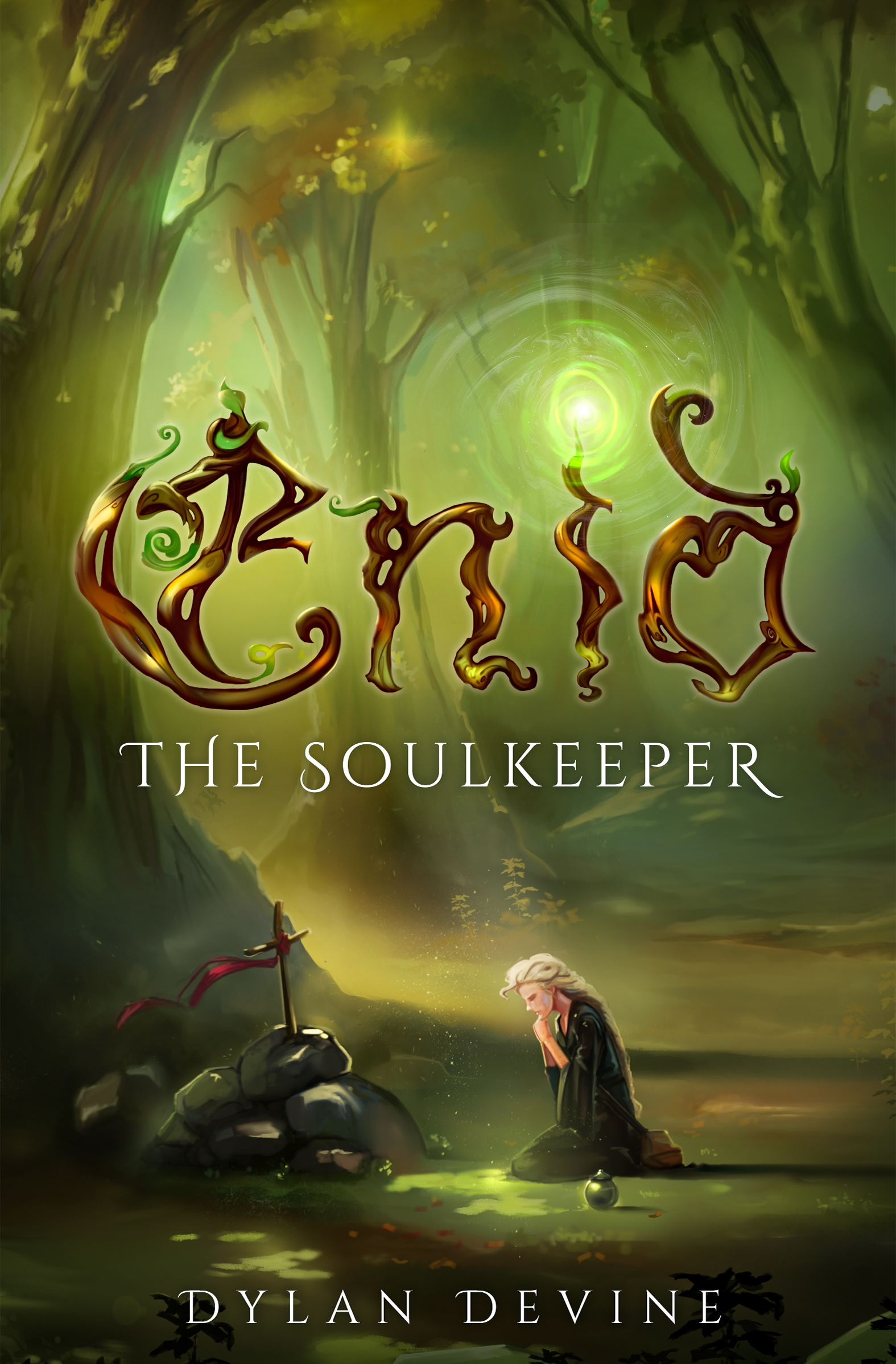
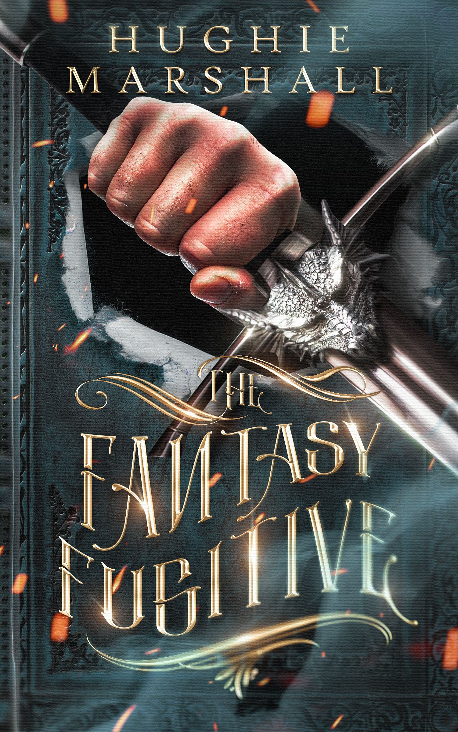
- As you can especially see in the thumbnail, the hand is a lot more immediately visible than the sword it’s holding; in fact, in the thumbnail, the sword is overlooked entirely. Reducing the contrast on the hand and making the metallic areas brighter could even this out; you’ll have to test it with various settings.
- The big problem here is that the title ends up being unreadable when you combine an ornate font, metallic effects, WordArt-style distortion… When I saw that there was also a reversed letter, I could imagine a reader saying, “Screw that,” and turning his attention to another book entirely. Remember that the primary point of type is to be READABLE. I would start with thicker letters (either a variation of this font, or another font altogether) and again, use the thumbnail as a guide.
Other comments?