The author says:
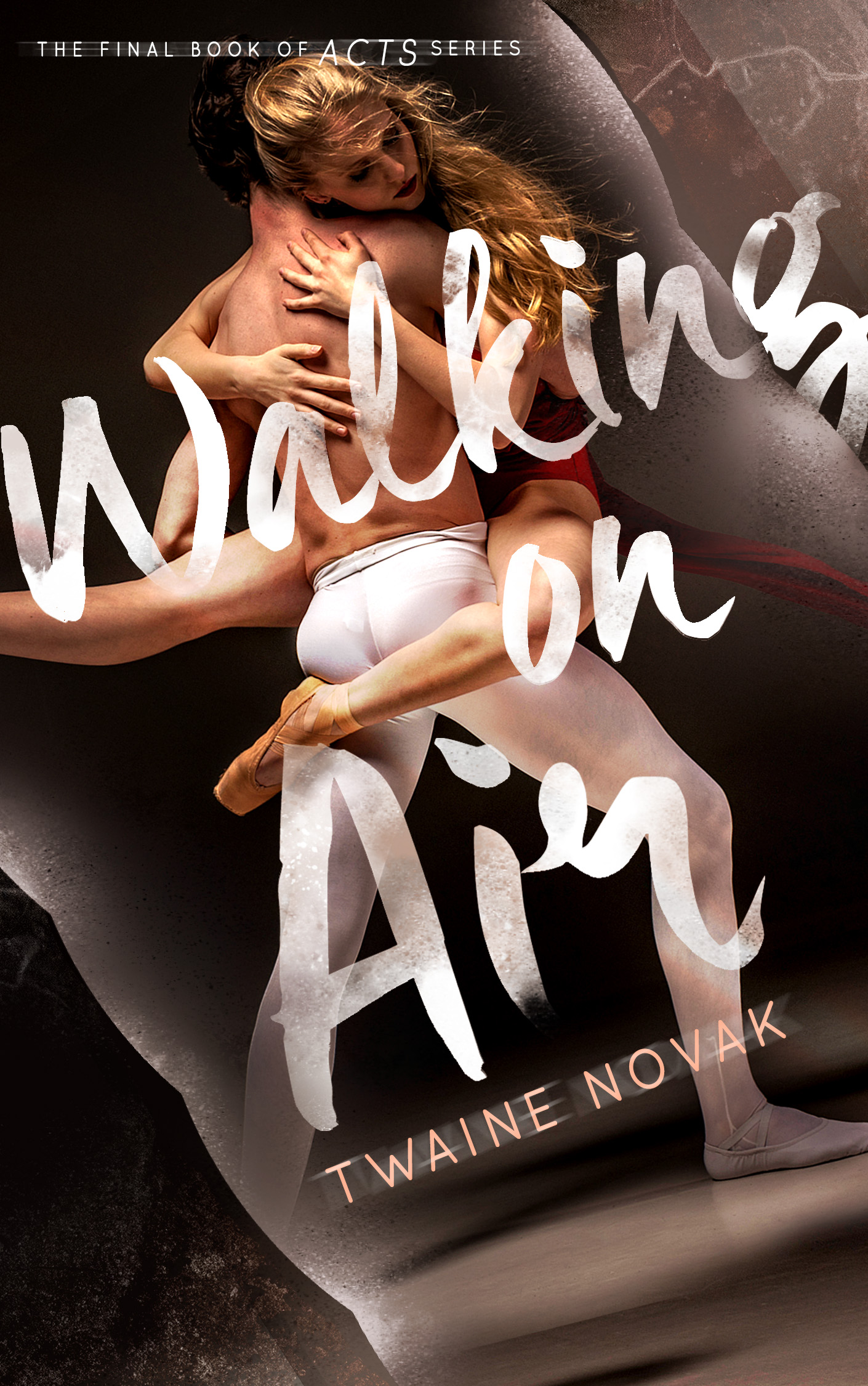
This is the continuation of the book “Breaking the Edge“. Still on the same genre as it is, sport-romance YA-NA, but this time, around dancing. It was said that “Breaking the Edge” was lacking of the ‘romantic’ feeling inside the cover, so I think of something like this?
Nathan says:
Yeah, I’m thinking you’ve definitely got “romantic” covered.
I can see that you deliberately kept the typefaces for both the title and byline, and good for you. That kind of continuity between books in a series is essential for branding. I don’t know if you changed the position of the byline on the Breaking the Edge cover; if not, you should put the byline in the same place on this cover as well.
Breaking the Edge had a limited color palette — not artificially, but simply because that was the nature of the photograph. I’d suggest that you use a similarly muted color scheme here: have the skin tones be the only vibrant colors here, and desaturate the rest of the cover to a large degree. Breaking the Edge also had distinct grain to the photo; I’d try to mimic that here, to maintain visual continuity.
Other comments?