The author says:
A small group of death Divers (hazmat equipped salvagers) pit wits against a group of armed mercenaries to retrieve an artifact from an irradiated and abandoned part of future Earth.
Nathan says:
Oh, goodie! I am totally the target audience for a book like this, so I can speak with even more authority than normal.
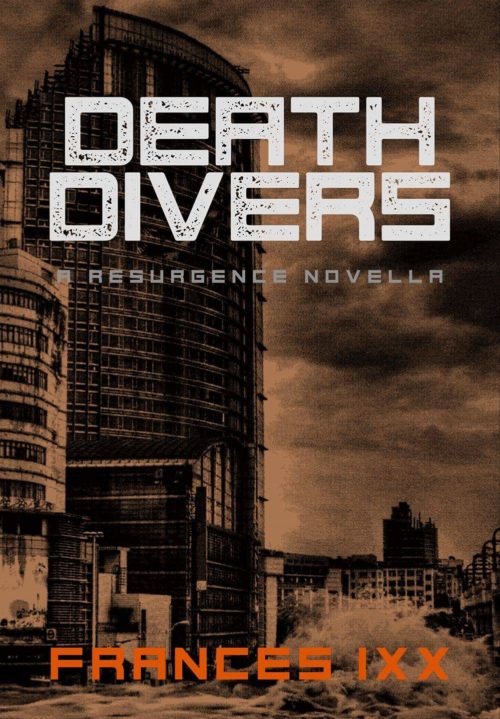
- The tan overlay makes everything murky. I appreciate that you’re trying to limit the color palette, but there should still be enough highlights and lowlights to make it stand out. (You’ve got the lowlights handled.)
- But the image itself isn’t very evocative; in fact, without the tan, it wouldn’t seem post-apocalyptic at all — none of the buildings seem ruined at first glance.
- I don’t propound “Always have people on the cover” as a hard-and-fast rule, but in this case, where your story isn’t just “someone wanders around the wasteland” but a conflict between two groups of people, there should be some hint of conflict or violence on the cover.
- Even at full size, the byline blurs into the background; in thumbnail, it’s almost hidden.
I think you might want to start over with a different image. The good news is that there are plenty of photos and digital paintings of armed people against a post-apocalyptic setting out there, and I bet you wouldn’t have any trouble finding a photographer or artist willing to let you use their work on an ebook cover for twenty or thirty bucks.
Other comments?


Katz mentioned this with a previous cover: When you use a grunge font you need to doctor a duplicate letter to make it different from the other. You’ll see here that the D’s and E’s are identical.
In this case you could do a quick and dirty treatment by just flipping the duplicate D and E vertically, since the font is otherwise vertically symmetrical for those letters.
The cover is first of all too murky—even at full size. In thumbnail size it all but disappears into a general brown blob.
Even if this were not the case, the cover really doesn’t seem to express anything of your description of the book. Yes, there is a splash of water near the bottom…but the eye tends to go toward the center of a cover…and there is nothing of interest there…certainly nothing that brings to mind immediately “an irradiated and abandoned part of future Earth,” let alone salvage divers. Yes, the image may recall this to someone who has already read the book…but that is putting the cart before the horse. To someone unfamiliar with the book, they would have a very hard time determining just what kind of book this is or what it might be about.
I think that before you start worrying too much about typefaces you should rethink the cover image.
FWIW I hadn’t realised the bottom part of the image was waves until Ron Miller mentioned it – thought it was a scrubby bush.
I know the title is Death Divers but with lots of buildings, and mention of hazmat suits I thought they’d be looking in the buildings, not under water.
If it is all about under water, then a dive boat in amongst damaged half submerged buildings? With a war boat thundering up firing at them?
If this is about diving underwater you can find lots of photos of wrecks on the bottom, if nothing else. A well placed radiation or haz-mat symbol somewhere in the composition, possibly a watermark behind the silhouette of a derelict ship, could be all you need with the right color palette.
I too thought the waves were bushes. Consider changing the orange filter to blue to bring water to mind. That way the orange titles would pop. I’d also raise the water level and sink the buildings and maybe tilt them a bit or find a better pic of half-destroyed buildings. I’d want the water level the main visual in the scene. I loved the idea of a boat, but it’ll be hard to make it ‘futuristic’ enough. You also need an element that brings ‘war’ to mind. Your subtitle is almost unreadable so maybe instead of gray go for a much lighter orange.
The flooded cities idea brings something to mind. Japanese sci-fi manga often deals with flooded city centers, it’s generally like cyberpunk with a lot of rust and decay. There could be useful visuals for inspiration purposes.
The manga Gunnm could be particularly useful, it had an entire culture based on salvaging in and around a gigantic scrapyard. It was marketed as Battle Angel Alita in the US.
I get that this is post-apocalyptic, but it could be literally any post-apocalyptic story. “Hazmat salvage divers” sounds cool and different. Show us that.
(I know, I know, by definition, if something is unique, you won’t be able to find stock images of it. But that’s what I’d really like to see.)
In firefighting, it is known as smoke diving, so there may be some stock photos somewhere? I found some pics from training exercises, like https://twitter.com/insmokediver – not very good pics for this, but something like that could be a starting point.
From the description and choice of imagery on this cover, I rather get the impression this is not a story of people actually diving into water, but of people called “divers” because their haz-mat suits (with air tanks, perhaps?) bring deep-sea divers’ suits to mind when people see them. That people would use this kind of slang in the future makes sense, and it’s a common concept in any story of the future. That said, I have to ask: where can we find a picture of the “divers” so described?
While having a picture of some big abandoned buildings for a background makes sense, you really need to show us at least one somebody in a “diver” suit in the foreground. In fact, if these salvage workers and mercenaries both chasing the same artifact wear different styles, it wouldn’t hurt to have one of each in the foreground. Also, while the use of sepia tones for your background makes a certain kind of sense, everything is blurring together in the thumbnail partially because it’s too dark: the effect you need to seek here is more “harsh blinding sunlight” than “dark storm clouds” over the desolate city you’re presumably portraying.
Basically, what your story requires for its cover is Fallout box art. Showing us the irradiated urban wastelands of the future is fine, but you won’t close the deal with your prospective readers until they get a clear view of who’s fighting over this wretched bit of real estate.
My thoughts are similar to those above.
I think the major problem here is that there is no real visual hierarchy – i.e. no one dominating element that grabs you. Something needs to take the lead.
It’s not going to be this photograph, as thee is no real focal point within it. I could see it working as more of a background with some fancy typography taking the lead – a really cool treatment of the title that sits bit and central and is used to hint at the content of the book where the image doesn’t (e.g. this kind of thing
https://s-media-cache-ak0.pinimg.com/736x/76/0b/57
/760b578148bf1c4eceafc9632ebaba32.jpg
But that’s some pretty advanced design work.
So I think you’re going to have to find a photograph that works harder and provides aa stronger visual (especially at reduced size).
I agree with Nathan that the presence of people on the front of the book would help, because it sets the tone better – a person in a hazmat suite carrying a gun lets people know it’s a plot full of action and conflict, as well as signalling the post-apocalyptic setting clearly. The above image doesn’t give much away.
There are plenty of stock images available that would be more dramatic cover fodder, e.g. https://www.shutterstock.com/image-photo/post-apocalyptic-survivor-gas-mask-destroyed-121884493?src=zjLj2LRjyIaOxwIrLIfjzw-1-82.
I would say that of course you’re not going to find something that conveys everything about your book in a single photo as your book is your own unique creation, even if it fits into a genre.
But you can find something that gets across at least a couple of the hooks that will draw people in.photo isn’t getting across; e.g. giving the words a water texture or a contrasting colour can indicate a lot.
Water texture for the font is an awesome idea. Makes me want to write something with a water theme.:)