The author says:
This is a non fiction how to business book geared to entrepreneurs who want to create online businesses.

Nathan says:
The biggest problems are those you can see in the thumbnail — or rather, that you can’t see: The entire cover is unreadable and unintelligible. The fonts are too neutral and unassuming, the orange-vs-teal color scheme doesn’t contrast in value enough for the subtitle to be distinct from the background, and the stock graphic doesn’t seem to have any relation to the topic — it certainly doesn’t draw in potential readers who would want to learn about online businesses. The entire effect is definitely not a passionate one.
There are a lot of online business how-to books out there. Your cover needs to be aesthetically appealing and easily understood, or else the eyeballs of your target audience won’t even pause on your cover before being drawn to the covers to either side of it in their Amazon search:
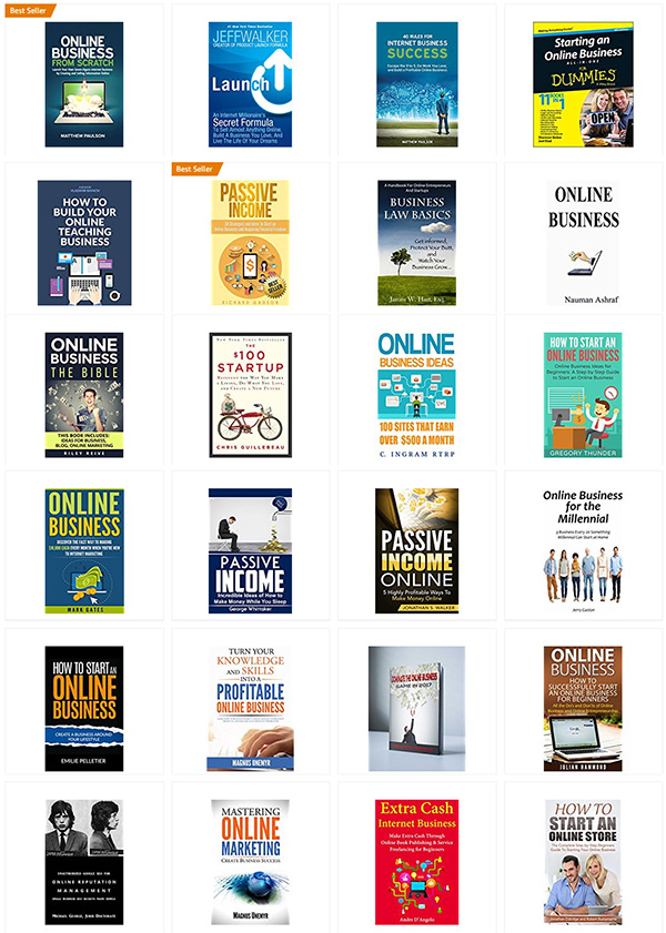
These are the covers that come up when I search for “online business” books on Amazon. This is your competition.
My advice would be to start again from the concept up.
(And as an aside, I have no idea what a “PMP” is, or why that designation improves your credibility.)
Other comments?