The author says:
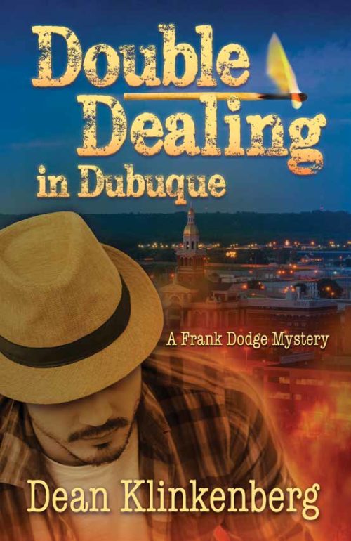
Double Dealing in Dubuque is a contemporary novel influenced by the noir mysteries of the past. Frank Dodge gets an assignment to write about the growing appetite for boutique food in the Midwest. When a fire breaks out at the food convention he’s attending in Dubuque, Iowa, two people die. Dodge suspects the real cause is being covered up by city officials. As he investigates, he gets drawn into a bitter dispute between two of the area’s craft food royalty, all while trying to fight off a rival writer intent on undermining his work. Double-Dealing in Dubuque delves into what can go wrong when feuds get out of hand. The book will appeal to fans of writers like Nevada Barr, William Kent Krueger, and Dana Stabenow. Peggy Nehmen created the cover art.
Nathan says:
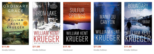
I love it when submissions here include specific writers whose audience is the same audience. That allows me to go to Amazon and see a gallery of their current covers.
Nevada Barr:
William Kent Krueger:
Dana Stabenow:
The first thing that jumps out at me? Crisp, clear, THIN contemporary fonts. Stabenow’s are the only ones that even use any serif fonts, and even they are both clear and thin. My takeaway from this is that your faux-typewriter font isn’t going to signal to your target readers that this book is for them, and the distress on the title is another false step.
The second thing I see is a lot of high-contrast cover images, with the text both dominant and stark in its contrast with the image, whereas yours concentrates on midtones and avoids areas of high contrast.
The third thing I see is that only seven of the fifteen covers above feature a human figure at all, and the only ones that could be said to feature a “portrait” are Stabenow’s “Kate Shugak” series book — and a little bit of checking shows me that those are reissue covers, not the covers that originally introduced the character. So I’m going to say from those examples that having fully a third of your cover space taken up with the bust portrait of the dude with the hat is the wrong way to go.
Your designer obviously has the technical skills to put a cover together; now you need to put your heads together to come up with a cover concept which targets your intended audience.
Other comments?


maybe this is pure coincidence but the books might be better if The Psychic and the Priest and Double Dealing in Dubuque exchanged there fonts they might look better. Am I the only on that noticed this?
I think Nathan is spot on, as are you in using other authors to pinpoint where your book sits tonally and in setting.
Just to talk about tone firstly, that’s the biggest thing missing from your current cover. You synopsis tells me that this is a mystery novel but whether dark and tense or relatively light and fluffy I still have no idea. Currently the elements are not pulling together to convey any kind of tone at all. I’ve gone through a couple of ways to create a more ‘dark and moody’. In my mock-up I assumed ‘dark and moody’ was the way to go and given some guidance on conveying that. Tone is probably the single most important thing for a book to get across. Well, that and genre, which is related. Everything else about your book – characters, events, even place – are things which your reader does not yet have any idea if they’ll enjoy. But if you can convey the idea that this book is dark and gritty, for instance, the people who like dark and gritty crime books will be happy to give it a go regardless of where it’s set or who stars in it.
As for setting, this quite related: the cover is certainly failing to convey any atmosphere in its setting, which I’ll talk about below, but I’d also point out it;s simply failing to establish setting in even a basic way.
I’ve never heard of Dubuque Iowa and and my immediate guess on glancing at the book was not Midwest America but UAE! I think it’s because the tower of the courthouse is the only bit of the photo that leap out and it looks like a minaret, and because the Dub- sound puts me in mind of Dubai. I might be an outlier in missing the mark by that much but bear in mind that you’ll be selling internationally, not just to people who know Iowa well. Setting is an essential part of any thriller, and its sounds like you have picked this place for good reasons. Those need to be signalled harder on your cover.
Party it’s the photo used that is the problem as it’s the kind of panorama that could be an awful lot of places in the world, but mostly I’d say it’s an issue of framing. The fact that most of the image is hidden is a big part of the problem, and the composition generally feels far too comfortable for a mystery novel.
Look at the covers of Kruger’s books, for my money the best of the examples above: the photos are very carefully chosen AND framed to convey the right idea of place and atmosphere. The bridge of ‘Ordinary Graces’ is evocative of a particular place but is also positioned low on the page and overwhelmed by patchy sky. Some of the other books use landscape in a way that is beautiful but also unfriendly and overwhelming. Human figures are dwarfed and isolated.
An innocuous photo can be transformed into something moody and tense with simple framing (and a few filters):
https://www.kathrynrosamiller.com/single-post/2017/06/13/Double-Dealing-n-Dubuque
The vital features here are that the setting feels distant and overwhelmed by an atmospheric sky. The town may look cosy and pretty, but we feel removed from it and but the dominance of the moody sky tells us this place is about to be overwhelmed by something bad.
You’ll notice I’ve also grabbed images that zero in on a few evocative details rather than have panoramas of the city. Between the bridge, the industrial buildings and the church/university/civic tower in that first one, a viewer can immediately place this setting as a big Midwestern Town, even if they don’t recognise the exact bridge and the Mississippi immediately.
It’s just one approach to take in establishing tone and setting. Another would be to find a more particular location that conveys the right atmosphere (a street-corner at night etc). But I’m aware that working with stock limits one (and quite frankly Dubuque seems like too nice and picturesque a town to have many ‘spooky’ images available!) so this is a way to use treatment and framing to lend atmosphere to photos they don’t have inherently.
And I would certainly get rid of the face. Nathan’s points out that the only time we see that device among the examples is on reissues of a series. That’s because by this point in publication, the character of those books has presumably become a selling point: people have read and liked at least one book featuring this character so it’s worth the covers stressing that it belongs to a series. That is not something important to your books, at least yet. So get rid of him and leave the space for stuff readers WILL find intriguing – the setting and atmosphere.
Outside of the reasons mentioned the only kinds of books that tend to feature photos of people on the front are romances. There’s various reasons around readers not liking to be told how to imagine characters etc, but suffice to say it’s generally not the done thing. Notice that even those Dana Stabenow covers really dial back the photo, cropping her halfway, making her monotone.
Your designer has put together a competent cover featuring well-done work, but she hasn’t quite got to the right cover for your book yet. I hop my comments contribute to the others here to help you guys get towards the perfect cover.
Hmmm…I’m struggling here. First, Nathan was evil, (Bad Nathan!) and stole my shtick; I usually chatter on about fonts. However, I’m strongly seconding what he said–the fonts are all wrong for this book, and the genre, and what you’ve described. What he’s pointed to is exactly right for it.
Secondly, my bigger issue is simply that this isn’t a Noir cover. It says absolutely nothing “noir” to me. It’s not even really dark, despite the dark(ish) sky behind the guy’s head. The covers that Kathryn did–the top two–are highly evocative of Noir, but unfortunately, this proposed cover doesn’t.
I appreciate that the character has been limned in that glow to create contrast, but…lose the character, lose the limn. It’s just all wrong. I wish I could say it’s not, but…it is. I’m your target audience, across the board (mysteries, Noir, PIs or Amateur Detectives), and I’d have walked right past this. Plus, the hat’s wrong. I get that she was trying for a fedora–sort of channel the 30’s-40’s–but it’s not working. The character isn’t conveying a Noir detective; he’s conveying an LA look. Not one related to Noir or Mystery.
(BTW: Nevada does her own covers, if memory serves. I think Julie Smith told me that; apologies to Nevada’s cover designer, if I got that wrong.)
Sorry–I know that this all sounds negative, and I don’t mean for it to. It’s a nice cover, but it doesn’t feel right, at all, for this book.
Good luck. I’d love to see the reworked cover. The book sounds terrific.
To be honest, my first impression upon seeing this cover was thinking that maybe a James Bond expy had gone Midwestern. A guy in the foreground amid blazing shades of orange and blue generally suggests action more than mystery in a novel. You want this to be a noirish detective novel, you’ve got to distance the detective visually from the action a bit; that’s why the people you do see on the various examples our host has provided are mostly “isolated figure from the back at a distance” shots or (in the case of Stabenow’s novels) “vaguely gloomy face off to one side” which is clearly not actually “in the frame” with the rest of the picture.
So feel free to save this cover for a story of a James Bond expy in the Midwest (which would be a rather original idea for a story, come to think of it), but go more for that ponderous “distant observer” shot that indicates your detective (in the tradition of all such stories) is trying to remain at some emotional remove from the situation in order to sort things out rationally and without bias. (Whether he succeeds or not at maintaining this objectivity depends on which direction you take the story, but that’s generally what he’s supposed to be doing, anyway.) As for the fonts, Nathan and Hitch have already laid out what to do with them for you: Stabenow’s choice and style of fonts, in particular, seems ideally suited to your project.