Category: Covers

RE:Play

The author says:

Colden Frost, nineteen years old gaming genius has always day dreams of ‘better’ worlds, like the ones in his games he plays – and wins. When he finds himself transported to a different world in a different persona, he is elated. But is it the world he has always dreampt of or a dark reflection of his own world encased in ice. A reflection that holds something much darker, much deeper? Will Colden be able to clear this game? Or will he be consumed by his own personal Ragnarok?

Nathan says:

You’ve got a good balance between “techno” and “archaeo” elements here.  However, the wolf’s head looks more juvenile than primitive.  You could play with filters to make it look etched in stone etc., or you could just replace that with an actual Norse carving of a wolf’s head.

The other thing I’d say is make the title and byline bigger; there’s no benefit to leaving unused space around them.

Other comments?

First Ten Days in Heaven [resubmit]

The author says:

NEW VERSION OF COVER

Michael Greyson awoke one morning feeling better than he had in years. Unfortunately, he soon learned he felt so good because he had died the day before. The upside to being dead was he made it to Heaven. The potential downside was he didn’t believe in Heaven, or God. Although Heaven is the last stop, Mike has one other option. This is a thoughtful story about being dead and Mike’s first ten days in heaven; helped by his guide Pete, no relation to the famous saint.

Audience is baby boomers seeking a better understanding of the meaning of life. It’s literary fiction.

[original submission and comments here]

Nathan says:

I think all of the original criticisms from commenters still hold true here: There’s nothing to catch the eye or indicate the contents. There’s nothing that makes the cover a promo for the book.

You’ve changed fonts, but this one has its on problems: the kerning (spacing between letters) is problematic, so that “FIRST” looks scrunched together while “HEAVEN” has visible gaps (often a problem between A and V).  And the italic version for Personal Wisdom and Simply Bob isn’t a true italic; it’s just that same font, slanted.  I’ll grant you that most readers won’t be able to articulate comments about “kerning” and “true italics,” but they will come away with the impression that, not only is the cover not intriguing or appealing, it’s also not put together very well.

I think your best bet is advice I commonly give: Seek out half a dozen titles in the same genre that you would expect to appeal to the same readers, and examine their covers to see how readers of books like yours are used to being marketed to.

Other comments?

Evaline Transcendent

The author says:

Genre: Science-Fiction (colonization)

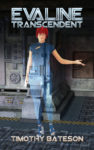
Back blurb: “Evaline is the shipboard computer on the Miranda Two, a colony ship destined for the planet Karman-III-Delta. She is possibly Earth’s last hope of establishing a working off-world colony. However, her predecessor stopped reporting home, so now she and the colonists must establish what happened to the previous colony.”

Nathan says:

What we’re seeing here is the common problem of being too close to the book. You’re the author and you know it inside and out, so the cover seems appropriate to you because it matches an image that you know is in the book.

But look at it from the perspective a potential reader — one who would enjoy reading the book you wrote — and ask, “What does this cover instantly convey about the book?”

Not much. Something science-fictiony, yes, but that’s a big arena.  In the thumbnail, I can see that there’s technology, and a redhead.  I may not even realize that she’s transparent (or I may just assume that she’s part of a semi-transparent collage — what we call “layers upon layers” over at LousyBookCovers.com).

At full size, I really don’t get much more.  I might understand that she’s a hologram in that techno-industrial setting, and I may even get, from her binary morph-suit, that she’s an A.I., but probably before either of those my takeaway will be that she’s a rendered figure from Poser or similar software… and that will probably be a strike against you, because so many indie publishers think that Poser-generated covers are adequate (they’re not) that they also have their own category of “pseudohumans” at LBC.com.

Nowhere do I get “colony ship” or “mysterious lost colony” or anything that would be an honest draw for your target audience.  (And honestly, the title itself doesn’t help; it tells me nothing.) From the summary, I would expect to see a massive colony ship in space, or — and this would definitely get my interest more — humans in shiny space suits looking down on the overgrown ruins of a colony on an alien world.  (In my mind’s eye, the illustration is by Bob Eggleston. For what it’s worth.)

Remember: Your cover is a movie poster.  Your cover is a daring flash of ankle. Your cover, as an esteemed commenter on this site so succinctly put it, is clickbait.  What it needs to say is, “Check out what’s cool over here!” and show something that the target audience for the book would think is cool.

Other comments?

Rabbit Girl

The author says:

Would you abandon your best friend to save your sanity?

“Have I gone mad?”

“I’m afraid so. You’re entirely bonkers. But I’ll tell you a secret. All the best people are…”

Lissie has long had more than her fair share of problems. For one, her only friend is a six-foot white rabbit called Lewis. Add to that a childhood traumatised by schizophrenia and Lissie generates enough material to keep a whole team of psychiatrists busy for years. If she is to recover, Lissie must be prepared to give up the only friend she has ever known. However, getting rid of Lewis is no easy matter…

Nathan says:

I think what we’re seeing is a common problem when an author designs her own cover: She tries to represent the whole book up front, instead of narrowing it down to a single engaging image designed to appeal to her target audience.

Some specific problems:

  • The font Papyrus has been so overused and misused over the years that it makes readers instinctively recoil.
  • You misspelled “Lewis Carroll.”
  • You have a center to your image, but then you mar it by putting the title right across it — the words and image war for attention.
  • The silhouettes in the lower left are not only in a distinctly different style from the rest of the image, but the impression of adults embracing (with one wearing rabbit ears) unfortunately connotes all of those head-scratching paraphilia-porn novels of the last couple of years.  Sad, but true.
  • The description makes it seem like a darker version of the Jimmy Stewart movie Harvey; the cover instead paints it as an Alice in Wonderland fanfic (of which the world has far too many).  The readers who would enjoy the first won’t be attracted by a cover that promises the second; the readers attracted by the promise of the second will be annoyed at receiving the first instead.

Other comments?


The Belief Algorithm

The author says:

The Belief Algorithm – How to be the Alchemist of Your Life

Belief _ how what you believe can determine you success and if you believe in yourself you can win and succeed

Environment – how your environment and the people you hang out with can determine your level of success

Law of attraction – how what you focus on can determine how successful you are.

Ikigai – your why and motivation. How to use this to be successful in your life.

Emotional Intelligence – how emotional Intelligence can lead to success. It is a better predictor of success than iq as per the research

Focus and failure – how to use focus and failure to achieve duccsss in your life

All the letters of belief stand for a way to achieve success in an area of your life

Next chapter is bridging the gap

Bridge the gap between beliefs and achievement through hard work, dedication, persistent, passion, etc. This chapter discusses other areas to work in such as discipline, etc to achieve succsss

The book is a self help, personal development/self improvement book intended to show people how to be the alchemist of their own life and create the life they always desired. I hope that makes sense. I can answer any questions you have related to others parts of the book. I discuss gratitude and perspective as a way to achieve success and how my beliefs around not wasting time, implementing with a sense of urgency and taking action with uncertainly can ultimately lead to success. Thank you for your feedback Looking forward to reading it

Nathan says:

While acknowledging that I’m not the target audience, I think this has winning elements. My only two recommendations:

  1. Add either a border or an off-white background so that the edges of the cover are visible against a white webpage background (as most ebook vendor sites have).
  2. Strengthen the word “Algorithm” (either make it darker, or add a dark border) so that it’s readable in thumbnail.

Good job!

Other comments?