The author says:
young adult urban fantasy
Nathan says:
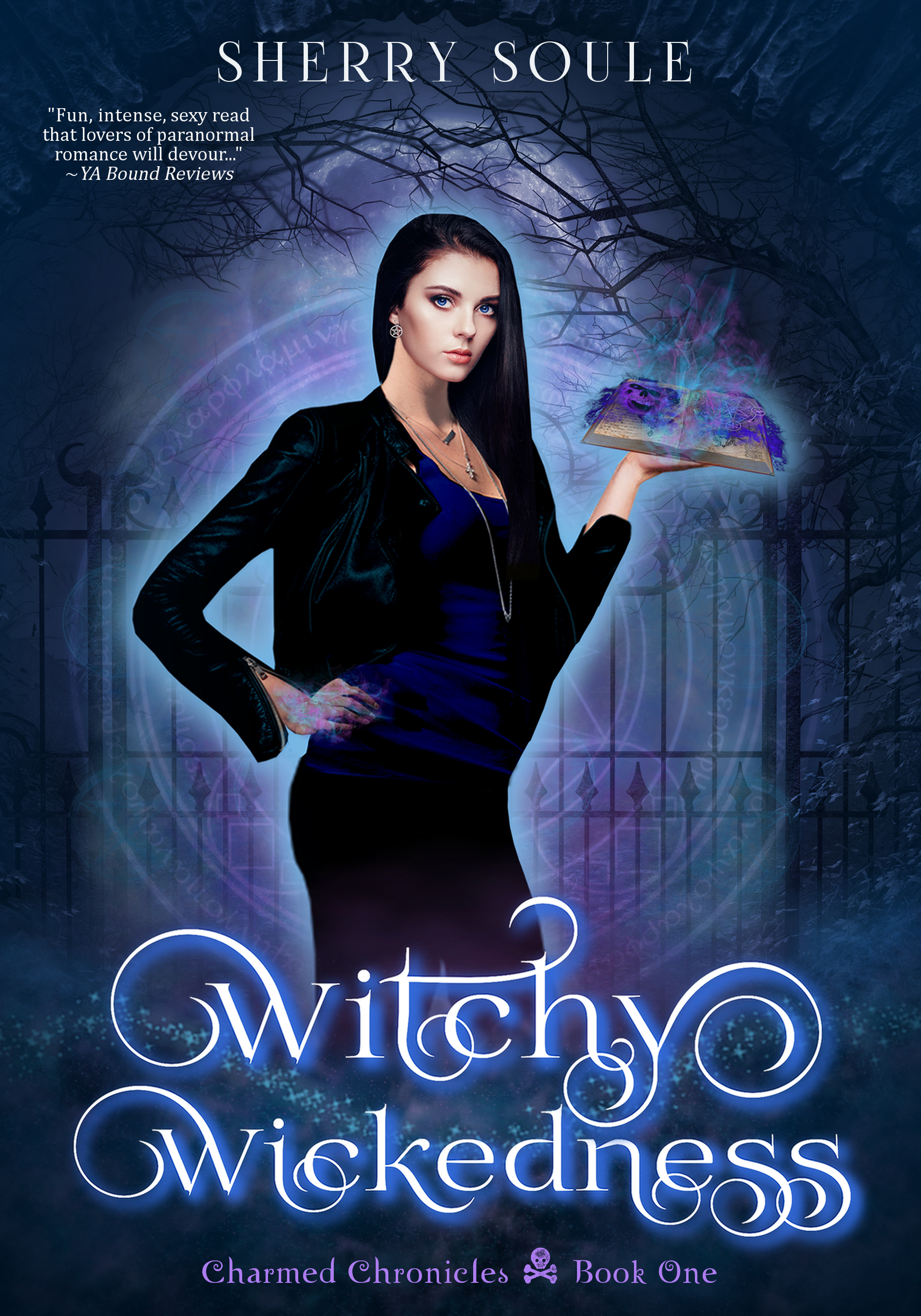
It certainly hits the spot for the genre. Here are the refinements I’d make:
- The title font is a little hard to read because of the ornamentation. I wouldn’t swap it out, but I’d enlarge it so that the curlicues on either side of “Witchy” extended off the sides — that would focus attention on the actual letters.
- In fact, most of my refinements would be “make it bigger” — there’s no reason that the byline shouldn’t go from side to side, and if that crowds the reviewer blurb, that’s fine; it could move down to the space beneath her left hand (and move to a bigger font size itself).
- Speaking of her left hand… That’s my one real complaint. Aside from the book’s lack of shadow, I have no idea what’s going on with that book. Is she using a steaming Halloween wig as a bookmark? It may be something that makes sense once I read the book, but this is the wrong place for that.
- The only other thing I’d play with is the glow around the figure; it looks too “out of the box.” I’d play with either reducing it to the bare minimum I need to separate her from the background, or adding a texture to it.
Other comments?