Category: Covers

I, Animal

The author says:

Q: When trusting your baser instincts threatens to stirp your hold on sanity, who do you turn to?

A: A turkey in the woods.

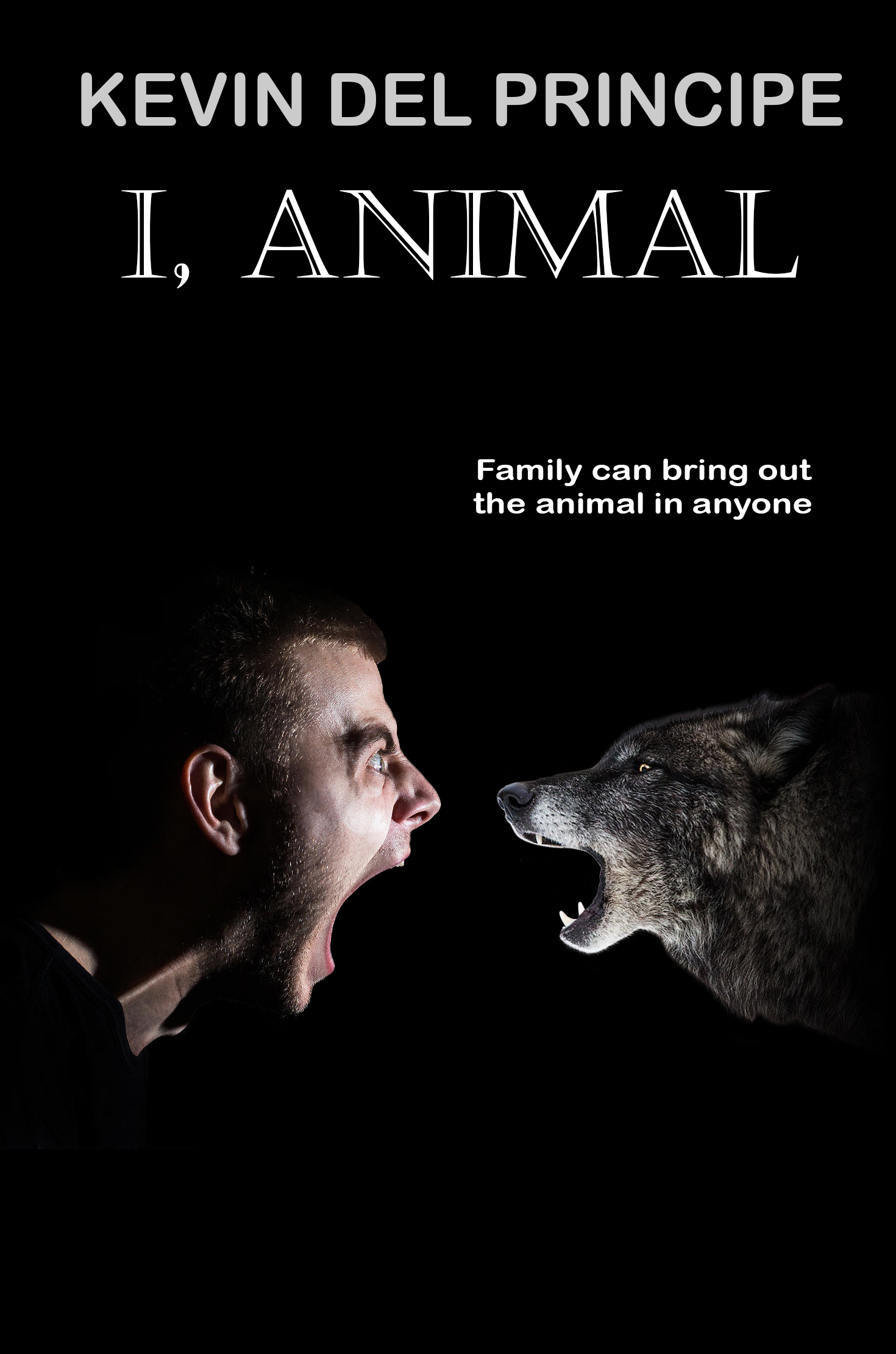
A primal force awakens in Tommy after learning of his mother’s impending death. She’s all right, not in the hospital on life support or anything, but her days are numbered. Returning to Buffalo made all kinds of sense, but Tommy’s efforts to “take care of” his mom faceplant when she refuses to let him help around the house. He teeters on the cusp of crashing into old patterns – but this canine has learned a few tricks since leaving for LA. Tommy engages his writer-brain in passing the time concocting elaborate plots, second-guessing his cousin’s livelihood – certain something more nefarious is brewing. And yet, who is he to point fingers when waking up covered in dirt with no memory becomes a regular “thing”. Amidst a neurotic, potentially psychotic, break Tommy is forced to face a past ready to plow right into his future. Reminiscent of Salinger’s Catcher in the Rye, I Animal immerses you in the head space of a Xennial neuroses.

Nathan says:

I wouldn’t blame anyone who picked this book up thinking it was a werewolf novel, and felt gypped when it wasn’t. Wolves and wolf-like dogs have become a signifier of a very specific segment of books these days; use them only with caution.

I don’t know that I can see The Catcher in the Rye in your description, but I’m guessing that, if not exactly humorous, the tale being told is wry and sometimes ironic. Yes?  Then that’s what you should play up on the cover, not darkness and conflict (and wolves).  I have no idea what the “turkey in the woods” has to do with anything, but a man and a turkey having a screaming contest (against a different background, and with a less self-consciously “epic” title font) would probably fit the bill better.

Other comments?

Everything We Dream

The author says:

Set in Boston current day timing, Contemporary Romance. readers: women 20-65 age group. This would be directed at the same kind of audience as Nicholas Sparks, Romance but giving attention to other issues such as adoption, etc.

Young woman of 18, meeting and falling in love with medical resident of 23. As a baby she was adopted, but due to circumstances, reunited with her biological father early in the series. She has gone through reunification with biological mother and other serious issues such as anxiety etc, again earlier in the series.

Nathan says:

Given that this is fifth of a series, I looked up the previous books to check the branding (here, here, here and here), and with that in mind, this book looks like you’re bullseyeing the branding perfectly. I don’t think there’s anything you need to change on the front. (The back looks pretty wordy to me — I’d be more comfortable with half as much text.)

Now, if you’re ever looking for changes across the entire series, I’d experiment with pushing everything just a little lighter, just a little warmer/pinker.

Other comments?

The Platinum Tail

The author says:

Book Description: A young light-gray cat named Narmel gains a platinum tail and learns to use it, while trying to find out secrets about a magical disaster called “silver storms”. The setting is in the land of Starnovia, where different animals are inhabited. This is a fully illustrated cover design, and not a quick concept demo. The rest of my book will have illustrations as well.

Genre: fantasy-adventure

Target audience: Young Middle-Grade (ages 9-10)

Nathan says:

Nice artwork, but shouldn’t the tail be waving in the air, as if it’s important?  I think you’ve also got waaay to much dead space; let the cat take up more of the real estate. And the lightning bolts… don’t look like lightning bolts.

The font for both title and byline is a little thin to be read easily, and too ornate to be read easily by your target audience.

And the back cover’s DEFINITELY more of a wall of text than middle-grade readers want to see.

Other comments?

Oops-A-Navy

The author says:

She thought he was neurotic. He thought she was psychotic.

The Navy thought they were the perfect pair. Shelby Ryder is a loose cannon. A Kansas farm girl, she became a Navy SEAL to avenge her parents, who were killed on vacation when a Russian sub torpedoed their catamaran. Earl Bernstein, from Chicago, became a SEAL to get away from his over-protective parents. Earl’s the sensitive type. He writes poetry and worries about his teeth enamel eroding. The Navy thought by pairing them together they would balance each other out. They were wrong. After brushes with the law and staying just this side of sanity, Shelby and Earl are on the verge of being de-SEALed. Now they’ve been given one last chance to redeem themselves. It’s a simple enough mission: they’re tasked with finding a United States senator who disappeared in Cuba while playing golf. But then one day the president tweets that the Russians are responsible, and things get hairy in a hurry. Soon it becomes clear—if Shelby and Earl don’t get the senator back, the situation will escalate into a nuclear war. So into the steamy Cuban jungles filled with snakes, spies and a German tuba band, the pair ventures, breaking every rule of civilized behavior known to man as they desperately try to find the senator before the missiles fly or Earl runs out of anti-cavity rinse.

This is what I would like to think is a final image. It’s not a quick concept demo. Set in Cuba now.

genre: humorous thriller

target audience: people who like over-the-top humor

similar authors: Carl Hiaasen, Tim Dorsey

Nathan says:

Hmm. Something about it says “memoir” or something similar to me.  The title and tagline point to comedy, but the graphic elements don’t convey humor (which is tough to do).

I took a look at covers by the authors you mention, Carl Hiassen and Tim Dorsey:

I can see where you drew on them for inspiration, but I think you missed the part that conveys humor. The images on the majority of covers from both authors are more than a little cartoony, and the majority of the fonts are either more chaotic than yours (which could be solved by shifting the letter positions, etc.) or more whimsical.

I think you’re on the right track.  You just need to bring the funny.

Other comments?

Function Overload [resubmit]

The author says:

 Following the advice of some commenters (thank you to all who the took the time, it really helped!) I went back to the drawing board and redid both covers for my series. I think the backgrounds work, but I’m having some trouble with the text and how to set it off a bit more. Maybe a color overlay on the text? Maybe I don’t need to? I’m trying to keep things a bit more simple but I may have gone too far. I am also unsure on the font itself. A more bold, less disintegrating font, may be better and simpler.

Genre: Cyberpunk, Sci-fi.

Elevator pitch: In the second novella, a night of playing a VRMMORPG turns dark when one of Ragan’s friends doesn’t wake up after being captured by a raid boss. Using her skills as computer security cracker she will have to figure out what is trapping people in the game, and for what reason before time runs out.

First cover redone: https://imgur.com/a/Onqw2mI

[original submission and comments here]

Nathan says:

It’s definitely a much bolder concept for a cover. With some tweaks, I think it’ll be perfect.

I think the main problem with the title font isn’t so much the distress, it’s the proportion.  With a long word like “FUNCTION” displayed vertically, it ends up being confined to the far left (in contrast to the redone first cover, where the vertical “DATA” dominates nicely).  I would try stretching the font horizontally by maybe 20%, and see if that gives it the visual weight you need.

As far as making the title pop from the background, I think the solution is simple: darken the background and use pure white for the type instead of off-white.

Other comments?