The author says:
This is a sequel to the book “Legend of the Dark Star: Year One”. It follows the characters on their journey to track down the enchantments on the powerful weapon in order to be able to disenchant them. The journey continues through a High-Fantasy world with a dark main plot and a lot of different sub-plots. The main plot kicks off with an unknown terror that grips a village known as “The Virgin’s Vale”, every once a year. The protagonist heads over to that city with his followers going in after him to help him in his battle. Being a sequel, it should appeal to the readers of the previous book, mainly, Teenagers and Young Adults. This is a preliminary design concept and I’m open to all sorts of suggestion, even a complete redo if need be.
Nathan says:
I hope you trust us enough now that you’ll listen when I say, “Absolutely not.”
Even if the technical deficiencies in the artwork were corrected, it’s such a different style from the first cover in the series that it works against any possible series branding.
Your first cover features a strong central figure against pretty much no background, and deep colors in a limited range. You should replicate those features in every successive cover in the series. You can obviously shake up the specifics — for instance, this one could be an armored rider on an armored horse, with a maroon background — but there definitely needs to be visual continuity between the first and second covers.
Other comments?
I thought the art for the first cover was pretty strong. The other things, not so much. I agree with Nathan, So Much, about the author branding. Can you go back to the same artist? Use the same fonts and everything. Branding, especially for a series, is very important.
It certainly is a jolt seeing the two covers together.
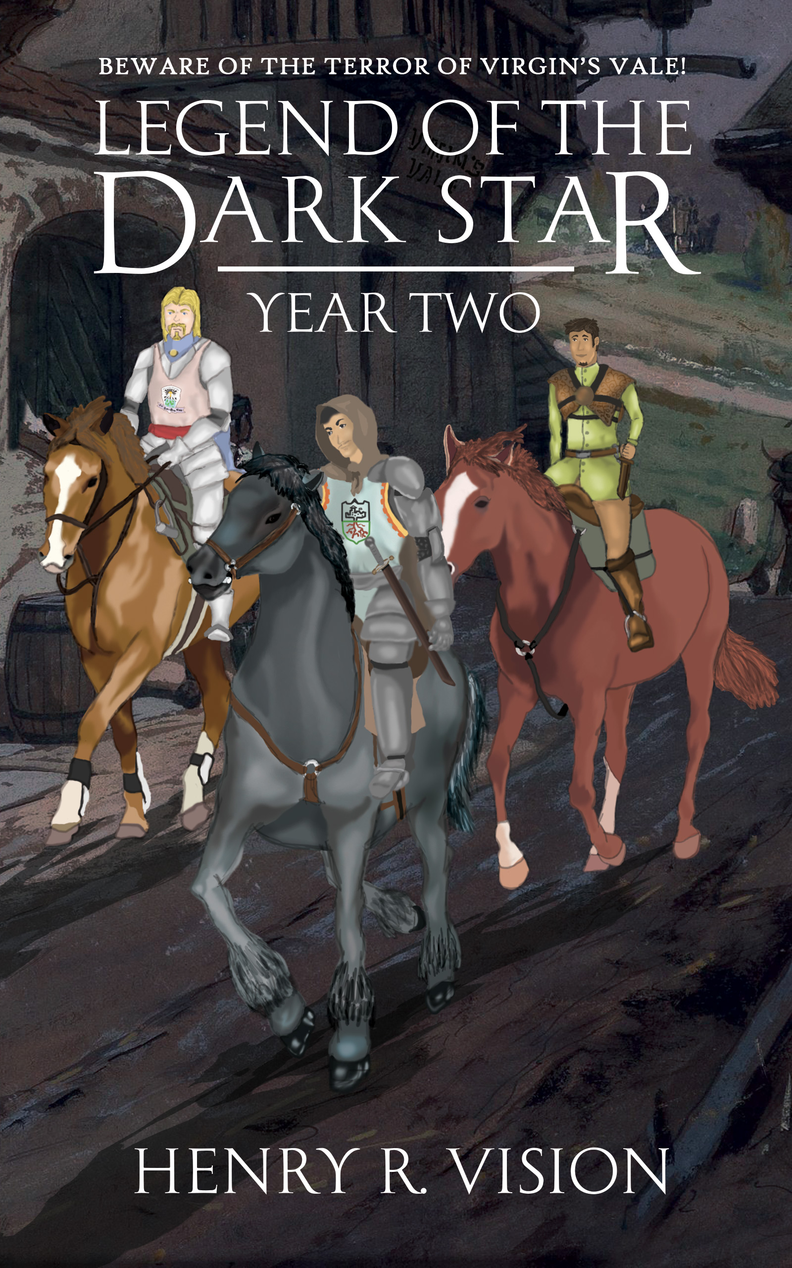
Even if there wasn’t the disparity, the second cover succeeds only as a sketch or study. The drawing and rendering are simply too crude to look even remotely professional. (This is all completely aside from the fact that the artwork doesn’t suggest anything at all about the story as you’ve described it. It’s just three people riding horses.)
But that is all moot since you should really go back to square one and try to create (or have someone create) a cover that is more consistent with the visual branding you established with the first novel. For instance, each cover in the series could focus on a different character or entity, treating them in a similar fashion to the character on the first cover. This doesn’t mean that colors, etc. have to be identical…there just needs to be an overall continuity in idea.
As an equestrian the lack of reins on 2 of the 3 horses, and even a bridle or halter on one, jumps out at me immediately, and would prevent me from taking the entire thing seriously even if the art was better overall.
Totally agree that it’s both a jarring stylistic change and a big jump downward in quality from the first cover in the series. You really need something that goes with that one!
Just noticed the bridle-less horse is also missing a girth! There’s a martingale, but what is it attached to???
The guy on the right “According to the plot” can actually command animals with his mind, so, he never uses any kind of reins as it tends to hurt the animals.
I’m not trying to give any excuses, haha. But readers, by now, would be aware of that fact if they’ve come to read the second book.
Regardless, I’ll see what can be done with this cover page.
It’s probably not a good idea to count on someone having already read the first book. It is always very possible that someone may find this one first.
That, of course, still leaves you having to deal with the quality of the art itself.
I agree, never rely on another book to fill in major plot points. You never know what motivates readers to choose a later volume for their entry point. I recently had a blogger start with the middle book of my series yet she was never lost becasue I wrote it to stand alone, so much so the first two can be read in either order.
As an actual equestrian, from before I was able to walk, I’ll demur from commenting on the idea that reins “hurt” horses.
I’m not really sure how your cover design process takes place, Henry. I remember the original artwork for Book 1, which was, IIRC, pretty disastrous, and this one seems to have ventured off in a similar direction. I think–and perhaps I’m confusing you with someone else that I met on the KDP forums–I originally thought you’d said that you’d paid, for that watercolor of the castle, wasn’t it? But you hadn’t? Is it possible that the same person who worked on that original book 1 watercolor worked on this?
There are so many things wrong with the artwork that I’m not sure it’s fixable. Telepath or not, the rider on the right needs a girth. He’s most certainly not keeping the saddle on with his mind, and his position in/on the saddle is really beyond awkward. His mount’s legs are also wrong, no matter what gait he’s supposed to be using.
The horse in the front is skewed. His chest is turning to his left, while his neck and head are turning to the right, and he’s pacing–the two legs on each side are moving together–which is pretty much only done by specific equines. Horses do NOT have two legs both on the same side of the body lifted off the ground at the same time. Fantasy or not.
The chestnut on the left is obviously traced or painted/created from an image of a horse most likely in a dressage ring. Now, to the typical buyer’s eye, that’s fine, but it’s noticeable to those of us that actually know each end of a horse from another.
AND, yes, the branding–diverging this far afield from your original image…I just kind of want to yell, WHY? You finally got to a really strong cover, and you’re tossing all that work, for this? If it were me, I’d figure out a way to get an image of another armored soldier/suit of armor, and make this second cover very much like the first. It’s crazy to throw away the power of that first cover.
People certainly have their comfort zones. After the much improved cover for Year One, this is definitely a step backward toward the original.
First, I’d use the exact same typeface and typeset, then maintain the tone while featuring a significant element just as the first cover has done.
I’ve gone from one extreme to the other with my cover, from attempts to tell the whole story to being overly simple, but as always the answer lies somewhere between and Year One found that balance.
I’ll see what can be done here. Maybe have the image redrawn or maybe completely scrap the idea. I’ll definitely be coming back here again and bother all of you with my eyesore cover pages, lol.
Apart from that, I need your suggestions. The first book, really focused on one certain plot, focusing a lot on the protagonist. So, I believed, having the protagonist on the cover page was a good idea.
However, the second book just has too many plot changes and a lot of different characters. It’ll be difficult to focus on a certain character or object here. Besides, the whole series revolves around the concept of “Friends keep you strong” and a lot about teamwork.
So, any suggestions on how I might go about creating a similar cover page without disrupting the branding? Maybe I could feature one of the other protagonists for the second book and so on. That could work given the number of team members the protagonist has and the number of sequels. Let me know your thoughts.
Full disclosure: I was thinking of going for this kind of cover design (Barring the bad artwork) for all the books in the rest of the series.
Thank you all for your suggestions.
If there isn’t a definitive single element to focus on, use the main characters but place them in a secondary role within a featured setting and make that the focus.
You don’t want to tell the entire story on the cover, nor do you want to include every character. And neither does the art need to depict any particular scene.
There is no reason you could not include more than one character on the cover, if you handled them in the same way you did the first cover. This might be particularly attractive if each character were distinctly different in some way.
I was recently faced with more or less the same problem recently with this cover
https://www.photoshelter.com/mem/img-get/I0000W3Djjo8lut8/s/1000?1520792660
So far as I know, none of the characters appear together in this fashion in the novel.
Here is another I had to do that included more than one specific character https://www.photoshelter.com/mem/img-get/I0000n5pVbcCLhIQ/s/1000?1441127193
(If you decide to go for a more illustrative cover on all the remaining books in the series, you should seriously consider going back and redoing the first one.)
Sorry about the bad links. I didn’t realize they would be available only temporarily.
Definitely not. It screams “I don’t care” to the reader. Even if I loved book one, this would be so much of a turn off I would not even try to read it, and that would kill the series if you write a third (or more) book(s).
Aside from this image looking more like something from a storyboard than finished cover art, my colleagues here are right about the branding: you can shuffle characters around, maybe even replace your first book’s protagonist on the cover if (as you say) he’s not so much the main focus of this volume, but don’t change the style. Now that your first cover has shown its protagonist against an abstract background, stick to having main characters against abstract backgrounds for however long this series runs. You can change the background’s coloring if you wish, add more characters in different armor and clothing if you like, maybe even show them holding reins and their horses’ heads in the frame to indicate they’ve got better transportation now, but keep those backgrounds abstract and the quality of the artwork consistent.
Am I right in assuming your first novel’s protagonist isn’t even on this cover? I mean, nobody seems to have a helmet or eye flares or jewels on his armor and weapon here, so all three of these guys appear to be his followers instead. If they’re the focus of this story, I’d recommend posing whichever one is most important front and center against an abstract background in the same pose your protagonist had on the previous cover, and then have the other two standing behind him and looking out to either side; again, they can have their horses’ heads in the frame with them as well to indicate these characters are mounted as long as having them there doesn’t clutter the cover too much. (The original box cover art for the video game Gauntlet makes a decent model for how to arrange your characters this way.)
While you’re at it, a different color and slightly different abstraction in the background may be in order too. Is the “unknown terror that grips a village” in this novel some kind of monster that stalks people by night? A bluish-black background with something looking a bit like storm clouds in it might suit the mood of the novel. Is it some kind of evil sorcery or magical plague or eldritch abomination terrorizing the villagers? Swirling vaporous miasma with a sickly green glow provides the proper effect for that.
In any case, figuratively speaking, don’t change horses in the middle of the stream. You had a good thing going with your first cover, so keep rolling with that style through this cover and any others to follow. Once you’ve got a brand to maintain, you can’t abandon it without redesigning everything from scratch, so stick with what works for the time being.
RK’s comments are absolutely dead on target.
This is a kind of essay I created for Scribophile a couple of weeks ago.
http://black-cat-studios.com/book_cover_design.html
If you scroll down to the bottom you will see examples of books from three or four series. While different cover art is featured in the books of each series, they are related in technique, style or some other characteristic. Lois McMaster Bujold specifically wanted to go with a non-representational graphic approach, so each of the 17 titles I did were connected in two ways: a similar handling of the typography and a similar approach to the cover art.
For the remaining examples I selected two representative covers from each series.
The two examples from the Haldeman series are connected by handling the same typeface in similar ways. There was no attempt to make the type design exactly the same for each book. The covers are also connected by featuring the same character on each, though performing different actions in different settings each time. Exactly the same approach was done for the Strider series: similar typography and the same character featured in different situations. A similar tack was taken with my own Company of Hero series, though several focused on specific situations rather than the same character. The Matthews books depended more on the repetition of the title graphics, though, with two exceptions, all the covers also featured her main character in some way.
The Charles Fort books are connected in a similar way: Each uses an illustration I created of Fort himself, along with some element representing a major theme from the book. The graphic style and handling of the type was a major consideration in creating the series.
The twenty-odd books in the Spaceways series are soft-core pulp fiction, so I tried to create a retro look to the overall graphic design, especially in the logo. The illustrations themselves attempted to recreate the look of the more lurid pulp SF magazine covers of the 50s.
So what I am suggesting is pretty much reiterating what RK wrote: There is no need to slavishly duplicate the first cover. An overall similarity of theme is more than sufficient. As they said in their post: “…stick to having main characters against abstract backgrounds for however long this series runs. You can change the background’s coloring if you wish, add more characters in different armor and clothing if you like, maybe even show them holding reins and their horses’ heads in the frame to indicate they’ve got better transportation now, but keep those backgrounds abstract and the quality of the artwork consistent.”
I recently scrapped my Arosil covers in favor of something cohesive. I thought using the same typeface was enough, but after seeing the new covers together I realize the previous iterations had nothing to tie them together as a series. What a difference a similar layout can make to say “we belong together”.
If you can fix the technical inaccuracies with the horses, fix the lead rider’s head, and add more contrast in the foreground element, perhaps it would look better reduced and placed in a new background featuring the entrance to the village with a sky appropriate to the story to add color and texture. The title and sub (matched to the first book) can be placed over that rather than cover details like the inn and sign.
https://i.imgur.com/pbrbHTI.jpg
Or this
https://i.imgur.com/ZXiEisf.jpg
Either of Alley’s suggestions would be very effective, especially if their hints regarding improvements to the artwork are followed.
Did you just call me Alley? LOL
Better than Alley Ooops!
😉
Here’s another idea for the cover. The horsemen would be added to the path just in front of the bridge.
https://i.imgur.com/y4K1t3W.jpg
Mr. Alley, you’re the man! That was awesome.
Don’t try to salvage the artwork. Any attempt will boil down to shrinking it and fudging it with filters so you can’t see how awkward the details are, and readers will know that’s what you’re doing.
Start over with a truly good-looking image that you can put big and proud in the center, like on your first cover.
I was trying to salvage the idea to individualize the covers while keeping the tone and overall continuity. I only placed the horsemen from the original to show how they might be redrawn into the examples I presented (I can’t draw, so there was no way to add new horses and riders) . The originals are definitely off from the rest.
Late to commenting here, but all my points had been covered, and didn’t want to just repeat what had already been said. I have to say that I love B.L.’s idea with the y41tK3W image. If you can place a well created image of a horse and rider on that, or a similar image, It would be an eye catcher.
Don’t worry, I didn’t intend to salvage the artwork anyway. But I like Mr. Alley’s idea. I need a complete redo.
Happy to help