The author says:
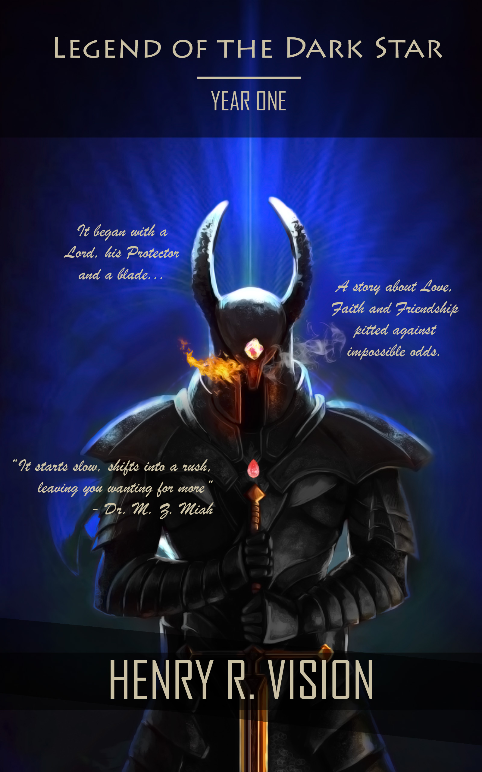
Lord of the Rootshire Province comes into the possession of a powerful relic: A masterpiece runeblade, capable of taking down armies with ease. He embarks on a mission with an Archmage and a Royal Protector on his side, to disenchant the runeblade little by little until it is weakened enough to be destroyed. Along the way, he obtains the only thing capable of countering the weapon’s powers: an Armor specifically created to battle against the weapon. With both the target and the contingency in his possession, the Lord continues his journey, gathering a group of misfits who fit in quite well.
Nathan says:
Nice art. But every decision you made after that diminishes its impact.
- There’s no point to having the dark bar across the top — it just takes up space and gives nothing back. You should use the space the artist left up there to present the title at a size that it’s readable. (Honestly, I saw the text at the top, thought it was just a series title, and searched the rest of the cover for the actual book title before realizing that that was it.) Emphasize it.
- Too many fonts, and of the three you have, only the one used for the byline is even close to right for the genre. The italic font especially is both too gentle and too unreadable for the use you put it to.
- The random distribution of unneeded text is a bad decision, too.
- And none of those chunks of text is needed, anyway. The top two don’t do anything to entice the reader, and the pullquote is both counterproductive (“starts slow” is NEVER a good thing to put on the cover) and unimpressive, since even a Google search didn’t tell me immediately who Dr. M.Z. Miah is and why his/her opinion should be persuasive.
The point of a book cover is to catch the attention of the target audience and get them to read the description, either on the back cover or on the sales page. That’s all. As a frequent contributor summarizes it, your cover is clickbait. Ditch the extra text and let your cover be the artwork, the title, and the byline. Put the title in a large, bold, readable typeface appropriate to the genre and let the cover do its work.
Other comments?
Agree. The little italic-y blurby things do your cover no favors. Awesome art. Bigger title in a fat font will work well.
This had some possibilities, which I am afraid were not used very effectively.
There’s not too much to add to Nathan’s comments. The black blocks behind the author’s name and the title serve only to crop the art into a square, wasting most of its effectiveness. The title is far too small—it is barely readable even at full size. It could easily be twice the size of the author’s name or even larger. Like most good artists providing art for book covers, this one left plenty of room at the top of the art for text. Take advantage of that.
There is at least one typeface too many—the extraneous one obviously being the script. But even if that were changed, the blurbs would be too small and too haphazardly placed. In fact, I see no real reason for them at all. If you could come up with a good one-line catch phrase for the book, that would be fine. But I would ditch the quote since, as Nathan says, no one is likely to know who “Dr. M.Z. Miah” is anyway.
Frankly, there is really not much more to say than that you should strip the cover of all the type and extra elements, go back to square one with the original art and start over from scratch.
Agreed with everyone else. The first thing I’d do is zoom in on that art so there isn’t so much empty space. I’d like about half as much space on either side of the figure. I’d also like to see some sort of background–nothing too busy, but something other than a big blue-black void, and ideally something that gives us more of a thematic sense of the story. (Stars, perhaps?)
In addition to enlarging the cover and losing all the blurbs and loglines (Brush Script only belongs on Hawaii postcards from the 50s), I might think about just losing “Year One” (since, as Nathan noticed, it makes the whole title look like the series name). I’d either just title this one “Legend of the Dark Star” and make the second book “Title: Legend of the Dark Star Book/Year Two” or come up with a whole different series name so that this book can be “Legend of the Dark Star: Series Name Book/Year One”.
One exercise that may be helpful is to flip the image upside down. Flipping the image helps you see it as a collection of abstract shapes and shows how the elements balance. Your unconscious mind knows what a pro book cover looks like and should point out elements that are lacking or need modification.
You could also compare the flipped image to a book of similar genre (high fantasy, I’d wager) turned upside down on your desk. Think “emulation”.
There are many other good comments above!
I’m not sure I follow. What is one looking for when it is upside down?
Broad similarities and differences; spatial relationships that may not be apparent at the first glance.
It’s an old arists’ trick to help you see something the way it actually is, rather than the way you *think* it is. (Betty Edwards’ book “Drawing on the Right Side of the Brain” explains it best).
When things are the correct side up it’s easy to get distracted because you’re reading words, examining the pretty art details…But by turning something upside down (and you could even blur it a bit, too, by squinting) you see larger overall patterns with less distraction.
In the past, I’ve noticed this upside-down trick help me move text away from the cover edges, increase title size and contrast, and result in something a little more pro-looking.
Let’s see if these links work…
http://de.tinypic.com/view.php?pic=2r6kw3b&s=9
In this case, placing the submitter’s cover next to a trad-pub-looking high fantasy cover picked at random shows: larger areas of brightness, much larger title text, certain margin spacing around said title text…and also a dark area behind both authors’ name areas–but while the submitter’s has a hard line, the other book has a soft gradient behind it that helps it blend into the composition.
These are all ways to self-check and self-tweak before the cover gets out to a larger audience. 🙂
First, Posrein (Positive Reinforcement) as we say on LBC. I want to commend this submitter; he had a very unsuitable cover, before, and has been willing to significantly rework it to get to this point.
Second Posrein: Freaking totally awesome artwork. I don’t know where you got it, but hang onto that site, person, name, whatever, and don’t let go.
Alrighty–now, having said that, there’s not much more for me to say, because everyone else said it. LOSE the “blurb.” I don’t know who that is, and I don’t care. Unless it’s JRR Tolkien (unlikely) or GOT Guy, George RR Martin (what is it with all the damn r’s, anyway?), it’s pretty much worthless. Lose the (multiple!) taglines.
The intended tagline “[i]t begins with a Lord, his Protector, and a blade” is, I’m sorry to say, boring.
The Mini-description “A story of love, faith and friendship pitted against impossible odds”…sigh. Jeeze, I hope so! The entire point of The Hero’s Journey (presumably, that’s what we have here) is protagonist is born, protagonist is “the one,” protagonist finds out s/he’s the one, gathers up magical relics, has mentor, has sidekicks (the ubiquitous “ragtag band of misfits”), up against impossible odds, wins some, setback, wins some more, TRAGIC setback, wins at the end. (That’s the Hitch encapsulated version.) If you don’t have impossible odds, then you haven’t adequately challenged your protagonist, and your reader will be let down. My point being: you don’t need to tell your reader–that’s what they’re expecting it to be. Anything less than that will be a major bummer to them. Right?
FONTS. Hooo, boy. I can’t quite tell if you are targeting High Fantasy, or Men’s Action Adventure, etc. BUT, you have a dark knight kind of figure on the front, so….High Fantasy, I’d guess. That doesn’t really slap us in the head, and scream ‘USE THIS FONT, DUMBO!,” as that (High Fantasy) covers an awful lot of ground, but…HF covers can use either serif or sans serif–those set in medieval sort of settings tend toward serif, or decorative serif. The lettering is usually a bit brighter than you have it; and much, much LARGER than you have it.
You need space for 23 characters, so…Give or take, something around 16-18 point, if you were making this in a Word template. I’m going to say, stay away from any foofy decorative serifs. (YOu know the fonts that Derek Murphy suggests, for Fantasy? Don’t use those.) Instead, keep it simple. Use something like Bauer Bodnieu. Or Adobe Caslon Bold. Seriously. I know, not exciting–but this cover, this artwork, doesn’t need, and doesn’t want exciting or foofy. This sucker is all about that artwork. Maybe Imperator Smallcaps–that’s always nice. Completely lose the Book One stuff. Nobody will care, until you’ve published book 2. In fact, if Book 2 is not published, they’ll be annoyed if the like the first book and then find out Book 2’s NOT ready.
As someone else said, you should never use Brush Script, pretty much for anything, ever. It’s right out of the 1950s, as was pointed out, and worse, it’s not that readable. Given that we all think that you should lose those bits of front elements, anyway, no loss.
If you want to go a bold strong sans serif, for the byline, I’m fine with that. I don’t hate what you have there now, although I feel that it might be imparting a semi-SciFi vibe that’s all wrong for this book. I can’t suggest any, until I see what you do with the title (which needs to be MUCH larger).
Consider a BRIGHT yellow and possibly white for the lettering, to make it stand out. Not the muted yellow you have now. Think yellow mustard, not seedy mustard. You might be able to get away with a teeny amount of “glow” around the letters-and I mean, TEENY (!!!!), just to make them stand out a little bit. When I say, teeeny, I mean, like, 1-3px worth. I’ve done it on a few covers, to give lettering a bit of oomph against darker backgrounds, and it’s worked nicely, but you will need to play with color combos and the like. I usually make the “glow” a completely different color than ether the typography or the background; for example, use a pinky glow around yellow lettering on a dk blue background. Sounds awful, I know, but if you dedicate a few hours to it, you’d be surprised at what you can coax out of the letters and backgound and glow, if you spend time with it.
Good luck. And again, my sincerest congrats and encouragement on the artwork. Well done there!
I don’t have much to add to the other critics’ suggestions, but I do have to ask: am I the only one who thinks the artwork and description are highly reminiscent of the World of Warcraft story of how Prince Arthas Menethil of Lordaeron became the Lich King? A powerful enchanted blade with mystical runes on it that gives the wielder the power to destroy whole armies? Frostmourne was certainly that. Armor to make the wearer virtually invulnerable? I don’t know whether it could have stopped Frostmourne, but the Lich King’s armor was certainly a powerful defense too. Eye flares? Well, as Lich King, Arthas generally emitted blue flares from his eyes; other than that…
Granted, if people who are into the World of Warcraft stories are your target audience, this kind of artwork and story are pretty much the way to go; though the audience for all the hammy blustering and ponderous pronouncements in that series would likely disdain your current tagline for being wimpy even more than Hitch does here for its being boring. (Yeah, either way, that tagline’s going to have to go.) Still, don’t you think you could try being a little less obvious about your source of inspiration? With that many similarities, your work seems to border on out-and-out plagiarism.
At the very least, you could possibly extend the fiery orange motif of the protagonist and his equipment into the color scheme of the background to make it look like he’s not up in the icy wastes of Northrend preparing to sit on the Frozen Throne. A simple swap of the red and blue channels in my editing program, I find, does wonders for the background; and though this also turns the sword and jewels and the eye flares blue, you can simply replace those by cutting and pasting the properly colored items from your cover’s current artwork onto them. Here’s my five-minute revision doing just that. (The eye flare would have been a bit clearer, but I’m working from my laptop which doesn’t have my other editing program that works better with transparencies.)
O.M.G.: that red is drop-dead gorgeous. LOVELY work, RK, really. I mean it. I hope the submitter takes heed.
Also…FWIW, I don’t think that the author-pub knows WOW from WWII. (Seriously). Just a feeling I get from reading his posts at the KDP, etc. But I could be totally wrong.
First off, that art is amazing!!
A few (Okay, not really a few) tips:
-Use a serifed font for the title and make it big
-Really big (Maybe even use a bevel)
-Switch up the color scheme to something brighter, such as orange as RK suggested
-Nix the black transparent boxes
-Use the first half the quote, and only that
—
Here’s my lazy 10-minute version
(Font is Imperia)
https://i.imgur.com/hgkow6F.png *
Yup, more like that. I disagree with the weight of the serif you used–I’d go a skosh heavier, and without the bevelling, but overall, YES, that’s a good way to go.
I love the beveling, It’s very genre appropriate and the slight cracks it gives has a nice gritty vibe. I love the shadow on it… I would love to see Hitch’s idea too in a side-by-side.
2000% better!
I would still lose the box behind the blurb and author’s name, though.
Love that!!!!!!
That’s really great.
Thanks for all the helpful suggestions. I’ll ask the artist to make the changes. I really like Vee’s and RK’s design concepts.
As for the “Year one” it indeed is a part of a series and “Year two” will be coming sooner or later. So, unfortunately, can’t really ditch that. But let’s ditch the blurbs anyway.
I created a set of mockup covers for this author a while back after he asked for feedback on his original cover. I guess he didn’t like my advice of keeping it simple, clear, and making the title larger. Old on the left, mockup on the right.
https://static.wixstatic.com/media/402253_af3a4c26545e419ba84188d30db0653e~mv2.png/v1/fill/w_600,h_450,al_c,usm_0.66_1.00_0.01/402253_af3a4c26545e419ba84188d30db0653e~mv2.png
His new art work is much better than the original and he did make it much clearer so I would say he did take your advice and in fact used quite a bit of it. If you compare yours to this posted one it is very similar, including a textured background and the underlines and text placement. He added the blurbs, probably thinking he needed to fill in the space but the picture is good enough it doesn’t need filling. Vee’s choice of font and placement is just beautiful as is the color palette. So hopefully he take’s Vee’s advice too…lol
I agree the posted one is much improved, but Vees alternate version is great. Mine was designed to show how you can have a black object on a dark background and still have contrast, but after I posted it he never responded.
Mr. Alley, I don’t know why you felt like I didn’t like you advice. In fact, I posted this image on KDP forums before posting it here. And I appreciated all the time and effort you have spent behind the cover page. I specifically told the artist to ensure that there’s a different background effect so that the image is more noticeable: something that I learned from your feedbacks. Again, I appreciate everyone’s feedbacks.
With all said and done, the new cover image is live and yes, I’ve taken Vee’s inspiration as well. You might check it out here:
https://www.amazon.com/dp/B078GRQ221
I’d appreciate it if I could get more feedback for the second part of the series as well. I’ll be posting the image as soon as my editor is done with editing (Personally, I like to invest the time and money behind the cover page while I wait for the proofreader to work his magic after the edits have been done. That way, both the book and the cover page is ready almost around the same time).
I never saw a response from you after I posted the later mockups, only a lot of criticism of the helmet even though it’s only a stand-in to show the contrast and lighting. You also never formally accepted nor declined further help from me.
I’m glad you found something that works. It’s a very nice cover now.
Your answer was selected as the best answer though. And changed the post’s status to “resolved”. And you went through a lot of trouble for my sake, and that inspired me to have it redrawn. And I asked them for a redo and they came up with this design.
Contrary to the previous version, this wasn’t a digital artwork. It’s a painting made with a combination of acrylic and poster colors. The typography and everything else was added on its scanned version.
Thanks again. I’m just an amateur novelist and I really appreciate the guidance from veteran authors.
I’m always happy to help.
Very nice! I particularly like the improved tagline and (of course) the burning orange background. Somebody’s still probably going to bring up the inevitable World of Warcraft comparisons, but as I say, drawing people who are into that genre is not necessarily a bad thing. At least no one is going to look at that cover and feel like saying “Let them come… Frostmourne hungers!“