Category: Covers

The Gryphon Saga

The author says:

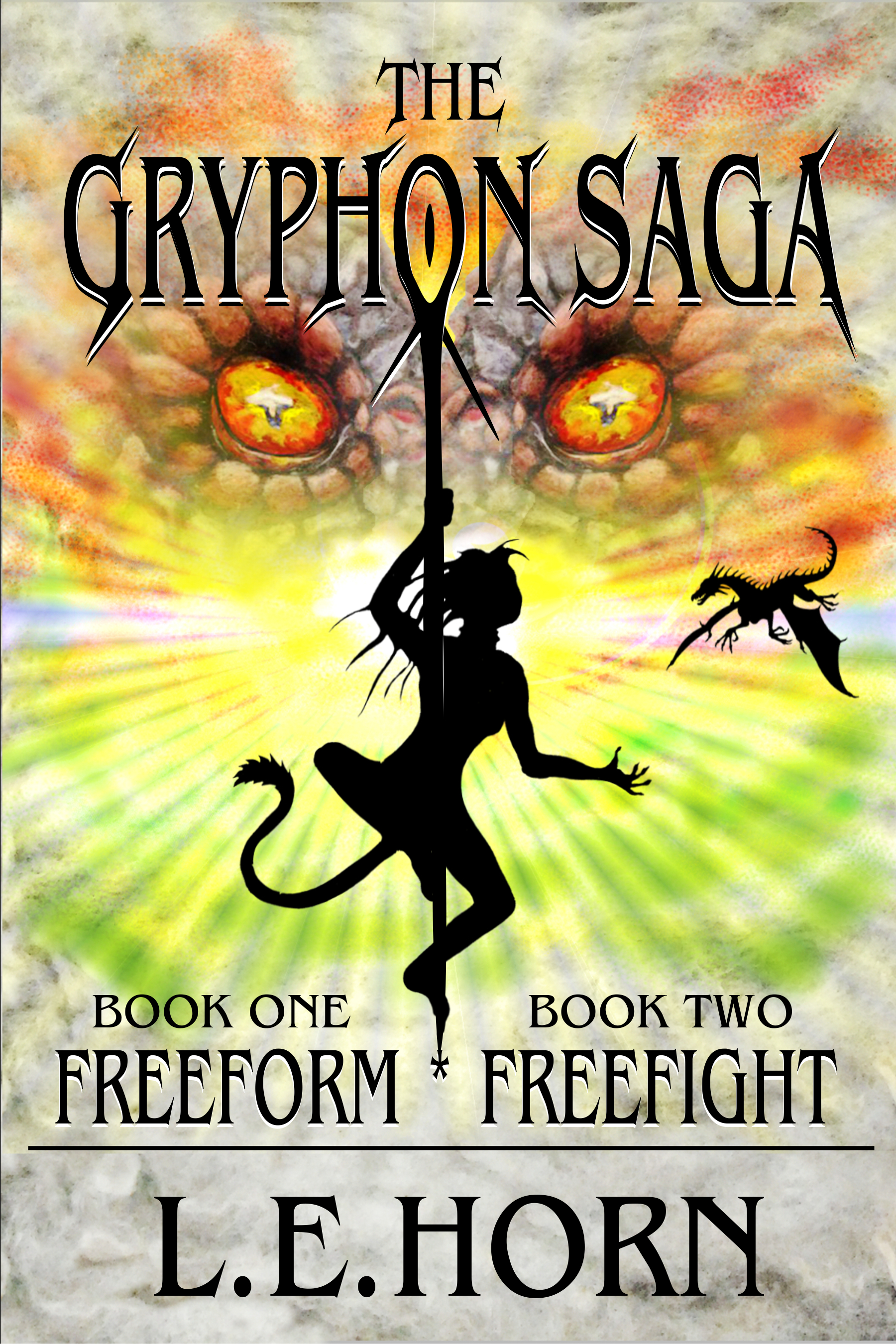
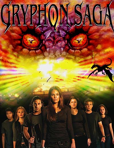
If there is one thing that binds the cosmos, it is that only the strongest prevail. Kidnapped and genetically altered by a brutal race, human slaves are forced to fight in an alien war. Hope appears in the form of an alien underground rebellion led by mysterious beings—the Gryphon. Together they engage in a desperate battle. The human heroine, Lianndra, faces a grim reality—sometimes the only way to protect power is to use it.

Nathan says:

The first impression is that you have a pole-dancing cat-cosplayer on the cover. Probably not what you were going for.

I think a large part of the problem is also that your color scheme doesn’t suggest a “grim reality”; it’s too bright and colorful.

One way to suggest oppression is to have the image representing the more powerful antagonist looming over the smaller protagonists.  They don’t have to look like they’re actually in the same space; people are familiar enough with the visual language of movie posters to understand the meaning.  Here’s a five-minute redo to show the concept:

(Plucky freedom fighters stolen from the poster for Tomorrow When the War Began.)

Other ideas?

Regarding Tiberius

The author says:

Christian Historical Fiction set in 1st Century Roman Empire. The name listed on the cover is that of the narrator of the account, Helena Mithridates Kleopatra, who is also the main protagonist. The mask is sort of the “McGuffin” of the tale (the blood on it, however, is merely symbolic–the mask is never “bloody” in the story). I chose this design because it was simple, direct, and evocative. I made sure the typology was legible at any size. The book is nearly 200k words, so I won’t test your patience with a synopsis. These comments should be enough to go on for the purposes of critiquing the cover.

Nathan says:

Very legible, very clear.  However, I see two big problems:

  1. It says “Roman” very clearly, but doesn’t say “Christian” at all, no matter whether you mean that it’s about 1st-century Christians, or it’s aimed at Christian readers, or both.  I don’t know if there’s a simple iconographic fix which is both historically accurate and evocative to a modern audience (I don’t think the fish symbol has enough umph to do the trick); you may have to resort to a subtitle like “A Novel of First Century Christianity.”
  2. The first-person narrator’s name is all well and good, but where is your name?  Are you going to be anonymous? Is your name going to be present in the Amazon listing?  Unless you intend to be completely anonymous (which is an arguable choice), it’s your name that should be there, not the character’s. (The other problem is that the protagonist’s three-part name doesn’t immediately seem like a single name, given that “Kleopatra” seems like a first name to most modern folks — when I first saw it, I thought it was a list of three separate characters.) You might get away with “The Tale of Helena Mithridates Kleopatra, as told by XX,” but that seems like a Rube Goldbergian workaround, especially if you’re also going to use a subtitle to clarify the Christian angle.  I think you should just do without naming the protagonist on the front cover.

Other comments?


Ryan Ribble & The Tower of Lore

The author says:

This young adult fantasy is set in the modern times, but in a fantasy world that is built around various lores from our own. It is supposed to appeal to readers that like Percy Jackson and Harry Potter. The protaganist is Ryan Ribble a rabid gamer, and Deidre Mikals another girl from his own world. Together they must ascend the mysterious tower in a race to restore the princess’s magic before her time runs out and an invading army overtakes the land.

Nathan says:

I can see what you were trying for here, but it really doesn’t work. The main font especially doesn’t look like it’s intentionally pixelated; instead, it looks like an oopsie by someone who didn’t know how to use the software. The image of the boy isn’t especially dynamic or interesting, and his pixelation again looks like a mistake more than a conscious decision.

From your description, it doesn’t seem like this is supposed to be a LitRPG or a “sucked into the game world” adventure, and if that’s the case I think you’re overplaying the “gamer” angle. I think simply having a boy in modern dress (possibly with a Minecraftish tee shirt) surrounded by people in pseudo-medieval garb against a fantasy background would work better.

And your name shouldn’t be the easiest-to-ignore element of the cover.

Other comments?

Atlantis Lost

The author says:

This is the beginning of a fantasy series set in the modern oceans, where the last merpeople in existence live in secret, struggling to survive. Over the series, the mers come out of hiding and reshape their relationship with humans through war and peace. The book is set in real underwater locations, and is illustrated with B&W stylised photos of the animals which live there, hence the choice to use a photo for the cover (I took the picture, so no copyright issues). Each book in the series will have an underwater photo from the appropriate location as its cover. This is intended for eBook publication. The cover is as close to finished as I can make it, so not just a concept test.

Nathan says:

Nice photo.

For a cover like this, which is essentially a background photo behind type, you really need typefaces that are going to carry the weight.  This typeface doesn’t.  I can see that you’re trying to convey a slightly antique, slightly fantastic mood with the type, but this typeface is too generic and overused (you also miss an opportunity to play with positioning between the initial caps and the rest of the words in the title).

Also, if “Pelagius Nemo” is the byline (and even I’m not 100% sure that it is), this might be an occasion where “A Novel by” is justified (or something more specific — “An Undersea Adventure by,” “A Saga of (and Under) the High Seas by,” etc.).

Other comments?

Invisible in Vegas

The author says:

This crime fiction novel is set in present day Las Vegas. The target audience is adult men and women who enjoy Robert Crais, Michael Koryta, Reed Farrel Coleman, James Swain, Jonathon King, and James W. Hall. The protagonist is Gus Donnelly, a man whose grandfather and parents opened a Las Vegas casino in 1959. Along with his best friend Marcus Anthony, he is searching for a poker chip from his family’s casino worth $10 million dollars. The cost of failure is the death of his girlfriend. I’ve done my amateur best on the cover. The photo is free.

Nathan says:

Technically it’s a nice try.  Conceptually, it needs some work; I can’t speak for anyone else, but to me the cover says “dramatic thriller” — the kind that is usually targeted to WOMEN, not men.  I don’t know whether it’s because a female face alone on a cover is a trope more usually aimed at women, or what…  But let’s take a look at the covers for the authors you cite:

What I’m seeing, more often than not, is clear color and large type — any image is so much an afterthought that, in some cases, it’s practically invisible.

With that in mind, here’s a two-minute redo:

See what I mean? It’s not a good cover by any stretch (because two minutes), but it conveys more clearly its affinity with the authors you cite.

Other comments?