The author says:
The novel, The Battle for Taiwan, is set around the South China Sea and is the second in a series of books. There is a slight change of action in this second book as its focus switches from an early sea battle, which the Chinese lose, to dramatic internal problems in China. Chinese faceless generals and other powerful people take the opportunity of disorder in China to steal three nuclear bombs. These faceless men act first against Taiwan and then Vietnam. Our hero Matt Fraser, accompanied by his loyal friends, hunt down the faceless men. All this happens against a backdrop of the faceless men trying to assassinate the new President of China who was not their preferred choice. In the mold of Sum of all Fears, the action is both suspenseful and surprising in its outcomes. Once again the book is fiction, but it draws heavily on actual events for its story line.
Nathan says:
First up: You say it’s the second in a series. I can find The Third Gate listed for you on Amazon; is that the first book? If so, you’ve missed an important opportunity for branding. Ideally, books in a series should maintain the same font choices and art styles so that they look to be of a piece — you want readers and fans of your first book to be able to pick it out from the background noise on Amazon or in the bookstore. I’d advise you to start work on the second cover by returning to the first cover and deciding what to modify: The color scheme? The particular images (keep their same place in the layout)? etc. (If that’s not the first book in the series, then ignore this paragraph.)
On top of that, while filling in a country’s geographic borders with another image is a design trope with a long and distinguished history, in this case it works against you. The image inside the border is a longer-range shot than the surrounding background, and so the internal image looks like a hole to something more distant — there’s more confusion than recognition, which works against the goal of immediate comprehension of a book cover.
At this point, one way or another, rethinking the concept of the cover will be more help than tweaking the present one.
Other comments?
I don’t think anything about this is salvageable. You have a bunch of dissimilar pictures thrown together with no cohesion and no appeal.
choose contrasting colors but ones that compliment each other and integrate them. you want the end result to look like one purposeful image and be pleasing to the eye.
your fonts aren’t horrid but they are bland as is the placement.
Consider getting rid of the water entirely as as far as I can tell from the blurb this isn’t about sea battles. I recommend a picture of a dangerous looking man skulking along a dark allyway in China, or running away holding files with Chinese writing or sitting at a computer in a dark room while peering over his shoulder. you need an image that says action and adventure.
Because Thriller by its genre means the action happens all over the world you don’t even need to worry too much about making the setting clear. Get the tone of the story clear. I promise you a glowing dragon doesn’t say thriller. But put that same dragon on the computer screen your MC is looking at and it could work. Add in a timer ticking down and we’ll know at a glance there are bombs in the story.
Don’t try to reproduce a scene. Try to reproduce the tone of the book.
Thank you Savoy
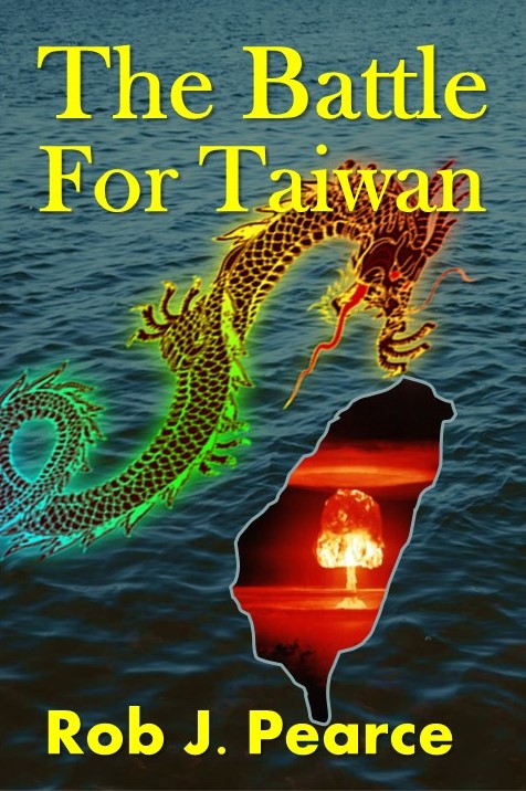
There is a naval battle early in the book before the theme switches to the missing bombs. The sea image was meant to signify the battle scene which is in the Taiwan Strait between China and Taiwan obviously. Taipei is hit by a nuclear bomb.
Thank you for your comments. Back to the drawing board here.
I think you have underscored one of the problems with the cover: someone needs to already know something about the story in order to understand the cover. This is putting the cart before the horse.
Everything Nathan and Savoy said, and…
You are depending too much on a potential reader immediately recognizing what that shape represents. There may be too many people who think it’s the silhouette of animal or almost anything else.
Tangencies are also something to avoid, such as the dragon’s nose just touching the tip of silhouette. This makes their relationship and position in space ambiguous.
I have to throw my vote in with Savoy’s and suggest that you rethink the cover from scratch.
Ditto. On both, better choices for the typeface and color (not yellow) will instantly improve the cover of The Third Gate, and the second needs to start from scratch. The dragon superimposed over the mushroom cloud might work, but empty water does not suggest sea battle. Water littered with the bodies of sailors says sea battle, but that’s tricky without using stock imagery and potentially dishonoring those depicted.
Perhaps a lower angle image of the sea with the setting sun replaced by a mushroom cloud and the silhouettes of ships on the horizon?
On, and don’t be afraid of upper case for cover text. Unless you’re going for a particular style, usually involving script, I’m not a fan of mixed case.
For example…
https://static.wixstatic.com/media/402253_dfe4365a064c419bbcb88a1f766cc057~mv2_d_1612_2500_s_2.png/v1/fill/w_600,h_931,al_c,usm_0.66_1.00_0.01/402253_dfe4365a064c419bbcb88a1f766cc057~mv2_d_1612_2500_s_2.png
sorry for the URL. IMGUR was down
Very striking B.L. It grabbed this unqualified designers attention very quickly.
Someone else said to try and match the type face on the first book so that people know it is book 2 of a series.
I don’t have the experience to know if this advice is correct as this is only my second book.
But thanks very much for your efforts.
The advice regarding the typeface was good (and bless you for using the correct word, “typeface,” and not “font”). It is one of the best ways to maintain continuity between books in a series.
I am also an unqualified designer who has already made many of the mistakes noted on this site.
To address whether to make series covers similar, here is a graphic depicting the three versions of my Arosil covers. You can decide for yourself if keeping the covers similar is better than having them be different.
and the link
https://bit.ly/2Knah4F
Using the same fonts and placement for text can be great series branding, but that being said, I took a look at your first book, The Third Gate, and it could use some tweaks too. The art is nice and bright but the sizing is off. I don’t hate paper texture as a rule but it feels off for this cover. Your crowding on the effects just for the sake of effects. a simple smoky overlay would be better. I think the elements are nice but could be placed better to avoid all the empty space where the rip in the paper is now. Then you could easily make another cover along these same lines but I might still adjust the text color unless yellow happens to match. It matches the first one because of the yellow tones. So, unless you have those SAME yellow tones I’d choose a different color that matches whatever pic you go with.
this font isn’t horrid but if you’re remaking the first one to a more traditional size, which IMO you really should because anyone just browsing will be Leary of buying because of the blatant format error on the cover, it could be assumed that there will be tons of errors inside too, you might as well pick a heftier war/thriller font.