Category: Covers

Borderlands [resubmit x2]

The author says:

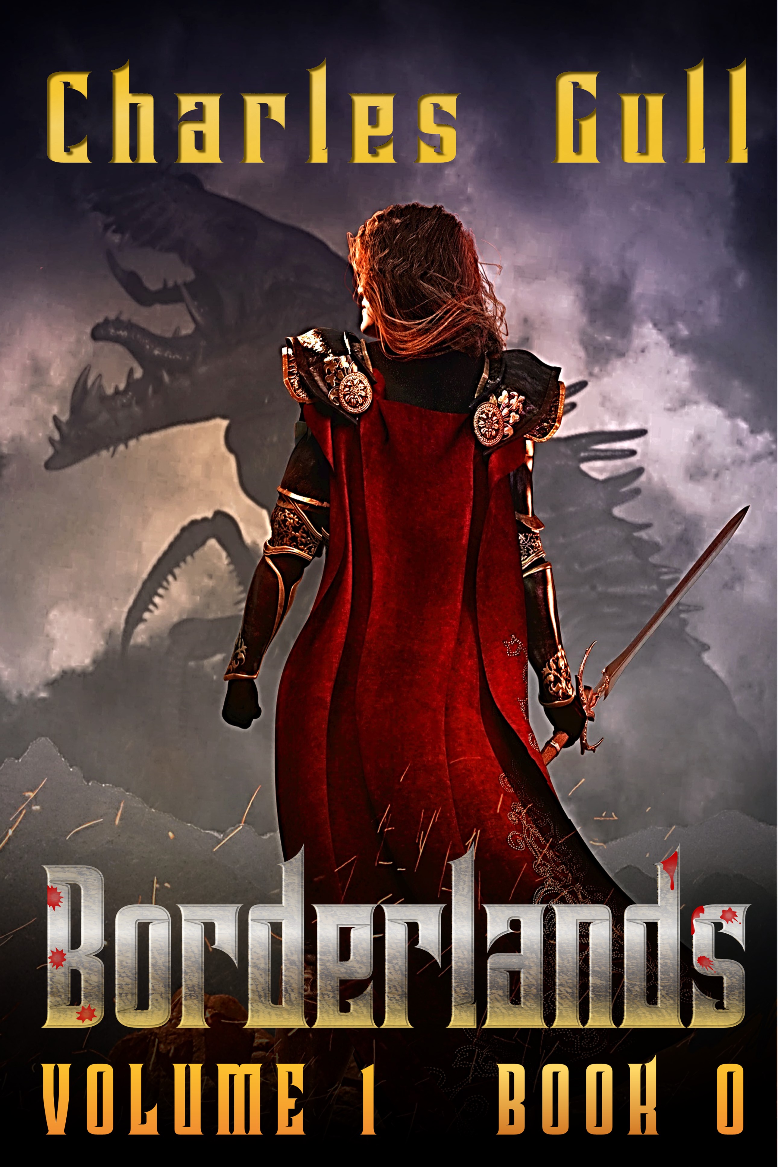
[BORDERLANDS Resubmit – This is an experiment with a view from behind. The motivation is that the gender of the protagonist is only revealed quite late in the book, so I wanted to keep the gender ambiguous on the cover. Ironically, the figure looks more feminine now! Also, I have been having fun with the titling.]

VOLUME Blurb:Trapped in an eternal battle against the all surrounding Realm of Chaos, the nations of the The Rationalle fight to preserve the purity of their oasis and its most sacred relic, The Temporalis. In the shadow of the Realm’s corruption, where steel turns to dust, stone walls crumble and spells turn on the caster the battle-hardened Aether Guard hunt down and destroy the ravening Spawn before it can reach their home. Skill and experienced not withstanding, their sworn enemy surfacing deep within the Rationalle itself catches them completely un-prepared. On this new battle front politics and ambition prove even deadlier than the Spawn the pursue. Can they keep up with their enemy, or will the Realm of Chaos finally desecrate the Temporalis itself? Grimmdark marries Bronzepunk in this hard fantasy epic where action abounds in a unique and immersive world of captivating characters and frightful monsters.

BOOK Blurb: Captain Ganse of the Aether Guard leads a handpicked team on patrol through the insanity of the Borderlands. Long trained and battled hardened, this band of heroes must forsake magic and hunt the vile Spawn with deadly determination, simple brutal weapons and obscure advice buried in ancient book. What starts a another routine sweep soon becomes a battle for survival as they are challenged by horrors powerful beyond record. Now, not even skill, experience and the Captain’s unique family legacy can guarantee the patrol’s survival. In a chain of battles where the soldiers must win every time but the enemy needs but a single victory, can the patrol triumph or will the Realm’s dark blood finally choke the bright heart of their homelands? Grimmdark meets Bronzepunk in this action packed 30k-word novella that launches a unique hard fantasy epic set in a deeply immersive character centred world.

[previous submissions and comments here and here]

Nathan says:

The artwork is of similar quality to the previous resubmission — i.e., quite good — so I have no complaints there, although I don’t understand why you used NONE of the elements in that previous trio of options.  I have only two comments — one related to your blurb, the other to your branding:

  1. Please tell me that you’re not keeping the protagonist’s gender a secret FROM THE READER until the end of the book.  It’s one thing to have a character whose gender is misdirected to the other characters for most of the story — think Mulan, or half a dozen Sharespearean comedies — but when a novel tries to keep something as basic to the protagonist (who is usually the viewpoint character) as gender identity a secret, the reader rightly feels played.
  2. I don’t think that “Volume 1, Book 0” works.  (I have a problem with “Book 0” installments anyway; at best, they’re either a “limited-edition promo,” an idea taken from comic-book marketing which really doesn’t work with ebooks, or they’re backfill material for fans of the series/franchise, which you can’t really do if you’re actually publishing this first. What “Book 0” says to me is, “Nothing in here actually matters, because if it did, we’d call it ‘Book 1.'”) I understand what you’re trying to do — the first story of the first chunk of the expansive BorderLands saga — but it’s confusing at first glance.  My inclination would be to have a title for this “volume,” of which this is Book 1 (NOT 0!!!), and then have a supertitle proclaim it “A Tale of the BorderLands Saga” or somesuch.  (You could look to Katherine Kurtz’s Deryni books or other franchises which have discrete trilogies inside a larger tapestry to see how those have been marketed in the past.)

Other comments?


One Slip

The author says:

ONE SLIP is a child endangerment thriller novel. It’s Nicholas Sparksish in that the child dies, but it’s not a romance,and despite the child dying, the book is edifying in the end. It’s a tear jerker.

Nathan says:

Two big unanswered questions: What gender is your protagonist, and what gender is your ideal reader? (Based on “Nicholas Sparks” and “tear jerker,” I want to assume the answer to the second is “female,” but…)  These make a tremendous difference in how to book is marketed and who the book is marketed to.

I’m still a little confused as to the general thrust of the book, since “thriller” doesn’t usually go with “tear jerker,” and “Nicholas Sparks” doesn’t usually go with “not a romance.” I will say that there’s not even a hint of menace on this cover. In fact, one could easily assume that it was a humorous drama, and the “one slip” of the title was what led to the child in the first place.


The Powers Cataclysmic

The author says:

The Powers Cataclysmic

It’s over fifty thousand years into the future. Science, technology, and magic have evolved. Just about everyone can fly by sheer power. Humanity and other sapient races evolved into an infinite dimensional existence within a renewed universe. People use every part of their body, especially their hair and glowing clothing to store and project their powers.

On a reconstructed Earth, a somewhat paranoid man named Thrastara Navarra was a year out of college, and unlike the others, he has yet to realize his adulthood set of powers. Despite infinite life spans by yesteryears standards, there has been an increase in deaths among the people. Dr. Johnas Moorekase knows Thrastara and others like him called Eschaton Potentials are being targeted for their dangerous latent powers, for Lord Neraios is searching for a new vessel to merge with, which could bring about the final Apocalypse. When Johnas meets Thrastara, he rejects Johnas’s offer of help, for Johnas belongs to a group of maligned, heavily clad and long bearded Exorcists and Thrastara doesnt trust them and their god Azzana. It wasn’t until Thrastara loses people he cared about and a family secret when he takes Johnas’s offer for help seriously, for someone he should fear has been in pursuit of the Eschaton Potentials. Arrak and the demonic hordes might be Thrastara’s immediate threat, but his greatest threat lies with the demons from within and from within the realms beyond all dimensions, time, and space. After running out of options, Thrastara has no other choice than to join some of his friends and family, and follow Johnas and his allies to the truth. Will Thrastara finally awaken into true reality?

Please note the genre is Fantasy. The sub genre is science fantasy and superheroes, with an action anime style influence. I’m trying to create superheroes that are relatable and “human” at heart, yet are also exist on a super-cosmic scale. Even the average citizen in the book is powerful. However, people can’t will their problems away because everyone fears each other and everyone neutralizes one another (except the beings beyond dimensions, for the most part, which is the next stage people strive for). People still have to use strategy, politics, diplomacy, and form alliances to win. The battles are usually part of the payoffs. There are also powers that be that set limits what certain people can do at certain times.

Yeah, I wanted to try something ambitious, and I’ve been working on this for years. Please note this book is in the developmental stages, so much can change. For the cover, the most effort was applied by an artist to the illustration. The reason I went for such a character is to convey how the future might be different (hair evolved to become prehensile, which explains Thrastara’s hair on the cover). 150K words I plan on self-publishing. Sorry for the long explanation. I am the author of the book. Books that might be similar are the Amber Chronicles, the Neuromancer, the Wheel of Time, Star Wars, superhero novels.

Nathan says:

[Note: The contact form I use is one of the only ones which allows users to upload an attachment, i.e., an image. The trade-off is that it doesn’t retain paragraph breaks, so I end up making my best guess when I post.]

First up: Yes, your elevator pitch is waaay too long.  You need to focus on what kind of novel it is and why a fan of the genre would want to read it.  It’s the same thing you need to do with the cover, but with words instead of design.

Second: All of the problems with the cover are accentuated in the thumbnail: Not only is all the text unreadable, but the figure becomes an indistinct blot of colors.  Even at 500 pixels wide, all of the text is hard to read, and while the figure is clearer, all that the reader can understand from looking is “anime influence, maybe fantasy” — there’s nothing inherently interesting about someone just standing there (floating there).  Look to your anime inspirations: How can the cover be dynamic?  How can it show conflict?  What can be visible and attractive at thumbnail size?

I hate to send you/your illustrator back to the drawing board, as the illustration was obviously time-consuming, but you need to (a) figure out your elevator pitch and decide on what elements of the story and setting would be the most attractive to your target audience, and then (b) decide how to portray those attractive elements by illustration and design.

Other comments?

Blythe of the Gates [resubmit]

The author says:

Can the gates of perception be bypassed?

The year is 1911. A rash love affair with a member of the Irish Mafia catapults Luna Mulkerrins into scandal, murder, scorn and decadent friendships in Ragtime Manhattan. Escaping from the blaze of publicity, a new Luna emerges: Blythe of the Seven Gates. Her meteoric rise as a magician leads to fame, vaudeville, silent movies and the notoriety of a damaging court case. Can Luna reclaim her reputation and reinvent herself as an independent woman of the time?

“This book is as enchanting as the magic tricks within. Heartbreaking, thrilling and powerful, it’s a journey you won’t want to miss.” — Jo Niederhoff, Seattle Book review

[original submission and comments here]

Nathan says:

I see you took a lot of the comments to heart. That’s always gratifying.

If it were me, I would:

  • Make the sky lighter behind the skyline at the top, possibly with a slight sunrise/sunset glow of color.
  • Enlarge the female figure downward; there’s no reason that the tagline at the bottom can’t overlap her knee.
  • Audition other fonts for the tagline — something about it doesn’t sit quite right with me. Possibly just make it the same font as the byline and credits, or switch both of them to something new.

Well done!

Other comments?

Blue Sky: Deadly Secrets

The author says:

Please help me decide between these two covers. Thanks.

LOG LINE Professor Jason Butler has sacred texts that bring death. An assassin stalks him. Can Jason protect his family and stay alive?

DESCRIPTION In this psychological mystery/thriller, Professor Jason Butler battles to stay alive and to protect his family. After a tumultuous past, Jason and his wife are at a turning point where everything looks wonderful. But disaster hits. Taking place on a university campus in 1986, Jason sees a terrorist assassinate a colleague who sent him sacred religious manuscripts. The manuscripts are deadly to possess, and the terrorist must reclaim them. The assassin kills with a poison called Blue Sky. To his dismay, the police pursue Jason as the prime suspect. Wherever he turns, Jason can’t escape: he can’t go to the police, he can’t find his family, he can’t return the manuscripts, and he can’t elude the assassin. Can he survive the deadly Blue Sky?

Nathan says:

both covers are clean, efficient… and boring.  Too many horizontal lines, too little variation in hue. In a lineup with other cover thumbnails, which is where most potential readers will first encounter them, there is nothing to stop their eyes from sliding without a hitch to the next thumbnail.

Angles are dynamic, and color contrast is interesting, so here is a variation encompassing both of them:

The other thing I’ll point out, which may go a bit deeper, is that your type and imagery don’t convey “ancient mystery,” which is a definite draw for people looking for the latest Da Vinci Code. Including some slight historical flavor to it, either in the image or the type, would help nail that demographic.

Other comments?