The author says:
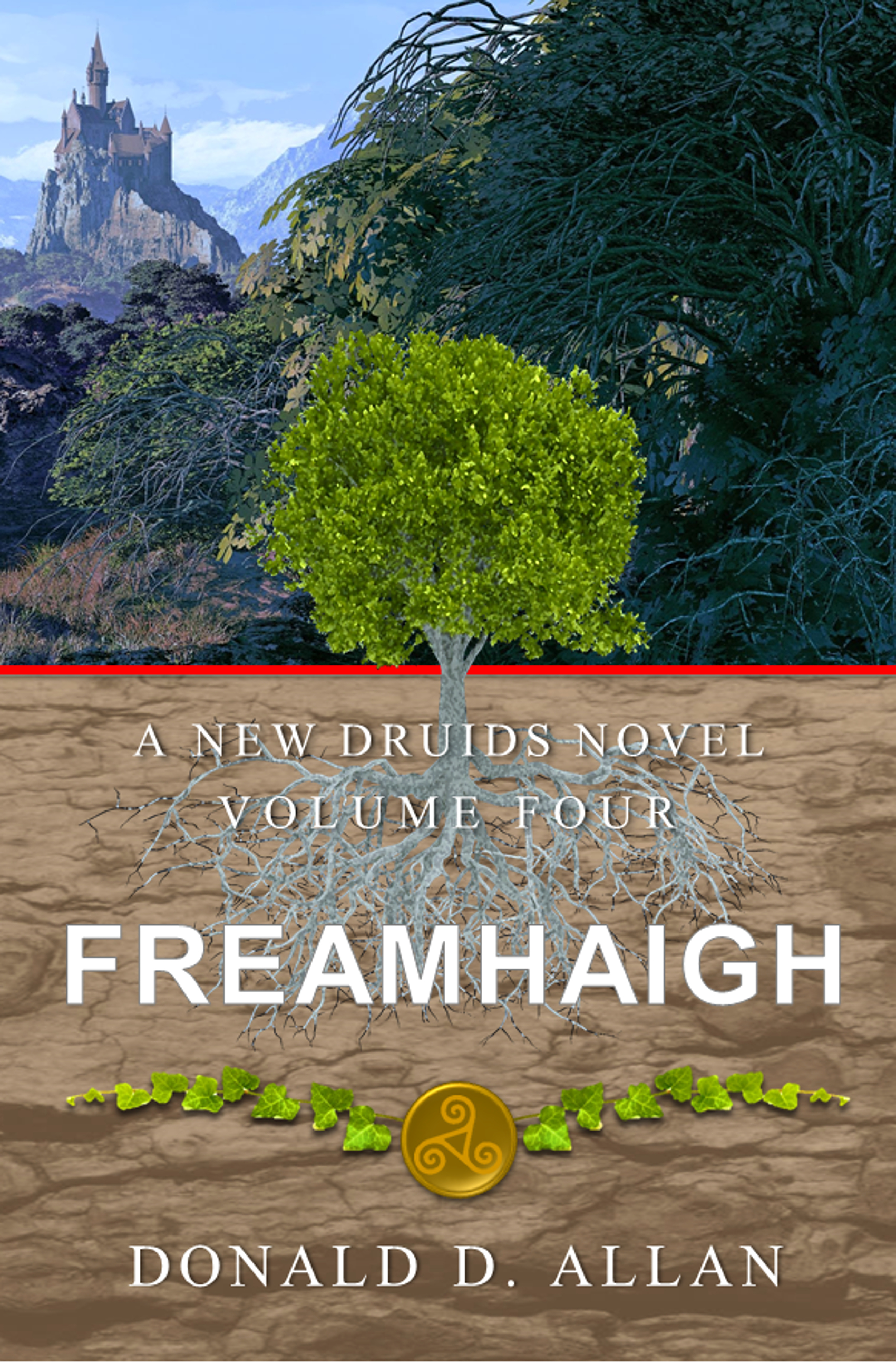
The realm of Belkin is now in open civil war. The southern county of Turgany rises up to try to defeat the self-proclaimed President and end his tyrannical rule. Will Arbor, Freamhaigh to the druids, must find a way to counter the threat of Erebus. Gaea has been wounded and no longer responds to her druids. Meanwhile, the Sect of the Church of the New Order rises with greater power and threatens to destroy the unstable harmony of the Realm. Will Arbor and the druids are all that stands between Erebus and the land of Belkin. As Freamhaigh, Will must be ready to sacrifice all he holds dear.
Nathan says:
I looked at the previous three volumes up on Amazon, and they all show consistent branding. Unfortunately, those consistent parts are the biggest problems.
- Your title font is the plainest, most non-evocative font imaginable.
- The white type disappears against the light brown background.
In addition, while I understand the progression of the central tree from a sapling on the first cover to a full-grown tree on this one, the tree in the center clashes with the foliage behind it.
Now, I also saw that you have some combined volumes up on Amazon, one with the first two volumes and one with the last two:
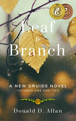
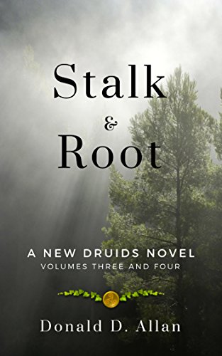
I think these covers are a lot closer to what you need. Simply switch out the title font with something a bit more evocative of ancient Britain, and I think you’re good.
Other comments?
There is probably just a little too much going on. The cover comes perilously close to falling into the “Kitchen Sink School” of cover design, where everything that seems of importance is included.
There is also a little too much mix-and-match of styles, none of which really work very well together.
This is exacerbated by, I think, much of the imagery being too dependent on a prior knowledge of the book. I am sure the tree with its roots, the leaves and the sigil are all significant…but only to someone already familiar with the story.
You should settle on one dominant image that best represents the character, nature or theme of your book.
To this end, there is not much in the present cover that seems to really reflect the story suggested by the blurb.
I think that the cover imagery needs to be resolved before any worrying is done about the typography.
(Having seen the earlier volumes, thanks to Nathan, I think these share the same problem of vagueness. Neither suggests anything about the nature of the books. Imagine switching out the tagline with something like “A Guide to British Woodlands,” and you will see what I mean. As many of my colleagues here already know, there is a test I often suggest applying to a book cover. And that is to imagine the text in an unfamiliar language. Would you still be able to tell something of what the book might be about or what it’s themes are? I don’t think either of these covers would succeed.)
By the way, should that tagline read “A NEW DRUIDS Novel” or “A New DRUIDS Novel”? I am not sure what the title of the series is.
My problem with it, very simply, is that it doesn’t look like a fantasy novel. I’m in this book’s target demographic–a reader of fantasy, drawn to druidic stories–and I’d walk right past this. Nothing here says “Druids” or “fantasy” to me, unless I read the tagline. Like Ron says, I initially thought it was a book on gardening, or (a family tree, perhaps?), or something similar.
At the very least, you need to find a font that screams “FANTASY!” And emphasize the “DRUID” phrase, someplace visible. The title, as a made-up word, doesn’t tell anyone anything, unfortunately. One of the ubiquitous, (somewhat wrongly-termed) “Celtic” fonts would help.Even something subtle, like Immortal, would aid in making this look more like what it is, and less like what it isn’t. Good old Celtic Garamond, or Stonecross (which is an all-caps font, if memory serves) would help set the tone.
The problem is, again, with a cover image of trees or a tree….while everyone knows that the Druids worshipped mother Earth, natural ways, yadda, it’s not the sort of thing that forms an instant mental connection, e.g., spaceship=sci fi or at least sci-fantasy. Or romantic couple=romance, and the like.
The challenge, as Ron mentioned is that the cover image only means something to you. Or someone who already knows the story–which is, presumably, someone who’s already bought and read the book. If you are able, you might want to consider rebranding the entire series–sorry. If, on the other hand, you have an established, rabid fan base, then you should feel perfectly free to ignore my advice. 🙂
Oh, and yes–please do use a much stronger byline font, too. There’s little point to putting text on the cover if people can’t see it in thumbnail size.
All right, it’s not a completely horrible cover, but my colleagues here do have a point when they say it’s rather vague. When looking at the thumbnail first, I was about to guess “book of some kind of poetry” (books of poetry often have covers with lots of forestry or flowers on them) until I noticed that somewhat Disney-esque castle in the background (which looks a bit like a live-action version of the highly stylized castle in Disney’s version of Sleeping Beauty). So yes, I can see the fantasy element in the thumbnail, but only after giving it a second look; your target audience isn’t likely to give it that second look, or notice on the first glance that tiny castle up there in the corner taking up no more than one sixteenth of the cover.
I know forestry and green stuff in general are rather important to druids and the like, but did it occur to you that the one tree down in front might do better at establishing that plant magic is a big element of your story if it didn’t have a whole forest behind it to contrast so unfavorably? Seems to me you could kill two birds with one stone if you simply expanded that castle image to fill the entire upper half of your cover and expanded the tree to stand that much more prominently in front of it. That way, you have the castle that fairly screams “Fantasy!” prominently displayed, and you establish a sort of mystical symbolic link between it and the tree, maybe something along the lines of “As this tree sprouts fresh green life in the middle of a desolate land, so too this castle (symbolizing shelter and refuge for a whole kingdom or perhaps just for the druids in this story if that’s their private keep or something) gives rise to life in the midst of adversity.”
Speaking of that tree in the desolate land, it would seem that either its roots are nearly all on the surface, having failed at multiple attempts to penetrate the hard and barren soil, or else (if this is supposed to be a cross-section of the soil) that the majority of the tree’s trunk is buried along with the roots. Either way, having approximately half of it above the desolate landscape and half of it below makes no sense; the trunk and foliage both ought to be fully above the desolate soil with only the roots being down there below. I don’t see any reason why the split in the cover needs to be exactly half-and-half either; a three-fifths and two-fifths or even two-thirds and one-third split with the upper scene getting the majority of the cover to itself might be a lot more aesthetically pleasing, especially if the picture is meant to be viewed from a three-dimensional perspective.
Finally, whichever way you split it, that red line between the two images needs to go; it’s keeping them from meshing. While I can understand you want to draw a contrast between the two pictures (something like those “before” and “after” images one sees in some kinds of magazine advertisements), the contrast in this case also depends somewhat on continuity between the two: the castle on the forested mountains should appear to be in the same scene as the tree on the desolate plains standing in front of it, albeit with the hint that the two contrasting portions are in different eras. (Presumably, the desolate plains are the “before” shot from before the druids brought new life to the land with their magic, while the forested mountains are the “after” shot from after they did so.) As such, the way to divide the picture without disjointing it (even if the contrasting images are actually two completely different images from completely different sources as I suspect) is to fade the edges of each image into the other.
Only once you’ve dealt with the images in this way should you then turn your attention to the fonts, on which Hitch here is better than I at giving you advice. One bit of advice I can give you on that, though, is that whatever font you use, white against a tan background makes the serif fonts you use in your series titles and byline completely illegible in the thumbnail; either get a new color or a new style or both to make them more immediately accessible to the casual browsers in your target audience. Basically, that badge with the laurels you’re using for branding your series works fine and can therefore stay the way it is, but just about everything else on this cover needs to be changed.