[Apologies for the absence; the day job has been Six Weeks O’ Bedlam.]
The author says:
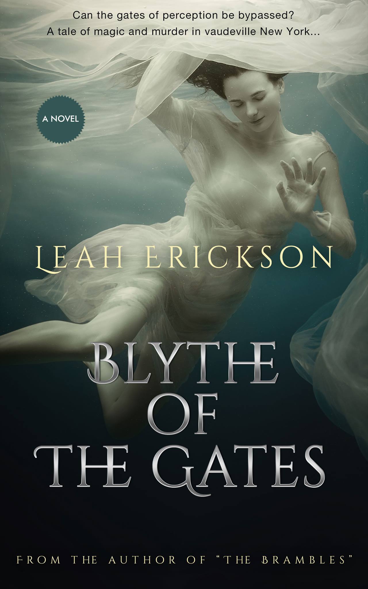
Can the gates of perception be bypassed? A rash love affair with a member of the Irish Mafia catapults Luna Mulkerrins into scandal, murder, scorn and decadent friendships in Ragtime Manhattan. Escaping from the blaze of publicity, a new Luna emerges: Blythe of the Seven Gates. Her meteoric rise as a magician leads to fame, vaudeville, silent movies and the notoriety of a damaging court case. Can Luna reclaim her reputation and reinvent herself as an independent woman of the time?
“This book is as enchanting as the magic tricks within. Heartbreaking, thrilling and powerful, it’s a journey you won’t want to miss.” — Jo Niederhoff, Seattle Book review
Nathan says:
Underwater shots are a hot flavor right now, so I don’t think you can go wrong with it. It doesn’t matter that the image doesn’t relate directly to your story; it draws the attention of non-genre-specific habitual readers, and that’s good.
Beyond that:
- The typeface for your tagline at the top is completely without charm. Find something that’s got at least a hint of magic.
- The “A Novel” badge is entirely unnecessary; no one puts a cover image like this on a nonfiction book.
- Oddly enough, the HE ligature doesn’t bother me in “BLYTHE,” but it sets my teeth on edge in “THE,” and I don’t know why. To be safe, it might be better just to use separate letter in both cases.
- RE: “The Brambles” — Usually, titles of other books are put in italics rather than quotes.
Other comments?
HARD seconding the tagline typeface change at the top. That’s GOTTA go.
I was going to suggest Rosarivo Italic ( https://www.fontsquirrel.com/fonts/rosarivo ) but on second thought, reusing the font at the bottom (“from the author of…”) might be just as good. Experiment.
You may wish to consider picking only one of the sentences you have now for the tagline. The first sentence is evocative, but doesn’t tell me a thing about the book (which is exactly what the Mysterious Floating Lady is doing). The second sentence, while not poetic, gives you a clue as to what this book might be about (which I personally like better, since the cover image + title don’t give much away). But only you can decide how you want your tagline to function. 🙂 This is just my opinion.
The “From the author” quote uses the same font as the title. My original take was, we need something simple, as the titling font is relatively ornate, but…I wonder if, as crazy as that sounds, Foglighten might not work? You’re trying to convey a “magical” feeling, would work? I’d at least try it and look at it, before ruling it out.
That’s my sole comment. The rest seems fine–do change the quote marks to simple italics for the title The Brambles.
“Underwater shots are a hot flavor right now,” our esteemed host says. They are? Maybe so; it’s not like I’ve been keeping up with trends like that. It strikes me, though, that such fads tend to fade quickly; is this cover still going to work for this book a year from now, or will the author have to roll out another one for us to critique?
To be sure, a floating woman in wispy clothing does suggest something magical; but with that dark bluish background, I was thinking this would either be set deep beneath the sea (maybe having something to do with mermaids) or up in a storm-filled sky or possibly in some kind of tumultuous cosmic realm. New York of any era didn’t exactly spring to mind, even after reading the tagline. I’m all for keeping the floating woman, especially since she does look vaguely old-fashioned in a way evocative of the turn of the twentieth century or so, but can’t help thinking the picture could maybe use just a little something more to be complete.
Aerial photographs of Ragtime-era New York being effectively non-existent, and the floating lady being somewhat surreal anyway, I was thinking maybe just an abstract bunch of city lights twinkling down in the darker lower half of that image would be sufficient to evoke the early urban setting to great effect for very little money. Also, after the “floating” pictures fad fades, such a modified image on your cover would then still have your prospective readers thinking of magic, old times, and an urban setting. Moreover, having her symbolically looming over a city (even in the abstract) almost as if she owns it firmly establishes her as the protagonist in the viewer’s mind even before opening the book to read it.
Other minor point: the tagline’s decent, but I would try to put it all in one sentence; maybe something like “There’s a whole world beyond perception awaiting her out there, and not just in vaudeville New York…”
Perhaps, RK, instead of twinkling city lights, the lights could be the top of gaslights, from the NY 1890’s-1900’s period. That might establish the time period, at least.
Or–and I couldn’t do this, but someone like Savoy could–float a scene something like this one: https://commons.wikimedia.org/wiki/File:Fifth_Avenue_Easter_Parade,_1898.jpg somehow, in the darker bit at the bottom, just to establish a time-period. Granted, the woman’s dress sort of implies a historical period, but that’s all that does, and many people shan’t see it. It’s a lovely image, no doubt, but it does need something to set the period, IMHO. I’m not sure that gas lights alone would do it. Too many cities and areas still use gaslight-type fixtures, for that tactic to be immediately successful.
The cover looks great but…what in the world does the image have to do with the book as it is described? As beautiful as it is, I think you should nevertheless consider replacing the art with something that is more directly evocative of the book in the description. I realize that your heroine becomes a stage magician and if that is what you are trying to convey (is the image supposed to be of one of her acts?), you should instead choose something that can be more immediately associated with magic by the casual browser. The current image may require too much preexisting knowledge of the story.
And such an image might also not get across the idea of your heroine’s career but the time and place in which the story is set as well. I might, for instance, suggest browsing through period magic posters for inspiration
http://www.loc.gov/pictures/search/?q=magic+posters&sg=true&st=gallery
I also agree that the tagline appears very weak (as is the “By the author of…”) and you could lose the little “A Novel” badge without doing any harm.
I would take the quotes out of Author of because people understand what follows is a book title.
A novel – no shit. Kill that because it screams to me you are self-published and have to tell people what it is and have no clue.
Your have two tags at the top. I would kill one of them. Either or for they don’t mesh well together.
The strange HE is killing me.
I saw “magic and murder in vaudeville”, and I saw an underwater lady, and the first thing I thought of was the Hugh Jackman / Christian Bale movie, “The Prestige”. I don’t know if that would be an association you want to encourage, or even if many other folks would fall into that association.
Late to this thread but..
You’ve made some really solid choices here. You’ve found a stock image that communicates a lot of the right mood and tone. Like Nathan says, floating girls are A Thing but I think you completely justify the trope with your selection. The image reminds me of Victorian/Edwardian photos of spiritualists and magicians conjuring ‘spirits’ or ‘ectoplasm’, which seems perfectly on point for your book.
https://rlv.zcache.co.uk/vintage_herrmann_maid_of_the_moon_poster-rc3bfc27a51bc45bdad359acc4f58d61e_aiqzr_8byvr_540.jpg
https://theaddiechronicals.files.wordpress.com/2013/12/adelaide_suspension_caveney_web.jpg
However the image is being let down by the type treatment, which actively work against the expectations you want to be stting up. Your cover certainly looks like a competent book cover but not for any book in particular – it’s very generic, hainting at no particular genre or story.
As others have pointed out you have one tagline too many, and I think that’s because you’re trying to make up for what the cover isn’t telling us.
The question is always, with a book that doesn’t neatly fit a dingle existing genre, what elements to play up? The first step is always research into what the covers look like of books that tread similar paths.
What I gather from the description and existing cover is that this is a book which touches on a few genres – a bit of what Amazon classifies as ‘spiritual and metaphysical fantasy’, a bit of murder mystery, a bit historical novel – but coming together under would be shelved in the plain ‘fiction’ section in the bookshops.
https://images-na.ssl-images-amazon.com/images/I/51JhJCnP5VL.jpg
https://images-na.ssl-images-amazon.com/images/I/51XK29rRNYL.jpg
https://images-na.ssl-images-amazon.com/images/I/91lSoaO515L.jpg
What we learn from looking at (US*) books in the same ballpark is that the covers steer close to historical fiction. There may be something to clue the viewer into this being a little diffrent to straight hist lit (e.g. the strange mask added to the portrait on ‘The Witches of New York’.
In your case you have the ‘quirky’ element locked down in the photo. You need to signal the historical nature of the novel for that to play off.
I have taken a few looks at this cover, and talked through here what I’ve done and why here…
https://www.kathrynrosamiller.com/blog-1/blythe-of-the-gates/
*UK covers are tending towards a different on books in theis ballpark. Dark backgrounds with small spot illustrations around a large central typography:
https://images-na.ssl-images-amazon.com/images/I/51SJq%2B7DekL._SX321_BO1,204,203,200_.jpg
https://images-na.ssl-images-amazon.com/images/I/81rhc-fWADL.jpg
https://images-na.ssl-images-amazon.com/images/I/91woYBBoO4L.jpg
That’s some very, very nice work there, Kata. I think you nailed it.
Thanks! Half the work is done with the author having already done a great job selecting an image. Sounds easy but as we know on this site so many people don’t know what to look for.