The author says:
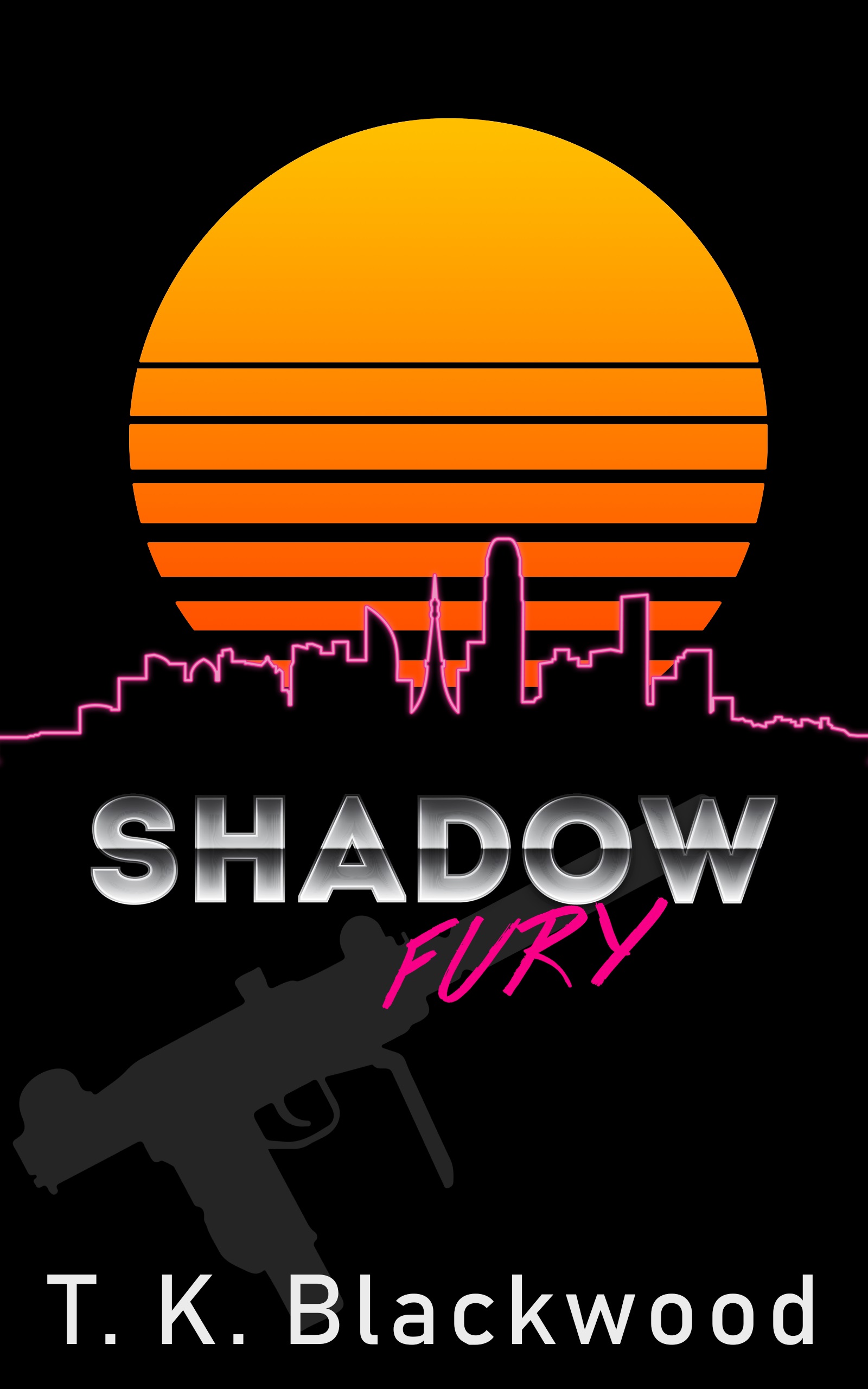
An action-thriller set in a 1980s retro-future after a devastating world war. It takes place in the South East Asian refugee metropolis of New Saigon and details one man going against a ruthless mercenary company he used to work for to rescue his love.
Nathan says:
Hmm. It definitely has an ’80s vibe, but I don’t know if it’s in the way that you mean — I look at this, and I think of cheap direct-to-video action movies on VHS cranked out by Roger Corman starring Don “The Dragon” Wilson. The fact that your stylized setting sun graphic looks like the logo for Corman’s New Horizons production company exacerbates that:
I don’t know how many people are in the target audience for that kind of ’80s nostalgia.
Also, “Fury” is very hard to read in thumbnail, and the UZI becomes almost invisible.
Unless the ’80s-ness is a big of the appeal — everyone wears Swatch Watches, there’s lots of kickboxing, and you can practically hear the synth-score when reading it — I think you might instead want to play up the post-apoc/cyberpunk vibe that I imagine from the description. (Remember, Blade Runner was ’80s too.)
Other comments?
I agree with Nathan, you can’t read “Fury” at a thumbnail size. Even the word, “Shadow” is hard to read at that size. Most people will see a thumbnail on their phone when searching for your title. And, it’s nearly impossible to see the gun in the background (black on black). Decide which word you want to emphasize— Shadow or Fury and tweak the readability.
Well, it’s certainly not a bad start at all!
Probably the first thing that jumps out at me is that…the cover really doesn’t jump out at me. You have some nice elements, but you got a little too shy with them. This is particularly true with the title. Everything should be larger, especially the word “Fury,” which at the moment looks like an afterthought.
The gun, too, looks like an afterthought…once one notices it. But a very dark grey silhouette against black is not remotely a good idea. Partially obscuring the gun with the type only makes this worse.
Probably the worst problem, however, is that I don’t think that the cover conveys anything at all of what the book is actually about. Until I read the blurb I thought it was some sort of thriller set in LA or NY…there is nothing about it that suggests a “retro-future after a devastating world war” or that the story “takes place in the South East Asian refugee metropolis of New Saigon.”
Frankly, before you start worrying too much about the type I think that you need to reconsider the cover imagery from scratch.
To your credit, I did think “It looks like a poster for a cheesy 1980s Kung Fu movie” the moment I laid eyes on the thumbnail: abstract two-dimensional silhouette of a city in the background? Check. Abstract two-dimensional representation of a sunrise (or sunset) over that city? Check. Reflective metallic and fluorescent-colored-spray-paint-graffiti-style lettering in the title? Check, and check (though my colleagues do have a point about that latter part of the title being too small to be immediately legible).
The question, as our esteemed host points out, is whether this imagery elicits the kind of retro-1980s vibe you want it to elicit from your prospective readers. For starters, judging by your summary, I think you were trying to elicit not so much a martial arts theme as the closely related theme of warfare between street gangs involving shootouts with automatic and semi-automatic weaponry. That much would have been clearer if your silhouette of an Uzi (which I mistook in the thumbnail for a silhouette of a dead body) were properly drawn and outlined in white (or some fluorescent color) to look like an Uzi.
More importantly, how much cheesiness do you think your target audience can tolerate in service to appealing to their sense of nostalgia for the 1980s? In considering similar stories from the actual 1980s, what immediately comes to mind for me are the Double Dragon games (the games, mind you, not the cheesy early 1990s movie loosely adapted from them; Double Dragon II in particular even specifically mentions that its story takes place after a nuclear war), the grittier Punisher comics from that era, and… well, various cheap imported Asian movies with people using guns in place of or in addition to the martial arts. All of these, in retrospect, are actually kind of cheesy; but if you think your audience wants that kind of cheesiness and is nostalgic for it, then you’ve probably got things just about right, and all this cover needs is some minor tweaks (i.e. enlarge the spray-painted title, make that Uzi more clearly an Uzi, and make that city silhouette look more distinctly Asian).
If you think your audience wants something a little more sophisticated, however, you may just have to spring for some more sophisticated art, like a drawing of your protagonist with distinctly retro-1980s clothing and hairstyle brandishing an Uzi while standing in front of a distinctly Asian (Vietnamese?) urban backdrop. I’m thinking you’ll want to look into things like the covers to Frank Miller’s 1980s comic books and to the cartridges for 1980s Nintendo games like the aforementioned Double Dragon and also Rolling Thunder (which had lots and lots of gun play in it) and (again) to the Punisher (both the comics and the game adaptations) for pointers in what kind of art to use. Heck, your whole synopsis sounds like a combination of elements from each of these stories: a former soldier/mercenary (Punisher) going up against his own former employers (Code Name: Viper, which was a blatant ripoff of Rolling Thunder) to rescue the woman he loves (Double Dragon, and also Rolling Thunder).
In short, you’re on the right track here, but we need to know how highbrow or lowbrow you’re looking to go with your concept. I, for one, look back on even the cheesier parts of the 1980s (in which I spent most of my childhood) with considerable fondness; but not everybody in your target audience is necessarily going to be the same way.
RK pretty much said what I would have said–he said it more eloquently, and in greater detail–and I need feedback from the author/publisher, to know what the plotline entails. To me, it absolutely evokes the 80’s Chop-Socky movies (I confess, I’m a huge fan of those cheesy sorts of things!), and if that’s where you’re going, you’re nearly there. I would do something about the “Fury” font; and I would consider making the Uzi silver, or a color that complements the existing yellow/gold/pinky shades on the cover.
However–if the storyline is not that; if it’s not an homage to the 80’s Chop Socky Cheese we’ve mentioned, then you may need to rethink it. Until I know a bit more, I can’t speak to the suitability of the imagery.
I think that you nailed the problem. The style of the book may be an homage to 80’s Hong Kong action flicks—an homage I think everyone is a little too focused on— but that is not what the book is about, based on its description. There needs to be something in the cover that conveys the post-apocalyptic setting that the story is actually driven by. At the moment there is nothing that that says “retro future” or “refugee metropolis” let alone even hints at the “one man vs ruthless mercenary company” theme.
Thanks so much for the feedback, everyone!
It’s clear that I should have been more detailed in my summary, I wasnt sure how much to include. My novel is absolutely in the vain of 1980s straight-to-VHS action movies so that is the vibe I want. Whether or not anyone else is looking for that is another question, but definitely what I intended to write.
I’ll beef up the “Fury” title and make the Uzi pop more for sure. For better or worse, I’m fairly married to the idea of a simple cover design, so I dont think I’ll do any photo manipulation.
My hangup is on how to make the city more Asian. I based it on the Shanghai skyline, not that it’sobvious, but I’m not certain if anyone has any ideas on that front I’d love to hear them.
Not to be all tropey, but…what about a pagoda, in the skyline? I know, I know, just SOOOOO stereotypical, but I’m not sure what else you can do that would yell “Shanghai!” to those unfamiliar with the skyline thereof.
You could, possibly, use a sign, on the buildings (?) that says Shanghai? Not my expertise, but perhaps…Savoy, are you here? Could you figure out a way to make that work? (Savoy has mad cover design and layering skills…just the person you want for that type of tweaky finessing…)
My other comment, though, TK, is that you’re not saying “post-apocalyptic” anywhere here. That’s a biggie to me.
I agree with Hitch. There is too much focus on conveying an 80s vibe and not nearly enough on what the book is about.
Getting across the sense of the book’s Shanghai location is only half the job. It has to be a post-apocalyptic Shanghai.
I find the flat black areas of the cover rather dead, and I’d suggest that as a way to enliven them and to push the 80s VHS action movie vibe a little more that you add a grungy texture over the top of the cover to evoke a beat-up VHS cassette cover.
Maybe you could add that grid landscape that might add to the cover