The author says:
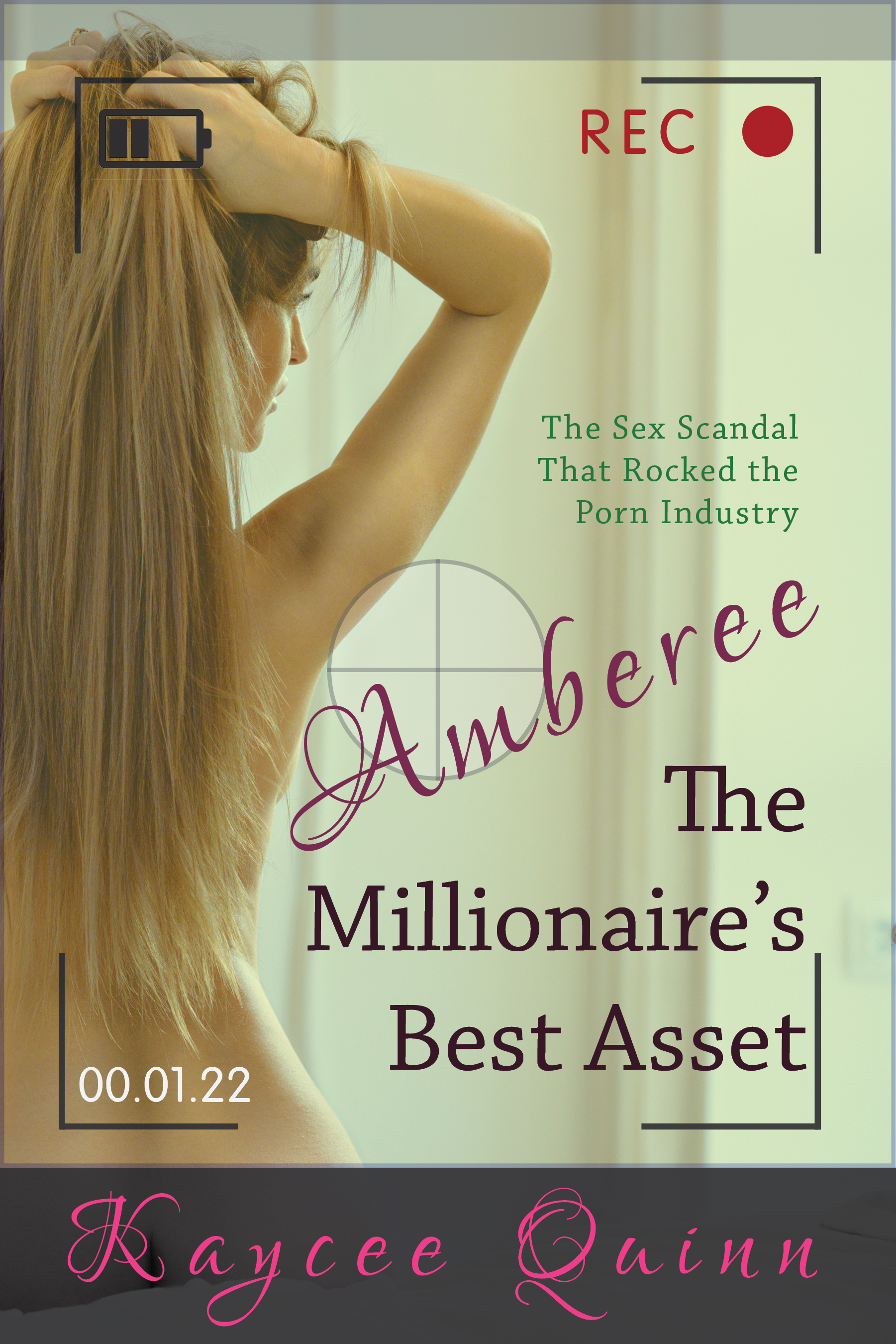
Amberee The Millionaire’s Best Asset is a fictional autobiography / industry exposé, which fits into the Contemporary Fiction genre and is about how a young woman came to work as a porn film and live action actress. Amberee’s life comes under escalating danger, and she secretly penned her autobiography to get the truth out into the world, because her life differs greatly from the business savvy marketing. (The book is Adult Content Only due to the nature of the content as well as the graphic descriptions within, so I’ve chosen to include a small warning on the cover.) I will understand if you don’t wish to critique the cover on your website because of this – but would love to gain some great feedback. I have tried to capture looking at Amberee through a video camera viewfinder, because (to me) it conveys the subject matter of the character being filmed as well as outsiders looking in (which is what she is trying to address).
Nathan says:
I can see where you’re going with this, and I like the basics. Here’s where I’d go:
- Lose the “Amberee” from the title and just go with “The Millionaire’s Best Asset.”
- Punch up the colors and contrast — use warmer colors, especially the skin tones, and make it pop with better highlights and shadows.
- The pink-against-black of the byline makes it almost invisible in thumbnail, and still hard to read at full-size (overspacing a cursive font doesn’t help, either). If you must have the dark bar at the bottom, use a bolder, less fancy font that’s more easily readable.
- Nothing on the cover points toward it being fiction — in fact, the subtitle works against that. If you don’t want confused readers — and you don’t — you need a subtitle that doesn’t make it seem like nonfiction. (Part of the solution would be to set it in present tense; past tense definitely makes it seem like the account of an actual event.)
Other comments?
General agreement with Nathan’s assessment. As a particular suggestion regarding the subtitle, maybe phrasing it as a question could help push this into the ‘fiction’ category. “What sex scandal could rock the porn industry?” flags this as a speculative case, which by definition would be a fictional treatment.
I agree that it looks like nonfiction, but knowing it’s fiction, it then looks to me like a sexploitation novel. If it’s supposed to be more of a drama that’s sympathetic and humanizing to Amberee, I’d suggest a different approach. For instance, making her look at the camera gives a greater sense of humanization to her.
I also agree that we need to play with the colors; the predominant color right now is greenish off-white, which is not what you want, and the pink font color clashes. The cursive font isn’t doing it for me either.
I agree completely with everything Nathan’s mentioned. The coloration of the cover is way too tasteful for the genre, and it implies a different type of book altogether, something memoir-ish or non-fic/literary, and you don’t want that. That would be confusing. So, punch up the contrast and, as Nathan said, warm it up.
Fonts: These fonts are not, in my opinion, helping you at all. The byline font, Nathan already addressed; it’s unreadable and it screams romance, not erotica or even Contemporary Fiction. I’m not wild about the pink text, in any font, but if you do need it, fine–use a nice sans serif for readability.
The titling font–that’s a toughie. There’s no standard font or look for CF. You can do what you want, but you do want to ensure that it’s not mistaken for something else. That Slab serif font you’re using is not knocking it out of the park. Something with a bit more weight, for the title–Bauer Bodnieu, maybe, or Bergamo (must be B day!). I’d also consider playing with font colors, to see (after you’ve punched up the contrast and warm it up), to see if you can make the title stand out a bit more.
Then, as I said–let’s try a nice compressed or Thin sans-serif, for your name at the bottom, and kern it widely, so that you get a bit of the Stephenie Meyer effect on the byline. Ostrich Sans or something similar, eh? If you want to go wild, you could use something like Rainfall, but that would be awfully heavy with a lighter-weight title font.
That’s my $.02. Design-wise, the only thing that strikes me is that I might consider a vignette effect, around the outsides of the “focusing frame” of the video, perhaps, just to additionally focus attention on the girl and the title. Not exactly a vignette, but something similar, like what you see on News channels around cellphone video, defocusing what’s outside of the content outside of the video frame.
Unlike most examples, I suppose something that would earn this the bringing sexy back tag on Lousy Book Covers is actually rather appropriate to this kind of cover, but I agree with Kristopher Grows that one sure wouldn’t know the difference between this and a true (if shamelessly sensationalized) story from looking at the cover. Making the tagline a question as KG recommends could help to clarify that, or just altering it in any way that makes it sound more speculative than factual might be sufficient: “A horrifying tale of a scandal that could have shaken the pornographic industry to its foundations!” Saying something like “This might happen sooner than you think!” could also help give it that “could be true but hasn’t happened yet” vibe.
As to the “adults only” content, don’t sweat that warning too much; I think Amazon and Barnes & Noble and Lulu (to name three of the larger online sellers of indie books) all include some kind of option for specifying on the sales page and to the search engine that a book is for 18+ readers only. While these measures won’t stop anyone (including kids) who looks for it by name from finding out about it, that should pretty effectively cover you from any legal liability. As with American comic book sellers who import some of Japan’s racier manga material to display on their shelves, as long as you keep all the stuff with exposed genitalia in a restricted area clearly marked as off limits for children, you should be all right.
Nathan, with the Tagline “The Sex Scandal that Rocked the Porn Industry”, my question is, should it be changed to present tense as you suggest when the story within is all presented past tense? I ask because much of the advice from authors is that the tense used on the front and back cover they say should reflect the content within, and the story is told from a ‘second edition’ autiobigraphical style. (It pretends that there was a first edition).
Oh dammit. Originally, the title of the book was just “The Millionaire’s Best Asset”, but when I used just that the cover felt too masculine to me despite the model, so I tried to include both a feminine and masculine quality in the cover by the way of using that contrasting typeface, which meant because the front cover text has to match the given title I now needed to include the character’s name.
I will see what I can do to address the problems you’ve highlighted. Thank you!
I don’t think that advice is backed up in practice. I just took a look at the five bestselling novels on Amazon right now, and the back cover copy for all of them is in the present tense. (The exception being when referencing a story point which takes before the events of the novel, eg., “Five years ago he walked out of her life. Now he’s back.”)
I have to go a ways down that list to find enough books with a sentence as a tagline because, well, they’re bestsellers, so their real estate is mostly taken up with “New York Times Bestselling Author” or a pullquote from Stephen King, but when I do get to tagline sentences, the use present tense:
“He’s not your husband. He’s hers.”
“There are a million ways to be wicked…” (And that’s on an historical romance, so even when you have events that clearly are set in the past, present tense taglines prevail.)
“One mistake could destroy everything…”
“She’s the girl next door. He’s the guy who loved her from afar. They’re in for an unexpected tumble into love.”
Back cover copy is (almost) always framed in present tense even if the book is in third simple past. Taglines are also usually in present tense. I think, if you follow the suggestions you’ve gotten here on warming up the colors, adding shadows and changing the fonts this will be a really great cover.
Would ‘A Sex Scandal to Rock the Porn Industry’ work? (Instead of The Sex Scandal that Rocked the Porn Industry).
Yeah, I could see that.
Ditto what the others have said. Especially those who have pointed out that the cover makes the book look and sound like non-fiction.
At least one too many typefaces, with one result being that “Amberee” does not look like part of the title.
The idea of the camera frame is good, but I don’t think it reads immediately. I saw the red circle device in the corner before anything else…it took a second before I realized what it was about (my first thought was that it was some kind of logo). You might want to fill the cover with the frame and lose the black and grey bars at the top and bottom. It might even be an interesting experiment to throw the girl out of focus. This might conceivably heighten a sense of mystery and voyeurism and she might even be moved further into the frame.)
All of the discussion regarding the back cover blurb is kind of putting the cart before the horse at this point since a potential reader has to get past the cover first.
Ron: I don’t think anyone’s discussing the back cover text. They’re talking about the tagline on the cover, unless I’ve missed something.
I suggested having all the content outside of the presumed focal point out-of-focus, for the same reasons that you noted; it doesn’t read as being seen through the lens of a camera or phone camera. I think that hurts the cover quite a bit.
Yeah. Going back, I see that I misread Savoy’s point.
Should not critique the text, but this does sort of overlap. What is this book? Neither the text provided nor the visuals clarify this for me adequately. OK so it is not non-fiction, that we covered. Is it erotica? Romance with erotic overtones? Crime thriller? Social issues exposé? The curly pink lettering does seem to veer towards it being romance/female erotica, and all in all it is rather pretty. The no-nonsense title font seems to fit a college textbook, or a thriller, or about anything – combined with the viewfinder, it seems to me to indicate True Crime, which we know it should not be. While it would be nice if we could not force books into genres, the readers tend to look for certain ones and be disappointed if they get something else than they expected.
If it was a thriller, I would maybe go with black and white image, or some grain, or both – to tone down the ‘pretty’, and use strong colour for the title in something a bit more bold: The image is a bit too tasteful for anything that we could describe as hard-hitting. Now, I do not suggest or want the photo to be changed, as it could work fine.
Amberee is both an awful name (probably on purpose, I get it) and does look like you clearly pasted it on the finished cover as an afterthought: The picture and composition, with the viewfinder effect, are OK from a purely aesthetic point, but there does seem to be a lot of text. There isn’t, I have books on my shelf with way more ‘I loved this book’ quotes and other word salad on the cover, but here it just looks like too many bits of text were crowbarred in. I blame the poor Amberee, that could not even wedge in horizontally. I suggest leaving it from the cover – the title would be punchier without it anyhow. Even shortening it further might make a better cover.
I am not sure there is any need for the dark bar on bottom, nor does the pink colour suit the colour scheme: If it IS romance/erotica, then it would need MORE curly font and/or pink, though dark pink would stand out better on light background. And the image could then be even a little more soft focus, perhaps a teensy bit warmer colour. Also, in any genre, at least try to see what the byline would look like on the top, with no bar?
One more point that occurs to me: while I don’t know the finer points about the how the industry operates, it might make sense that there’s a market for videos taller than they are wide that would play well on a cell phone. I can understand, too, the author’s desire to fit the video frame to the cover, it also being taller than it is wide. That said, if this story is supposed to have something to do with a millionaire making his millions selling dirty videos, don’t you think the production values for his videos would be a little bit higher?
I mean, even if the videos are meant to be shown mainly on cell phones, you’d think the millionaire would invest in some quality cameras capable of shooting Blu-ray or even 4K resolution, and then turn them on their sides to get the “portrait” layout. While cell phone cameras and some professional’s high-resolution still-frame cameras automatically adjust their text to match the camera’s orientation, I’ve not seen many video cameras that do so. For best results, therefore, why not either the camera text on its side while showing something to indicate this is being shot with a high-resolution camera? Another possibility: if this is a traditional “landscape”-oriented shoot, why not place the target off to the side just like the girl herself to indicate to prospective readers that this is actually only half the frame and you’re pulling a sexy discretion shot where the pornographers aren’t?
Nathan:
Are you sure your CC.com email is working? This seems a bizarrely long drought, brother, given that everybody and their brother is trying to publish their book for Xmas…???
Apologies — I’ve got some in the hopper, but I’ve been putting in 10 and 11-hour days at the day job, so CC.com has fallen off the long tail.
OMG, you mean, you’re allowing us to languish because you’re slaving for filthy lucre? The horror!
(From one workin’ slob to another, I feel ya.)