The author says:
Hi again, New name, blurb, and cover. The author did the cover art, this was finally acceptable after many collage-type attempts. Freeforce is set in current time, on earth, a spaceship, then mostly on the planet Tarin. The genre is soft, biological,science-Fiction with a tinge of fantasy. The target audience is adult females who enjoy reading epic (this has 180000 words), character-driven, space adventures
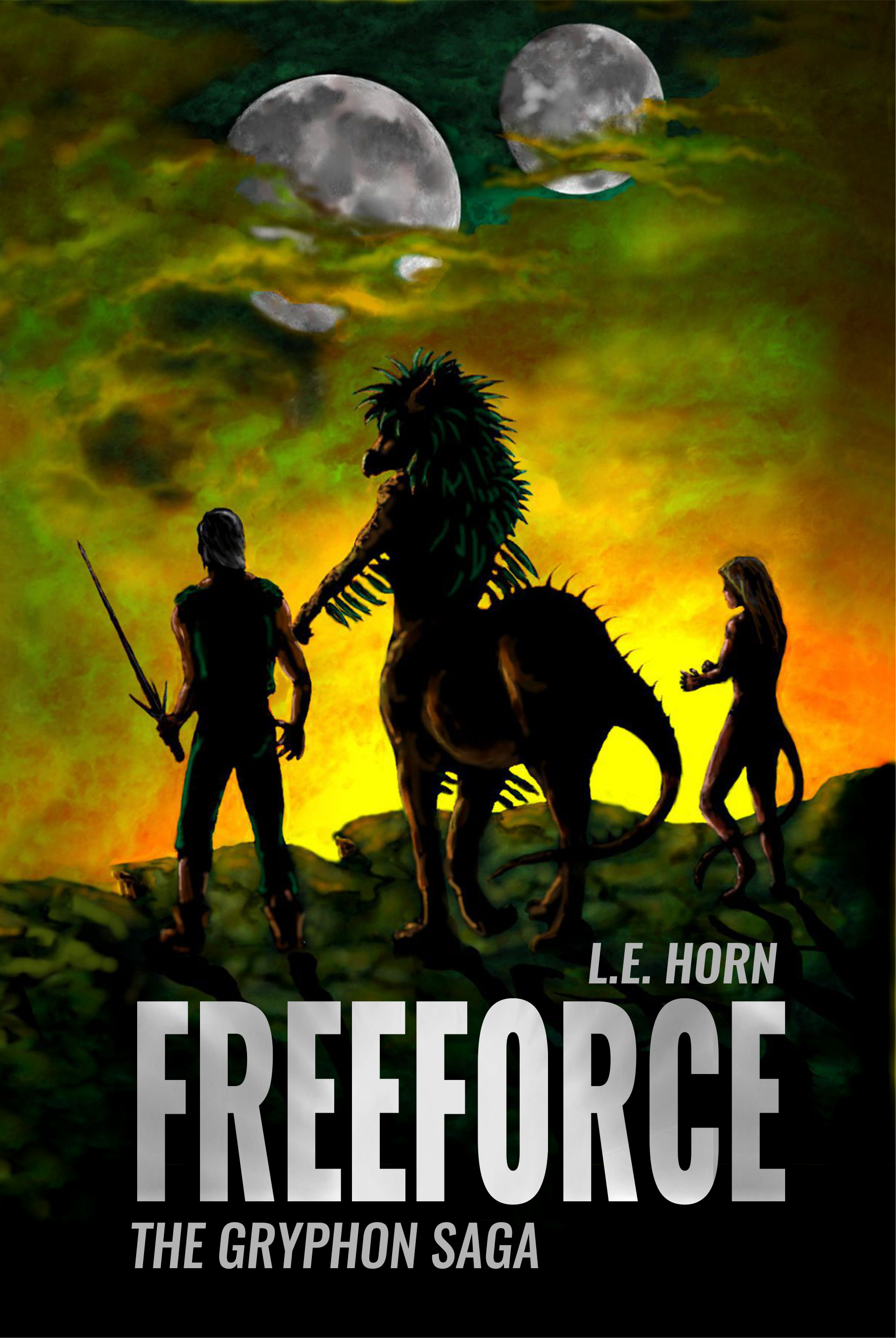
The blurb draft: All Humans live on Earth Aliens don’t exist. It’s easy to believe in lies. Ruthless aliens enslave veterinary student, Lianndra Ross, and force her to take part in an archaic planetary war. Amid chaos and death, she discovers the only chance of freedom lies with the very beings she is fighting against. After all hope seems lost, an unexpected meeting offers her an opportunity to rebel. With the help of her fellow captives, Lianndra pursues the one thing most people on Earth take for granted. There is a catch—if the rebellion doesn’t succeed, life on the planet Tarin and possibly the entire universe will be decimated.
[original submission and comments here]
Nathan says:
You know what? My only problem is that the moons don’t look like they’re lit from the same light source. Other than that, well done.
If anyone else has other comments, have at it.
I agree with Nathan that the lighting on the moons doesn’t look quite right.
I think that the cover is a job well-done, though I wish that the figures were not quite so dark. You could get some more detail and color in the shadows without entirely losing the back-lit quality. Brighter rim lighting would help to maintain the contrast if you do make the shadows a little more illuminated (that is quite a bright light they are facing, so one might expect the parts of the figures facing it to be lit more brightly than they are). Right now, the figures may as well be featureless silhouettes, even though they apparently do have a good deal of color and detail in them.
The overall use of color is very nice as is the composition.
I think the perceived oddity with the moons is because the rest of the cover is lit from below the horizon while the moons are lit from the right. A fire at night would be lit like this, but it can also look odd if the viewer interprets the fire beyond the hill as the light of the rising sun (which may be what has happened in Nathan’s eye). It might look better if the moons are each rotated about 95 degrees clockwise to bring the two interpretations in line with each other.
Yeah, I’m going to have to be the asshole and say that the art is really crudely drawn and nowhere near cover quality. They’re backlit in an attempt to disguise that fact, but if you enlarge it to full size and look at the woman’s hair or the man’s right arm, for instance, it’s evident that the artist is a beginner at Photoshop. The artwork has also been enlarged way too much, and the moons are just photos of the moon (public domain, I hope) fudged with a soft brush.
And, alas, I’m going to follow up the bad news with more bad news. The composition of the art is perfect for an epic fantasy novel, but this is a resubmit of this book, the space opera about scrappy human slaves fighting their alien captors. This is all wrong for that.
Last time we pretty much all agreed on a very simple approach: Tough dude and sexy chick with sci-fi weapons on the bridge of a spaceship or something. Like this. I still think that’s the best approach.
Yeah, well, you’re right.
Yes, but…let’s not forget, this isn’t going to be a movie poster, 6′ tall and 3′ wide. It’s only ever going to be, at most, 6″ wide, maybe. The perfection of the edges of the illos is not probably going to matter quite that much. The immediate impact, the click factor, is what matters, and this is dramatically, dramatically better than the last one. Not trying to be Cherry Cheerleader–you know that’s not my cuppa–but it absolutely is far better and it’s probably fine for a cover.
You’re perfectly entitled to think the art is fine, of course, but to me, there’s just no category of “good enough” when it comes to cover art. It’s either good, period, or it’s not good enough. The stiff poses and proportion issues are visible even at thumbnail, and to me, even at a glance it’s obvious that the art is amateurish.
Yes, that first glance is important, but you don’t want to be relying on them hitting the “buy” button before they notice that the art isn’t that good. Good cover art–and we’ve had some on this site–should just look better and better the closer you look, and make me want to buy the book more the longer I stay on the page. And just…why would you not?
Gwen:
Well, I”m pretty much always in your camp but on the other hand, maybe it’s as good as they can do or afford. That’s kinda what I was thinking. I mean…sure, it would be ideal if they had a budget or an artist that could perfect it, but if they don’t, I kind of hate to have them leave here feeling crappy about their cover, that’s all.
{shrug}
That’s fair.
I have to agree with the sentiment that the cover looks more fantasy then science fiction. That could easily be changed with one of the characters holding futuristic weapon. Or, you could add a spacecraft in the sky, if you prefer. I also agree with the moons lighting issue. Either change to lighting of them to reflect the sunrise angle, or show the flames of the fire over the horizon. I also think you need some soft green and yellow haze over parts of the moons to give them a more natural look, given that the sky is full of very colorful clouds. Lastly, the issues Gwen Katz is having with the characters is not apparent to me looking at it at screen resolution size. I’ve seen far more unrealistic character art on covers submitted here. The ground they are standing on, however, needs a lot of work. Looks very fake, especially when you look at where the characters are actually standing on the surface. The angling just doesn’t match. And the characters need shadows cast on the surface. I like the cover’s composition and colors. Just need to tweak it.
It’s a decent rough cut, but it still needs refinement. Unless they’re like Phobos and Deimos, those moons need to be better rounded. Also, unless they’re explicitly supposed to have atmospheres in the story itself, I’d recommend making them look cratered and airless just like our moon instead of cloudy and windy as they do right now.
Another potential problem others have brought up already is that this cover looks entirely like fantasy, there being not a single piece of modern or futuristic technology on the cover. As the famous author Orson Scott Card once noted in his book on writing science fiction and fantasy, technology is essentially the only difference between those two genres: if you can do some impossible thing with magic, it’s fantasy; if you can do the very same thing with technology, it’s science fiction. Moreover, in a mixture of elements from both, how the story starts determines which genre it is regardless of what magical or technological explanations it gives for the impossible achievements later.
Since we’ve read your summary, we know all the fantastic creatures on the cover are actually extraterrestrials and/or mutated humans, but your prospective readers won’t know that. With no technology more advanced than that medieval-looking long sword in the guy’s hand on the cover, they’ll just presume those two moons are a part of the fantasy setting, not that this takes place anywhere in a universe like ours that just happens to have something like the griffins and cat girls from our various fantastic mythologies in it. Since your cover is your prospective readers’ first impression of the story, it’s what starts the story for all practical purposes, and it’s unambiguously starting it off as a fantasy.
If you want readers to realize this is meant to be science fiction, you have to show something modern or futuristic on there, whether it’s a space ship up there with those moons or all the characters carrying modern military equipment (just say “Yes!” to cat girls with rocket launchers), or even just everyone having cell phones. Note that none of these alterations require removing any of the fantastic creatures: as long as you’ve got technology readily on display anywhere on your cover, people will automatically tend to assume such creatures must be space aliens or genetically engineered or some such. If nothing else, at least give that “Gryphon” a helmet with a radio antenna sticking out of it to indicate his people have achieved at least some level of modernity.
I’d pick this up! I like the aesthetic and the characters look interesting.
I like it. I respect your opinion Gwen but art is subjective. What one person finds sub par another will really enjoy.
If you are trying to ‘fix’ the moons, a soft brush in the yellow dabbed over the moon with a gaussian blur and faded a bit would fix the moons but they don’t bother me as is. You could just draw in white on a new layer over the edge of the characters and set it to soft light to highlight them where light would hit. also adding a bit of shadow to the edge of the cliff would make it look more real but those all are nit pics. Its a nice picture.
The addition of modern element would cement as sci fi. It does look fantasy
I wish I could agree with your assessment of the illustration.
https://imgur.com/a/08Qs1mR
all art by famous artists. Lots of people think those pictures are really great. But, if they weren’t famous would you? I’m imagining them posting here and being crushed…lol. It’s art. It’s totally subjective. It isn’t required to have the same opinion. It can be enjoyed even with ‘errors’ In fact, in my opinion, it’s those very ‘errors’ that give it a distinct style. I’m not looking for perfection in my art. I just want to enjoy the picture.
In my opinion this art is fine. I’m not saying your wrong for not liking it. Your opinion on it is just as valid as mine. I’m just saying it makes a nice cover. I enjoy looking at it. I think in the end that’s all any artist can aspire to- having someone look at their art and enjoy it. No one can make anything that will please everyone. That’s an impossible task. Because you guys are artists you’re holding the art to a technical standard of perfection that most don’t even know exists.
I agree everyone should aim for perfection in all they do but perfection is an unreachable state. I don’t mean to lecture… I just hate that the artist who drew this might think themselves not worthy. It’s good art.
See, I gotta go with Savoy here. I think it’s fine, but it does need something to say SciFi, rather than Fantasy. A spaceship in the sky, or something. (I don’t know what’s in the story, so my suggestions are kinda mooted.)
In viewing your imgur list, yeah…I’d have had serious Spockian eyebrows in viewing any of those–well, most of them. The top two are particularly…subjective, let’s say. 🙂
I think that this cover is such a leap forward, from the last that if you can fix the moons and add the element that will yell “SCI-FI, NOT FANTASY” to it, it’s fine to go.
You’re entitled to like what you like, but if you put those five pictures and this cover art together and asked me which one was drawn by a beginner, I wouldn’t find that very challenging.
So I’m kind of on both sides with the quality of the artwork. I absolutely agree with Katz that the brush- and figure-work are not as good as they ought to be for this usage. Art IS subjective, but the whole point of this site is that there are standards and parameters within which artwork has to operate to be fit for purpose and this artwork as presented is not really there.
However there are strong points and weak points within it and I suspect with a bit of clever adjustment and usage it might become good enough to base a professional-looking cover on.
Frankly you can get away with quite a lot of technical deficiencies with digital artwork. For example, I think the artwork for the French editions of Discworld by Marc Simonetti is really weak in a lot of ways common to digital art (not to damn Simonetti, his other digital artwork is very strong). I find his figures awkward and disjointed even allowing for the stylisation and his colour and texture muddy. Yet these covers are not only used on high-profile books but beloved by many.
You can get away with a lot of weak points in the technical department if you are strong in certain other suits.
Why Simonett’s covers succeed is because they are really strong in composition – composition of both shapes and areas of colour.
And that’s something you too can also use to boost your artwork into the realms of ‘professionally usable’.
You’ve already played to your strengths in the creation of the art, which is great. The contre jour lighting is very forgiving in terms of figure-work and brush-work.
I’d continue to pick out the stronger aspects and dump the weaker ones. Your artwork is only as good as its weakest point. The eye is automatically drawn to what doesn’t look right.
So I’d lose the human figures. I expect they’re important characters but they are the drawn much less skilfully than the gryphon. They look stiff and awkward, and actually they don’t particularly add anything visually – even if they better executed, they add to the genre ambiguity unhelpfully and their arrangement makes for a dull composition.
The most interesting and best-rendered element here is the central character, the one I’m assuming is the titular gryphon. That’s where to focus: that’s the element that’s going to grab the right reader’s attention.
I’ve worked up the below points into a couple of rough versions of where I’d take this artwork/cover – link at the bottom.
I’ve done a quick-and-dirty editing job here to get shot of the humans. The resulting composition is immediately better: You’ve chosen a great angle for this creature in silhouette and drawn that well. The gryphon fills the space in a way which showcases its interesting-ness while creating tension and intrigue in its pose.
To emphasise those strong points further I’ve moved the moons so the larger one is behind its head. The eye is thus immediately drawn to the creature’s face and so both the alien-ness and the personality of the figure.
Your inclusion of the two moons is another good touch of yours to keep. It really helps tip the genre visually towards SF rather than fantasy, counterbalancing the more fantasy-looking gryphon.
On that note I have experiement with just a couple of copy treatments but I think immediately got something stronger and more communicative of genre.
The look (front, colour, placement, effects etc) of your copy is massively important in making the genre and feel of your books clear. If your case it’s particularly important as the artwork itself is ambiguous between science fiction and fantasy.
I checked out some current covers in the fight field (always the first step) for a steer.
I’ve opted for a look popular in SF: relatively small letters with big kerning, in a relatively un-showy typeface. In this case dear old Futura.
I’ve tried placing it centrally on the cover which is a Big Mood right now in SF. I think it works very well for your cover. The text sits over an area of the illustration which doesn’t obscure any important detail, and since the artwork as I have edited and arranged it is lacking in detail or highlight, it forms a perfect backdrop for the title to balance that out.
I’ve also given it a go in Bebas and a bottom-third-placement for the more traditional SF look. To my eye it looks more old-fashioned but actually the US market is somewhat more traditional it its genre cover looks than my own native UK so this may be more appropriate depending on market.
Also, though this might be a debated point, I wouldn’t have the series name in terribly large text. What I notice from other covers in your genre now is that series name and number are increasingly printed small, not just unreadable at thumbnail size but hard to spot at all.
I think that’s for a couple of good reasons: a book being part of a series is no longer a selling point, at least outside of the big names. Everything is in a series these days! It might even be a turn-off to some readers. Also, a prominent series name clutters up the thumbnail with unnecessary, distracting information. In your cover I’d be hard pressed to say whether ‘Freeforce’ or ‘The Gryphon Saga’ was the name of the books and something about that feels like a turn-off. I want a cover to boldy own what it is and feel confidently self-contained, not immediately start referring to extraneous information. Judging by current cover trends I’m not alone there.
I’ve also tried a few different colour variations of the artwork. I find the current saturated yellow and green a bit sickly personally. But more importantly, colour has a huge role in placing your book into a genre and feel at first glance. Check out how the green cover feels different to the purple cover etc.
I think my favourite is the final cover. I’ve picked a purple, and massively turned down the saturation. The colour gives a strong SF feel (so many SF covers are cloudy purple because, y’know, space) without feeling incongruous to the imagery. It’s less dramatic than the original green/orange but I think for the best. It’s moody instead of overwhelming, picking up the still but tense attitude of the figure.
Finally I’ve tried a different composition which is probably a little less strong but has its own merits. Giving the figure plenty of space around them creates an isolated, lonely-hero vibe and makes things feel all the more dramatic.
https://www.kathrynrosamiller.com/single-post/2018/10/23/Freeforce
Oops, didn’t mean to leave this as a reply, it’s meant to be a general response rather than to this particular convo!
As an adult female enjoying epic space (and other) adventures I have to say that there’s nothing in this cover that would convince me to even check out the blurb. It also, at first glance, is a fantasy cover. Nothing suggests “space” part or aliens.
Echoing Gwen – it’s crudely drawn, lacks lush details that other covers has, and is overall very “dark” (as in muddy, not in atmosphere). It looks ok-ish in the thumbnail, but the large size shows its all weaknesses.
Check out the quality and the detail of the covers aimed for female audience (not all fitting exactly your genre, but then you have “space adventure” in the blurb but fantasy-like design on the cover):
https://www.angryrobotbooks.com/wp-content/uploads/HungerMakesTheWolf_144dpi.jpg
https://www.angryrobotbooks.com/wp-content/uploads/Skyfarer_144dpi.jpg
https://www.angryrobotbooks.com/shop/fantasy/an-accident-of-stars-foz-meadows/
Oh man, I would pick up any of those books in a hot minute.
I can only second what M. said.
It would be hard to find fault with any of the Imgur examples…and I didn’t recognize at least two of the artists.
It sounds very democratic to say that art is completely subjective and that there really are not objective standards that can be applied, that everyone’s opinion about art is equally valid. But it is not true, unfortunately.
“Errors” are not style. Yes, an artist can manipulate things like perspective, color, shape, line and everything else…but for this to work they first have to have an understanding of how these things work. In other words, you have to know the rules before you can break them. Picasso, for example, was a brilliant draftsman (meaning he could draw very well).
I do not want the artist of the cover we are talking about to think they are unworthy. There is no question at all that they have talent and ability…but it requires a lot more experience, practice and training before it is ready for publication. It is doing them no favor at all to suggest that whatever they do is just fine, that there is no way in which it can be improved, that they have nothing to learn.
I would never (at least hopefully never) tell someone who was making an honest try that their art was just awful and walk away with no explanation. That’s not helpful. If you cannot explain what you think is wrong, then it is pointless to say anything at all. Saying something like, “I really dislike that painting but I cannot explain way,” does no one any good, least of all the artist, who learned nothing at all. But if you can explain what it is you think is wrong, that is useful. The artist may agree and work to make their art better, or they may disagree and in disagreeing have to think about their art and how they can defend what they did.
But even the best artist works at improving themselves…even the artists you used in your example. Every painting and drawing is a learning experience…or at least should be.
PS
I don’t mean “democratic” in the political sense but rather as a synonym for “egalitarian.”
It’s okay, Ron. 🙂 I’m pretty sure that most of us assumed that’s how you meant it.
You know, just swapping the sword for a laser rifle might be enough. It removes an inaccurate flag, places an accurate one, and may not be that hard.
That’s a good idea, though the basic problem of the figures being essentially silhouettes would still have to be addressed. What would tell the casual browser that the weapon was a laser rifle? More fill lighting would not only add informative details about the creature and the figures and their costumes but details of the weapon as well. This fill lighting doesn’t have to be extreme, so that the effect of back lighting would be lost, just enough to allow for more modeling and details to be visible.